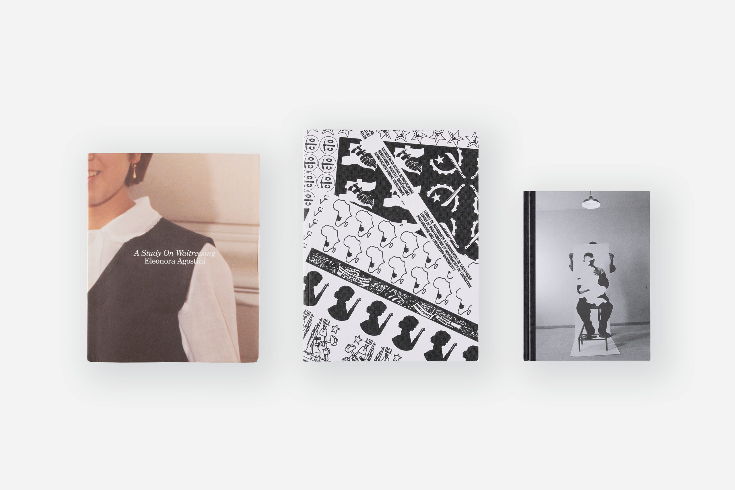
Photobooks
12 Graphic Designers on Their Favorite Books
Whether they’re about pills, products, art, or architecture, here are the books that photobook designers always come back to.
There are proper photobooks, showcasing the work of a single photographer’s accomplishments, and then there are books that use photography in the service of something else, as a manual, guide, illustration, or history lesson. For Aperture’s “Design Issue,” we invited a group of graphic designers to select some of their favorite books that use photographs to delve into a range of ideas related to design.

Sonya Dyakova
The Art of Papercraft (B. T. Batsford, 1971) by Hiroshi Ogawa is a comprehensive guide to the Japanese art of paper sculpture. It contains more than 110 photographs, with great attention to detail. The images are dramatic and atmospheric, as if the sculptures are suspended in space and time. The black background and soft shadows enhance the beauty of the shapes. Ogawa provides not only general instructions and suggestions but also explanatory illustrations and notes to accompany the photographs, making this book a practical resource for anyone interested in paper sculpture. It’s special to see the way humble materials and simple techniques can come together to create something so powerful.
Sonya Dyakova is the founder of Atelier Dyakova, a design studio in London.

Duncan Whyte
The Most Beautiful Swiss Books (Federal Office of Culture, Bern) is an annual publication documenting a yearly competition. The volumes are always fascinating, with a Swiss budget for epic reproduction. The two volumes with the best photographs are from 2016 and 2022: 2016 is devoted to “examination,” with spreads comparing all the nominated books through thirty or so different criteria, including spine, strength, and pagination; 2022 features a moody fashion shoot for each book.
Duncan Whyte is an independent art book designer living and working in France.

Jordan Marzuki
Aliens and Herons (Arbor Vitae, 2016) by Pavel Karous is a guidebook documenting postcommunist public art throughout the Czech Republic. The book employs its own taxonomy—class, order, family, genus, and species—to identify each artwork, along with beautifully structured typography and colorful pages. Cheeky illustrations contribute to an unconventional and hilarious narrative, in stark contrast to the serious, often dark history of the region.
Jordan Marzuki is a designer based in Jakarta, Indonesia, and the founder of Jordan, jordan Édition.

Other Means
Bill Cunningham’s Facades (Penguin, 1978) features 128 photographs of his neighbor Editta Sherman posing in front of buildings in New York City, wearing period-correct outfits Bill collected over ten years. In most cases the buildings and clothing are in harmony, with the exception of the Twin Towers—Bill contrasts the clean, austere modernism of the towers with the “raunchy” blue jeans culture of the time. Our favorite photographs show Editta next to a graffiti-covered subway, illustrating the book’s core concept of the city as a collage of design spanning two hundred years. The cover, designed by Quentin Fiore, is printed in brilliant red and blue spot colors on metallic paper, evoking Midtown Manhattan’s reflective facades.
Other Means, a design studio in New York, was founded by Ryan Waller, Gary Fogelson, and Phil Lubliner.
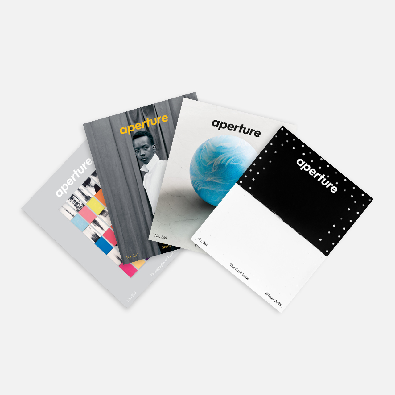
Aperture Magazine Subscription
0.00


WORK/PLAY
For us, Ghetto Gastro Presents Black Power Kitchen (Artisan, 2022) is more than just a cookbook. We love how the chefs incorporate experimental recipes along with new takes on traditional recipes and the histories behind these meals. The pages are culturally immersed in who we are as Black people and are showcased through a Black cultural lens. From the Bronx to destinations all across the globe, Ghetto Gastro is bringing “food for freedom, fuel for thought.”
WORK/PLAY is an interdisciplinary design studio cofounded by Danielle and Kevin McCoy and based in St. Louis, Missouri.

Maricris Herrera
Roberto Luna’s photographs of the architect Francisco Artigas’s houses published in Francisco Artigas (Tlaloc, 1972) are distinguished by their challenging of traditional visual conventions and their exploration of new forms of architectural expression. With remarkable boldness, Luna constructs insightful narratives for utopian scenarios, revealing his unique ability to fuse modern aesthetics with functionality. Beyond his architecture, Artigas’s distinctive style of self-presentation stands out for its innovation and, above all, its provocative character.
Maricris Herrera established the Mexico City–based design practice Estudio Herrera in 2016.

Vera Lucía Jiménez
I first learned about Puruchuco (Editorial Organización de Promociones Culturales, Lima, ca. 1981) from a beautiful piece written by the Peruvian poet Jorge Eduardo Eielson. Illustrated with photographs by José Casals, Puruchuco shows, with words and images, the attempt to rethink an architectural complex on the coast of Peru that belonged to the Inca Empire from the thirteenth century and served as an administrative center and house of the curaca, an elite official. Casals’s images detail the precision and sensitivity of pre-Hispanic architecture: places connected to the corporality of the inhabitant and the uses they gave to the spaces.
Vera Lucía Jiménez is a publication designer who works between Lima, Peru, and Porto, Portugal.

Adam Turnbull
I was drawn to this publication—the Blue Book of Quality Merchandise 1980 (Bennett Brothers, 1980)—because of the product imagery. I love how the photographs are art directed and the products styled: the hands wearing the gloves, the staged still lifes, the radios with the dark gradient background. The repetition of the products laid out on the page creates a beautiful rhythm. It’s an amazing relic of a piece of marketing material that was both functional and pleasing.
Adam Turnbull is the cofounder, with Elizabeth Karp-Evans, of Pacific, a creative studio in New York.

Gabrielle Guy
I happened to be living in Johannesburg at the time that UP UP: Stories of Johannesburg’s Highrises (Fourthwall, 2016) came out. I found the city fascinating—so different from Cape Town, where I’m from. The city center is big and run-down, and so much more ambitious architecturally. I remember going to the book launch, held in a cool space in Braamfontein on the outskirts of the Central Business District. I love how the book manages to incorporate old and new photographs, architectural illustrations, and archival documents. It’s difficult to deal with such a range of visual material in layout, yet UP UP, with its solid grid, strong typeface, and rigid approach to sections and binding manages to create a strong aesthetic.
Gabrielle Guy is an art book designer and artist based in Cape Town, South Africa.

Akiko Wakabayashi
Kurashi no souzou, no. 7 (Sogei Shuppan, 1978) is the design magazine’s special issue on Japanese craft. For me, the most attractive element is the cover image. The still life on the front is mirrored and then layered twice on the back. One section is treated with a distortion effect. Was this a mistake, a conscious experiment with technique, or is there a hidden conceptual message? The result is puzzling, but this mysterious outcome raises a lot of questions, which I love.
Akiko Wakabayashi is an independent designer based in the Netherlands.

Alex Lin
I found The Pill Book (Bantam, 2012), which covers more than 1,800 of the most regularly prescribed drugs in the United States, to be an effective use of photography as a reference for people. It’s a really beautiful and practical book, which runs more than 1,200 pages. I think it’s also great that the pills are printed to scale.
Alex Lin established Studio Lin, a Brooklyn-based graphic design practice, in 2012.

Scott Williams
The Powers of Ten (W. H. Freeman & Co., 1998) is a flipbook depicting stills from a film of the same name, created by the office of Charles and Ray Eames in 1977. The book is a conceptual and pictorial journey that starts at the edge of the universe and hurtles down to Earth, at tenfold steps, with a photograph depicting each interval along the way. The camera descends rapidly to Earth until the lens eventually enters the hand of a man lounging at a picnic at a park on Lake Shore Drive, Chicago, down into his cells, his DNA, and finally to a single proton. It’s a small book with a big idea.
Scott Williams is cofounder, with Henrik Kubel, of A2/SW/HK, a design studio in London.
This article originally appeared in Aperture No. 255, “The Design Issue,” in The Photobook Review.