Interviews
Behind the Scenes of Aperture Magazine’s Design Refresh
The London-based designer Scott Williams speaks about drawing inspiration from Aperture’s seven-decade design history—and all the details that go into perfecting the magazine’s new look.
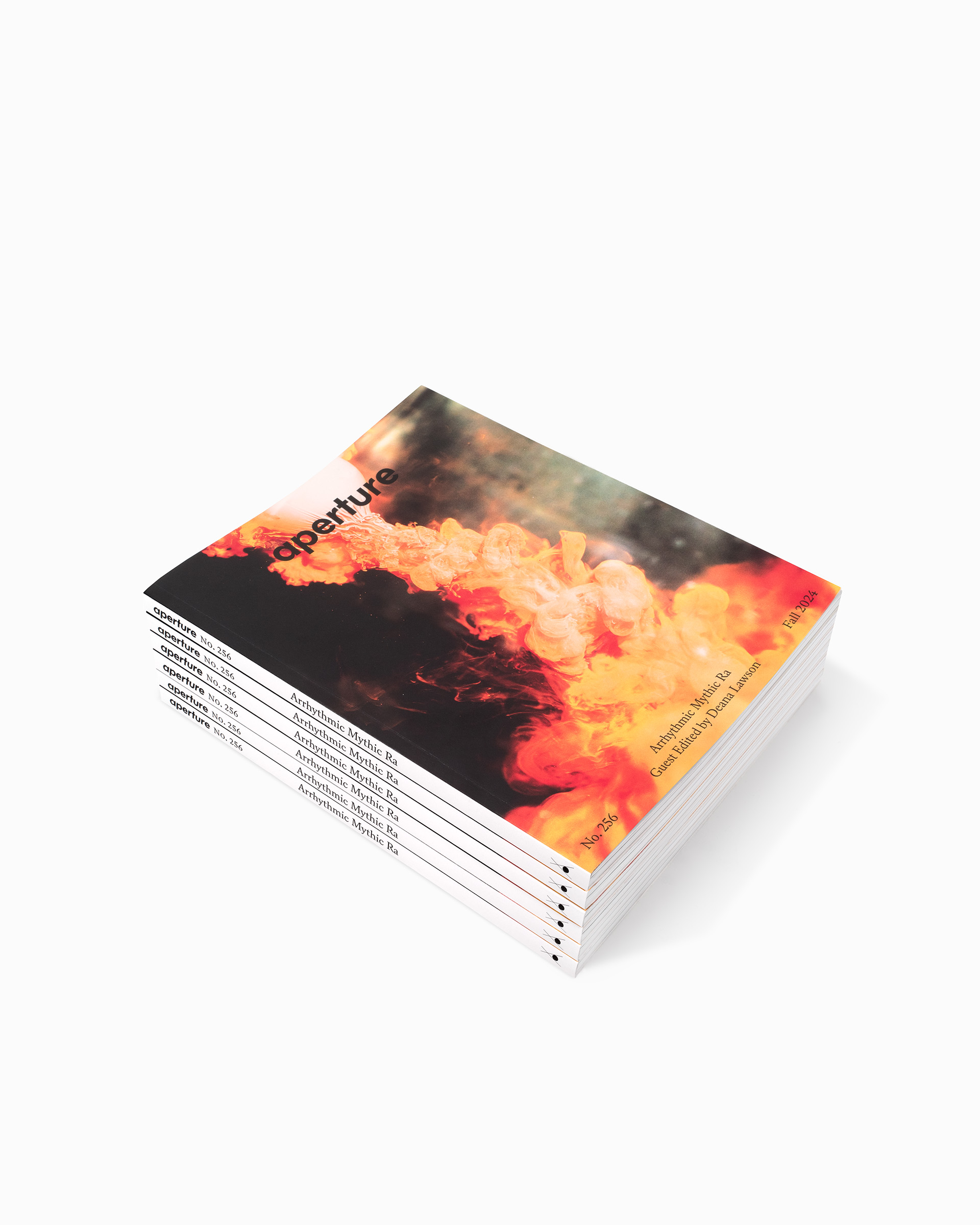
This summer, Aperture enjoyed a subtle transformation. Working closely with the magazine’s editors, the London-based studio A2/SW/HK—Scott Williams and Henrik Kubel—drew inspiration from Aperture’s rich seven-decade design history to devise a format that better reflects what readers want in a photography magazine today. We unveiled the results in June with an issue titled—what else?—“The Design Issue,” which explores photography’s relationship to design, from fashion to architecture to the printed page. Our fall issue—released in September and titled “Arrhythmic Mythic Ra”—finds guest editor Deana Lawson reimagining the magazine’s format in her own way. Here, Williams talks to designer Rob Giampietro about the details that went into perfecting Aperture’s new look. —The Editors

Rob Giampietro: How did this project begin? What was the brief?
Scott Williams: Early last year, Aperture asked how we felt about working on a design refresh of the magazine. It had been so long since we were brought on to redesign the magazine, in 2012, and it felt like time for a review. Typically, our process is to start every project afresh and to work from the ground up, exploring everything from formats to grids to printing techniques to designing typefaces. But the challenge here was to design with assets we’ve already created, with renewed criteria.
The key elements of the brief were to explore a new, smaller format, to develop a new approach to the front cover design, to explore a more prominent Aperture nameplate on the cover, and to rethink the table of contents. That said, a small change such as adjusting the format will have a knock-on effect on almost every part of the magazine.
Another early suggestion from Aperture, a brilliant one, I think, was the idea of using a single weight of the Aperture Serif font family as the primary typeface for the entire magazine. The ramifications of this are quite dramatic—previously, we were working with a palette of twenty to thirty fonts from the Aperture Sans and Serif type families. Suddenly, it’s one font with a supporting typeface.
Aperture Magazine Subscription
0.00

Giampietro: It’s rare for a print redesign to have a strong focus on usability, but that seems to have been an important element of this one—and it’s a welcome change. I certainly feel the difference of the smaller trim size in handling the magazine.
Williams: Usability is absolutely key in all design. Yes, a new design should be bold, ingenious, playful, inspiring, or be able to pique a user’s curiosity, but surely not at the expense of functionality. The refresh was largely prompted by Aperture’s desire to explore a new format, one that felt more comfortable in the hand and more convenient to carry and read on the go. Ever since the original redesign, we had been very conscious of the size and proportion of the art that features in the magazine, so we decided to build around the proportions based on the traditional 8-by-10 photograph format. The rationale behind adhering to the ratio of 8-by-10 is that full-bleed images will sit perfectly within the format with minimal cropping. Interestingly, even though we’re in a fluid, digital age when it comes to image-making, many contemporary photographers featured in Aperture are using traditional formats.
The new format has an aesthetic quality, yet it was born out of very practical considerations, which I like. It’s based on a photographic format, and there’s minimal waste on the printed sheet. It’s also more economical and responsible from a sustainability point of view.
Giampietro: Everywhere in this design, I feel typography from the past—the column lines, the historical serif, the justified text, gestures like “No. 255.” How do you think about these details in the context of the present? How do they set a different stage for us to view and learn about photography?
Williams: Some of the gestures you refer to were established for the magazine when we redesigned it in 2012. We’re certainly not trying to replicate layouts from magazines past but reacting to what a reader wants from a photography magazine today. We’re using design cues from Aperture’s rich history to help identify a design DNA, if you will, from which we can build upon.
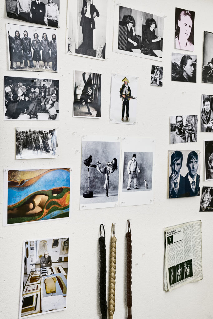
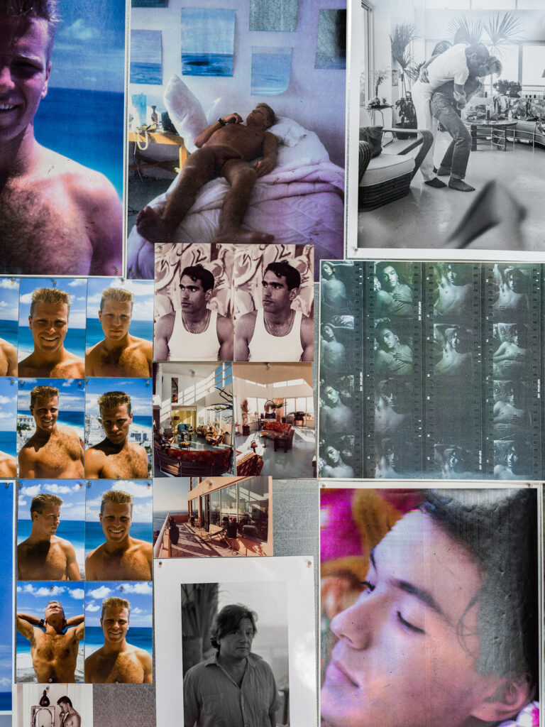
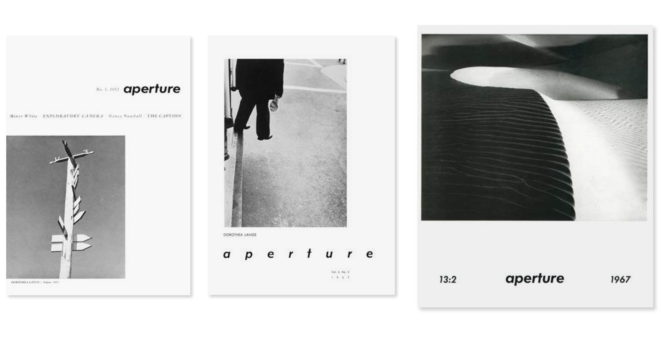
Luckily, Aperture had recently digitized their entire archive—stretching all the way back to the first issue, in 1952. I spent a few days reviewing every issue published over their seven-decade history. It does sound a little overwhelming, but it was a fascinating journey through Aperture’s rich history and print design more generally. For example, early issues of the magazine are clearly put together by hand using primitive paste-up techniques, and then there is the transition from black-and-white to color printing, then the advent of early desktop publishing, then, finally, the era we are familiar with today.

A key design element that’s been present since the launch of Aperture is the use of a modernist sans serif in a bold weight, variations of which have been used for the magazine’s logotype and as a magazine text font at various times. In 2012, we created a bold sans serif font, one we now use for captions, running footers, and page numbers—all the supporting architecture of the page.
Ultimately, magazines should evolve and react to the present. I do hope the refresh feels modern and contemporary and not too reminiscent of a bygone era.
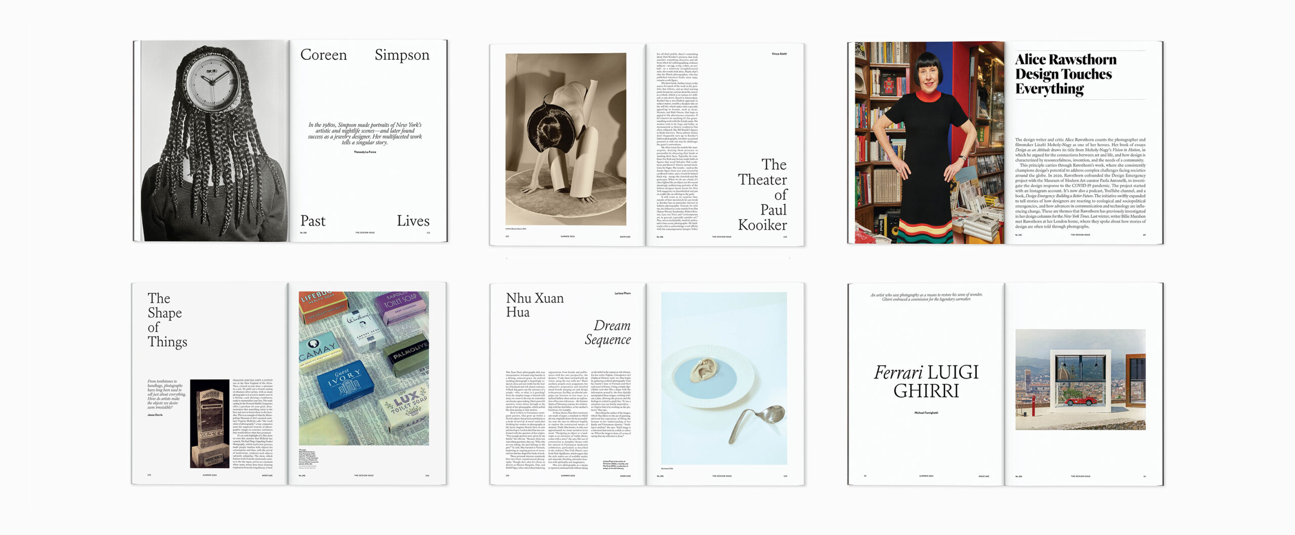
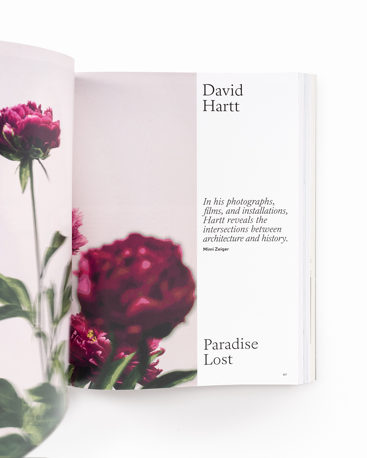
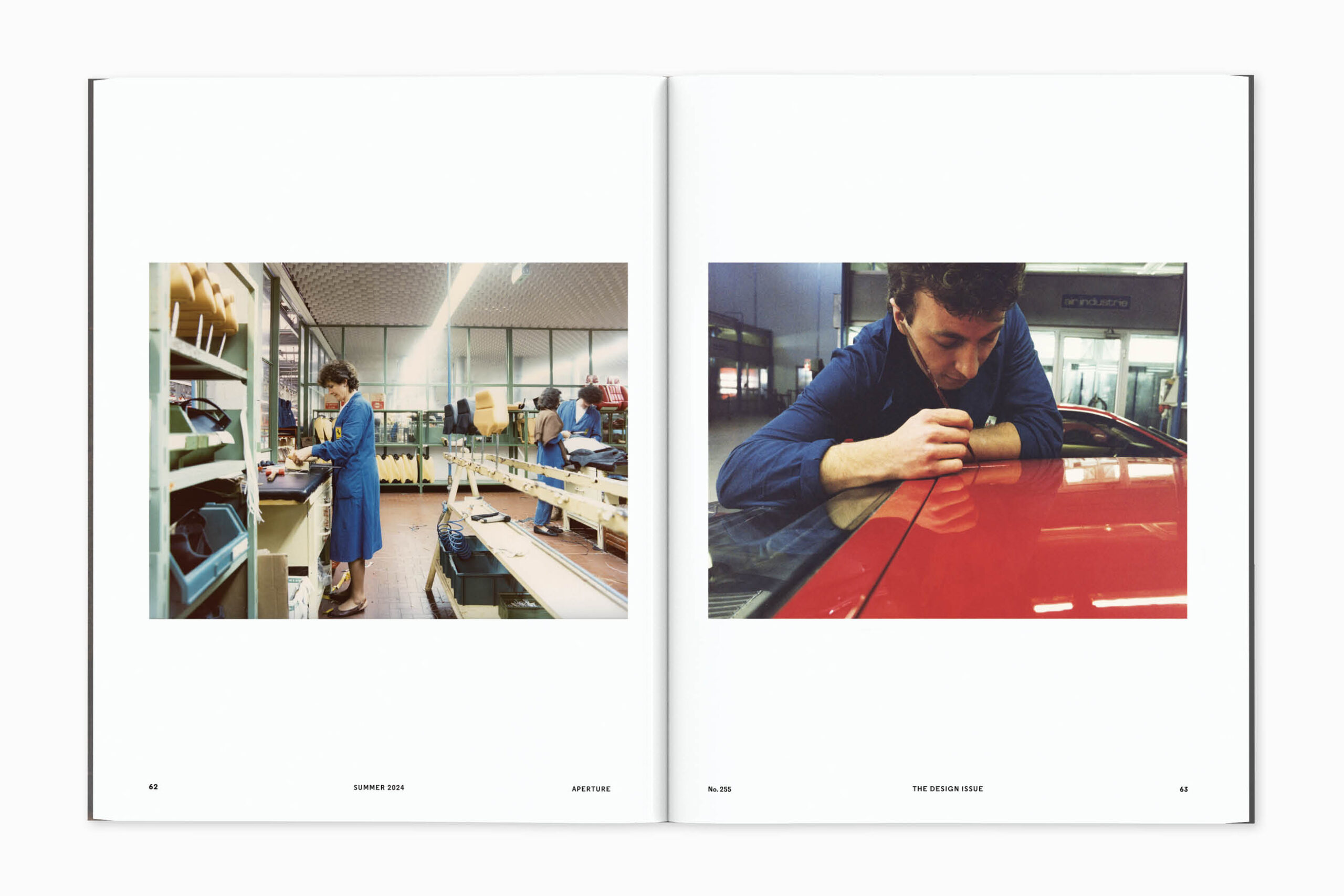
Interior spreads from Aperture, Summer 2024, “The Design Issue”
Giampietro: Some of these gestures also feel quite “newsy,” and I know it’s been an ambition of yours to do a newspaper. Did some of that desire creep in here, in the more journal-like format of the new design?
Williams: The “newsy” feel you mention is not something we intentionally set out to achieve—though I would love to design a newspaper!—but, I think, more of a byproduct of using a classical serif-style font, set in neat justified columns. This is a common device favored by most newspapers and many magazines too. We were very aware that making the magazine smaller would have a big impact on word counts, and a simple way to mitigate this is to use a justified setting for body copy.
Giampietro: You have to be quite intentional about building the grid in these projects, since the images and type are so closely interlocked. Does that start with your own typefaces in this case?
Williams: It’s been very much an iterative process of refinement with the team at Aperture. And as we started to review early sketches and to assess how the Aperture fonts performed at the smaller trim size, we had a discussion in the studio about the font weights in the Aperture Serif font family. More specifically, we felt the Light weight was too light, and the Regular weight was slightly too heavy, so we created a new cut of the serif to work on this new scale.
Giampietro: One of the things I enjoy about all your work is the way that typographic gestures really have space to be seen and felt. And yet when they get the limelight, they often bring a kind of quiet confidence and understated elegance that I feel particularly in this format.
Williams: That’s very kind of you to say. I do believe those attributes you mention, including the quiet confidence, come with experience and with the time we’ve dedicated to our craft. Typography and typographic design have been a linchpin of our design approach since we founded our studio almost twenty-five years ago. Typography is a seamless and truly integrated aspect of how we work, from creating unique fonts for clients to working with type on a daily basis. It’s an aspect of design we continue to feel passionate about—so much so that we developed this strand of our practice and launched our type foundry in 2010 to include the full library of fonts.
Giampietro: Do you feel any particular connection to one of the features in this issue?
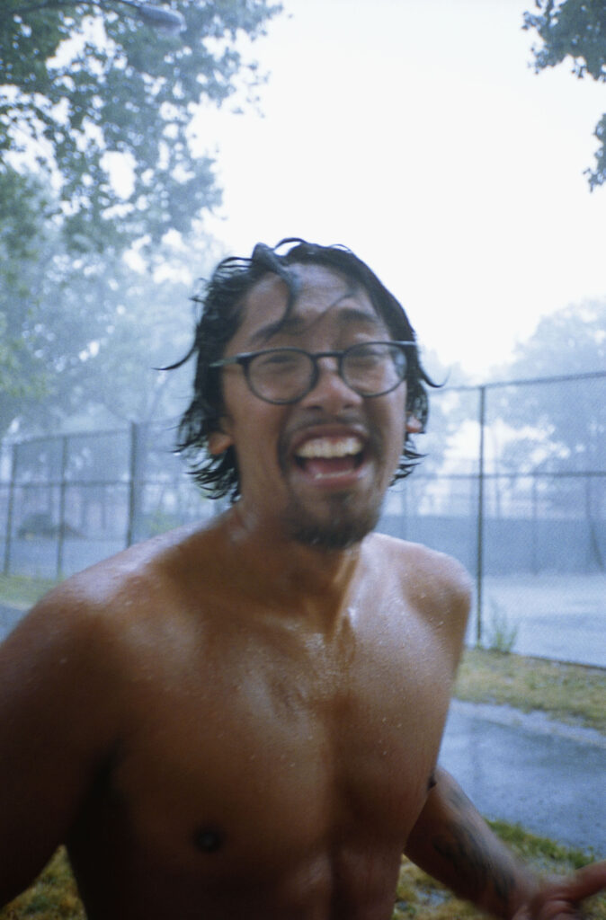
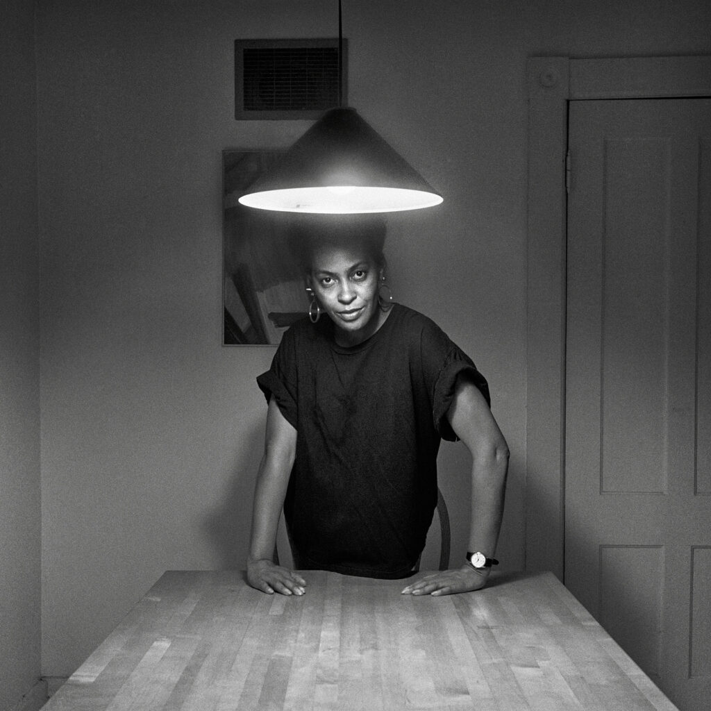
Williams: I’m immediately drawn to Luigi Ghirri’s photographs taken at the Ferrari factory. At first glance, it’s Ghirri’s unique eye and its rich visual vocabulary that appeals to me, but it is also the subject matter I find inspiring—a celebration of craftspeople working apart and together in the pursuit of excellence and with an incredible attention to detail. A true labor of love.
Giampietro: What was issue one of the design refresh like versus issue two? How does having an artist like Deana Lawson as guest editor start to stretch and refine the design gestures from the initial redesign issue on a more applied level? Are there aspects of the initial redesign that have come more fully into focus from this collaboration?
Williams: In typical fashion, having just established a set of rules for the new-look issue No. 255, we immediately set about dismantling it with issue No. 256.
Going from the rather slow-paced first issue to the fast-paced second issue, guest edited by Deana Lawson and titled “Arrhythmic Mythic Ra,” was definitely a bit of a gear shift. Also, structurally, the issues are notably different. The customary arrangement of long- and short-form reads, including articles, interviews, and artist portfolios, was, unexpectedly, replaced with a striking series of works selected by Deana, along with a few shorter texts and poems.
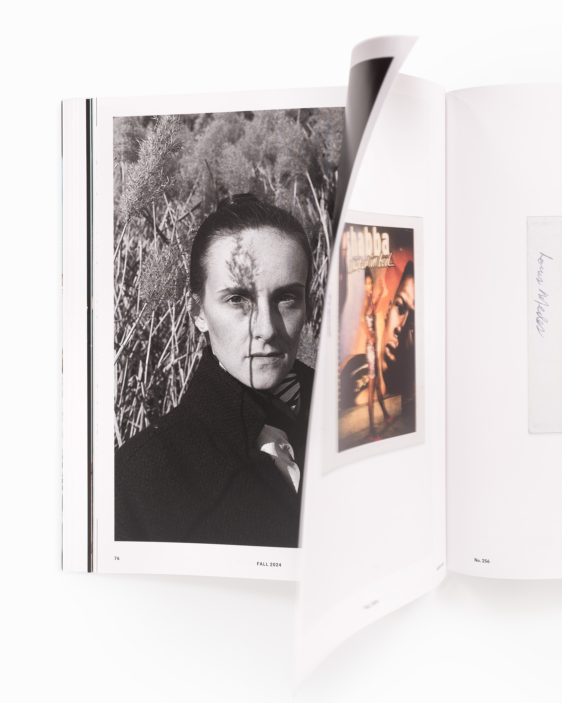
Again, returning to your point about usability, poetry is unlikely to sit very well, or read or scan as it should, set justified in a narrow column. As a result, several of the original design guidelines were swiftly abandoned in service to the art. As with each issue of Aperture, some of the key design considerations are to do with flow, rhythm, use of white space, juxtaposition of images, and sequencing—this is very much front and center with “Arrhythmic Mythic Ra.”
Click here to subscribe to Aperture.