© Eggleston Artistic Trust and courtesy Eggleston Artistic Trust and David Zwirner
Essays
Stephen Shore on the Color Red
The color can evoke love, anger, and—especially for photographers—danger. What makes red so tricky?

“I knew that red was the most difficult color to work with.”
—William Eggleston
Thirty years ago, an old-school, Magnum photographer came for a visit. He showed me a copy of his latest book. It was his first foray into color photography. Up to that point, he had been shooting in black and white professionally for four decades. I immediately noticed that every photograph had something red in it. It was as though he thought that if he loaded his camera with Kodachrome, he had to photograph something red. I also noticed that all of the reds in his pictures were, inexplicably, the exact same shade of red.
Since I began working in color in 1971, I’ve been aware of technical and formal issues with the color red. Red objects sometimes appeared flat, monochromatic, without tonal gradation. They lacked the appearance of three-dimensionality. Without the tonal gradation that we read as dimensionality, they didn’t “sit” in the spatial illusion of an image. In a sense, they floated up to the surface of the picture. The formal issue red presented was that since red attracts attention in a unique way, it can disrupt the structure of the image. A painter can choose the shade of red they want. They can choose not to use the color at all. They can place it where they want on the canvas and in relation to the other colors they have chosen. If a painter were to see a red door and want it to turn black, they would have that option. A photographer wouldn’t. We, as photographers, are tied to the world in front of us. If Fred Herzog, who made the below left in Vancouver, had instead taken it in Seattle, the Canada Post red mailbox would have been United States Postal Service dark blue.
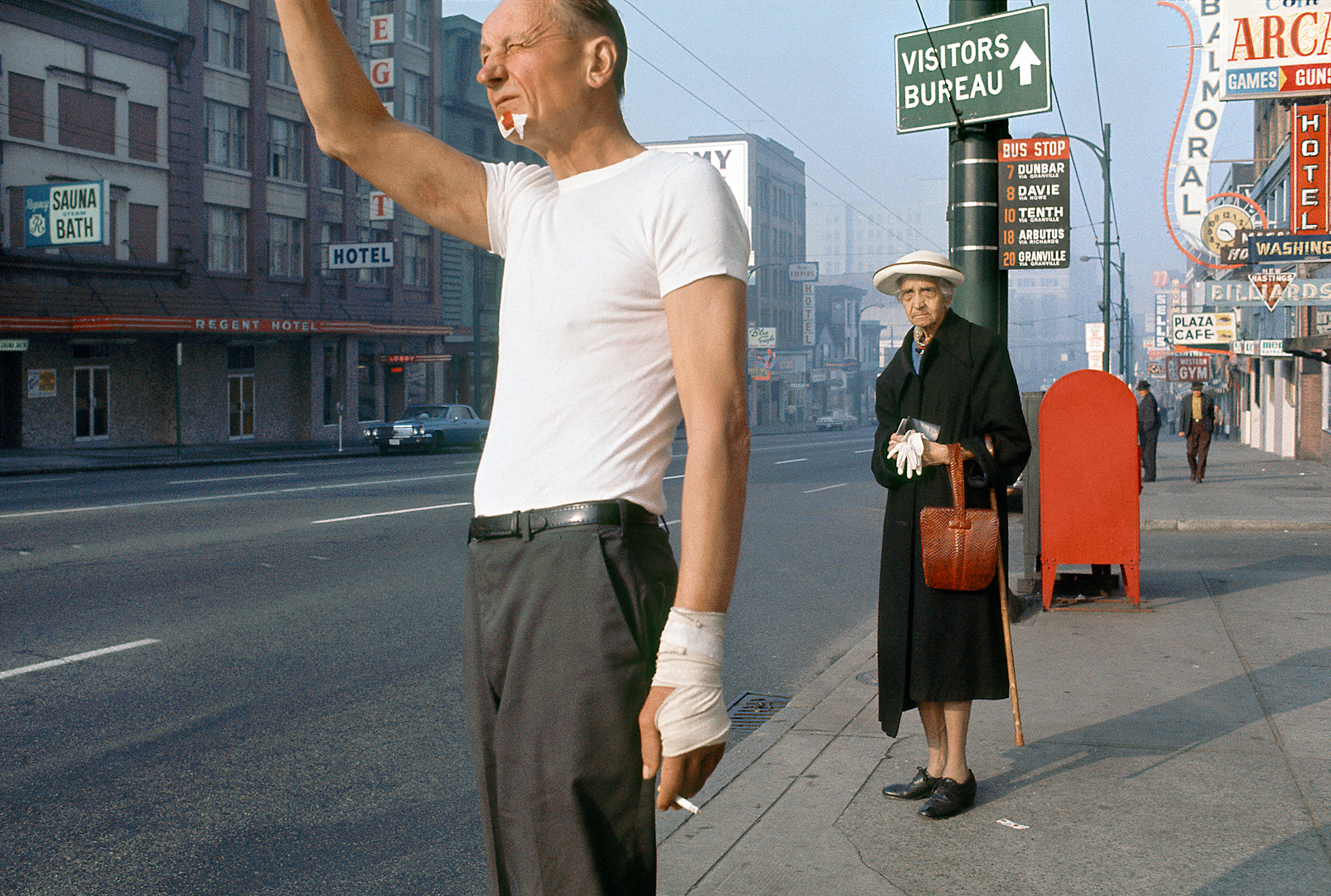
Courtesy Equinox Gallery and the Estate of Fred Herzog
Knowing this, whenever possible I avoided red unless it was central to the image, unless it accorded with the image’s structure. Otherwise, it was obvious and problematic.
When William Eggleston was quoted about the difficulty of red, he was discussing his famous picture of the red ceiling.
So, when I looked through the Magnum photographer’s color book, I had for two decades understood the issues red presented. What caught my attention, leafing through the book, was the similarity of the reds. I intuited that this similarity was key to the behavior of the color.
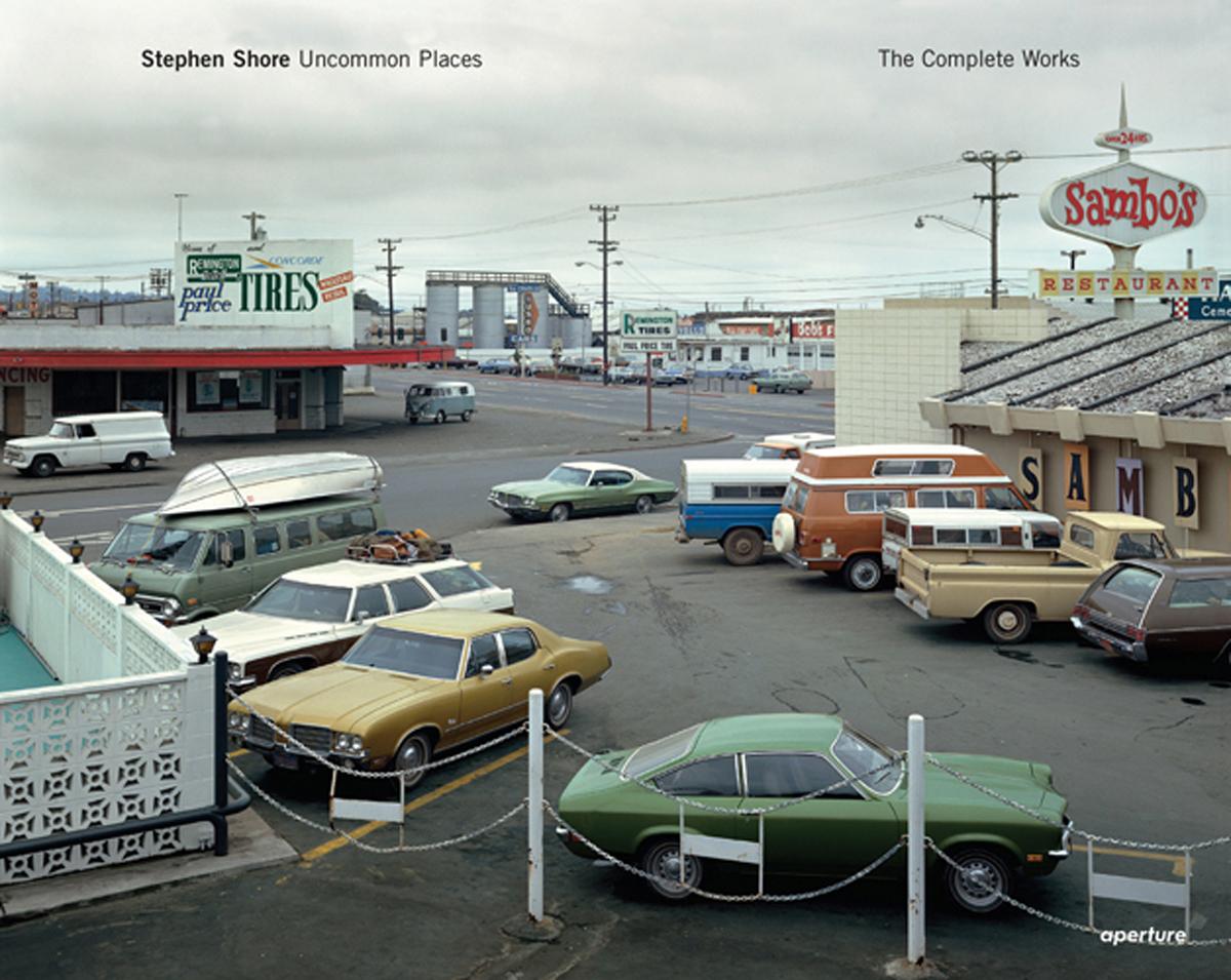
Stephen Shore: Uncommon Places
65.00

I had recently attended a workshop on the use of Adobe Photoshop. This was in the days of Photoshop 3 (as I write this, Photoshop is up to version 26). The workshop was taught by Richard Benson, a true master of photomechanical reproduction and a professor at Yale, and an engineer from Adobe, whose business card listed his position as “Digital Evangelist.” In that workshop, I learned about “gamut,” the range of colors that film or a digital sensor can record, and that gamut is always more circumscribed than what our eyes can see.
When a shade of red falls outside the gamut of a particular device, it is typically mapped to the closest reproducible red at the edge of the gamut. This process, known as “clipping,” substitutes the nearest available color, which can lead to distortions in tonal gradation and saturation.
© the artist and courtesy 303 Gallery, New York
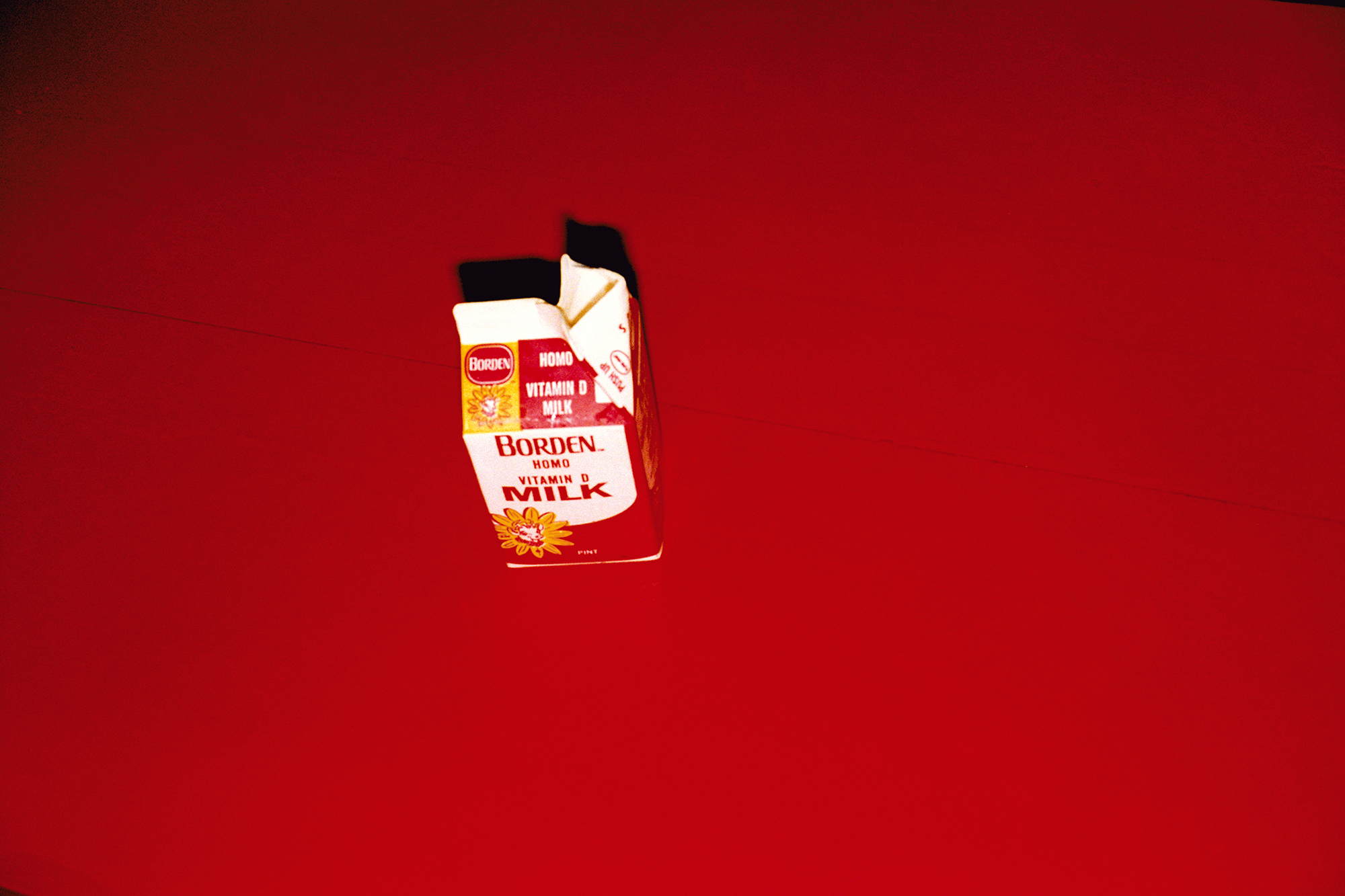
© the artist and courtesy 303 Gallery, New York
This clipping effect explains why certain red objects in photographs may appear flat and lack shading or tonal variations. Since the out-of-gamut red is replaced by a single reproducible red, subtle differences in brightness or hue are lost, resulting in a uniform appearance that diminishes three-dimensionality.
In essence, a pie-shaped wedge of different shades of red lying outside a material’s gamut are all assigned the same red at the edge of the gamut. These issues stem from the spectral sensitivities of dyes in color films and design constraints of digital sensors. Color negative film has a larger color space than transparency film; and transparency film, in turn, has a larger color space than digital sensors. The larger the color space, the less clipping.
We, as photographers, are tied to the world in front of us.
I can use Photoshop to turn Herzog’s red Canadian mailbox dark blue, but I can’t restore the tonal gradation and modeling that was lost to clipping on his original transparency. It will always appear two-dimensional.
While red is the color most vulnerable to clipping, clipping is not unique to it. The blue of skies, for example, experiences clipping. But the rendering of sky is not dependent on three-dimensional modeling.
© Eggleston Artistic Trust and courtesy Eggleston Artistic Trust and David Zwirner

© Eggleston Artistic Trust and courtesy Eggleston Artistic Trust and David Zwirner
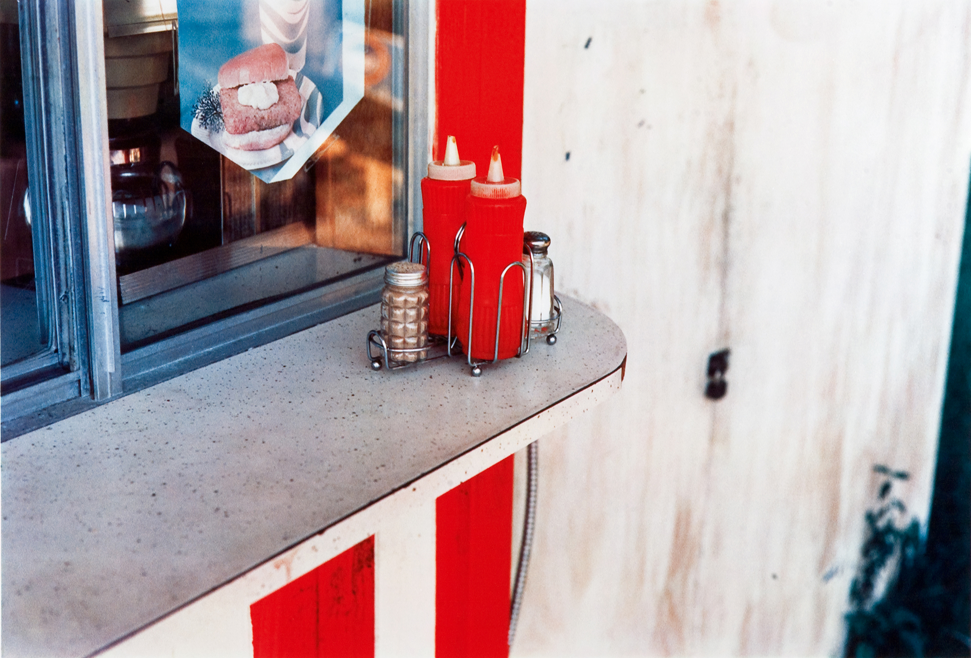
Clipping can be clearly seen in two photographs by Bill Eggleston.
Not only are the ketchup bottles and the painted wall rendered the same red, but the lack of gradation and shading makes the bottles appear flat. All the reds run together.
The car door’s embossing in the shade shows gradation of tone, but in the direct sunlight, the reds are clipped. The embossing disappears. The shaded part appears three-dimensional; the sunlit part is flat.
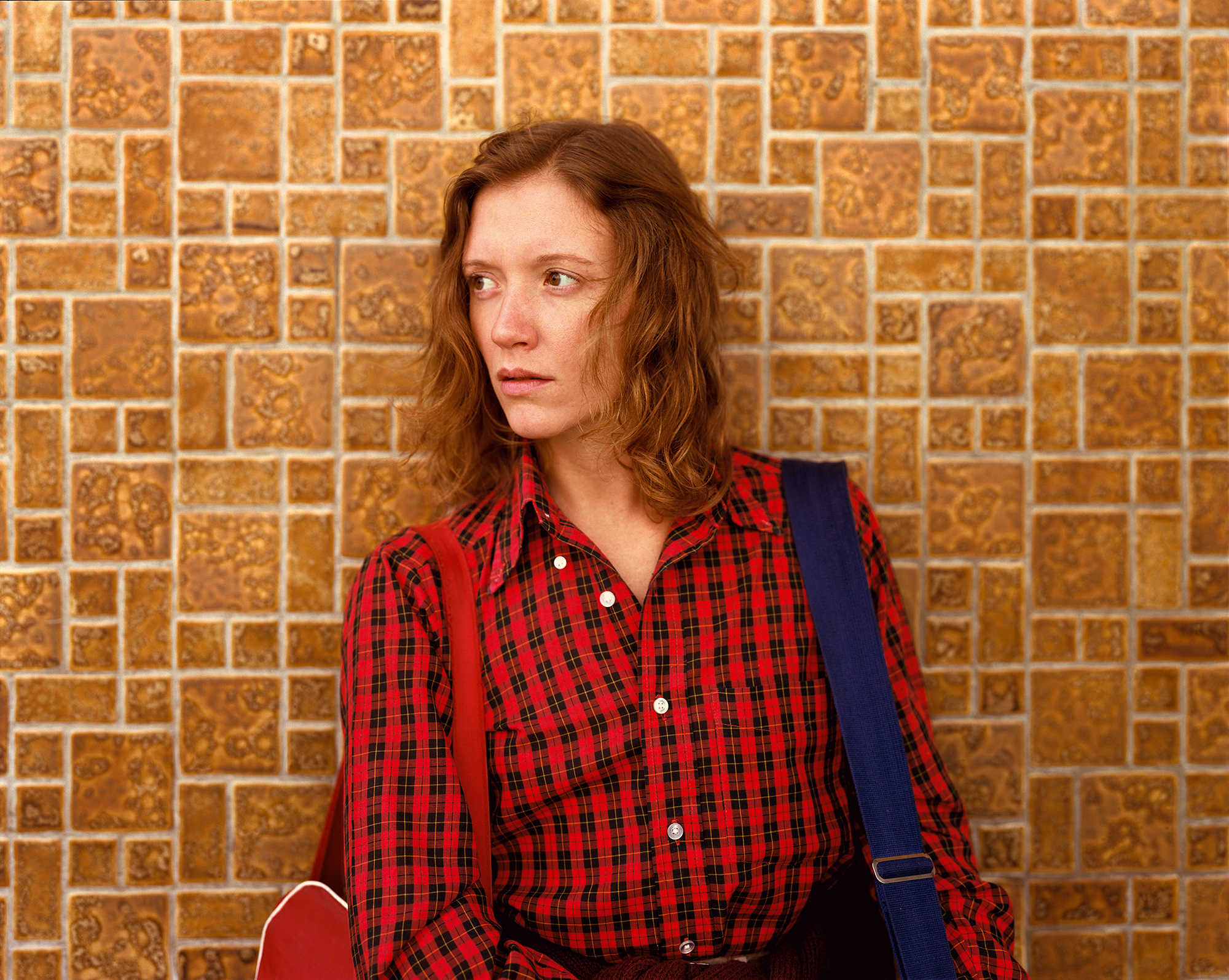
One final example.
In this picture of my wife, Ginger, the red of the shirt lacks the tonal modeling that I see on her skin. To be honest, it was years before I really noticed the problem with the red in this picture. I couldn’t take my eyes off the intensity and intelligence of Ginger’s face. This may be proof that love is blind.
© the artist and courtesy 303 Gallery, New York
This article originally appeared in Aperture No. 260, “The Seoul Issue,” under the column Notebook.