Expanding on Kitsch
Christopher Schreck speaks with Sara Cwynar about her recent exhibition Flat Death at Rosenwald-Wolf Gallery, University of the Arts, Philadelphia.
Blending elements of photography, sculpture, collage, and design, Sara Cwynar’s work explores the processes by which images and objects acquire, change, and lose their meaning over time. In her most recent series, “Flat Death,” the New York—based artist reimagines vernacular images as dense arrangements of found objects. By employing various analog and digital methods of intervention, she produces striking, highly textured imagery that confirms the expressive potential of seemingly archaic materials through the subtle subversion of photographic tropes.
In addition to her recent second monograph, Kitsch Encyclopedia, Cwynar will follow her current exhibition at Rosenwald-Wolf Gallery, Philadelphia with her first solo showing in New York. Flat Death will open at Foxy Production on Friday, April 4th.
Christopher Schreck: Until recently, you were a staff graphic designer at the New York Times Magazine, where you produced the same brand of imagery you’re dealing with in your work. How would you say that experience has informed your practice?
Sara Cwynar: Working at the Times was a really formative experience for me. Producing content for commercial and editorial purposes gave me a much better understanding of the way images work, how they’re affected by context and time. Commercial imagery is really about reflecting a particular moment—some images might stand the test of time, but many become dated almost immediately after they’re made. But I also feel like that’s become complicated by the fact that there seems to be a lot of nostalgia in design and photography right now. There’s a lot of combing through image archives for inspiration, talking about how cool and kitschy and funny these old images are to us now. What’s interesting is that people often don’t seem to think about how the images they’re currently making will inevitably share the same fate. It’s something I try to build into my work now. I like the idea of my pictures embracing that process, of retaining this sense of bad taste, while still being contemporary.
CS: It’s interesting, because while it’s a given that commercial images are both driven and ultimately superseded by these cycles of fashion, it seems to me that artworks often function the same way.
SC: Exactly! I’m very interested in the idea that the highly produced art images we see in galleries are subject to the same degradation in value and taste as anything else—that they can become just another item we use and leave behind. It’s something I actively try to build into my images, where they look at first like simple recastings of throwaway imagery, but then, upon closer inspection, reveal themselves as being something else entirely, almost like a trompe l’œil painting.
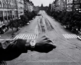
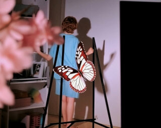
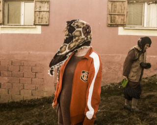
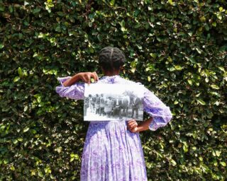
All the images we make are subject to some sort of change in value and reading as soon as we put them out into the world. It’s really clear when you look at how images circulate online: they enter the stream and end up in unpredictable places. For example, when you see my pictures at reduced sizes on a screen, you really can’t tell what’s going on. They just look like the original, mundane images, so people might not realize they’re really looking at an intricately composed artwork. If you look at how my work has progressed, my images have been getting denser and denser, and that’s in part because I wanted to make them harder to read in passing, online. My earlier “Color Study” pieces flipped around the internet too easily. There was no reason to think you weren’t getting the full experience of the work by viewing it on the computer—which is fine, since not everyone is in New York and can see the works in person. It’s a different way of experiencing the work. It’s hard to get much information out of a 600-pixel-wide jpeg. So in moving forward, I’ve wanted to make sure that what you’re seeing online is not the whole story.

All images courtesy of the artist and Rosenwald-Wolf Gallery, University of the Arts, Philadelphia. © Sara Cwynar
CS: You seem to be asserting a more pronounced materiality in this body of work: rather than using straight shots or scans as in previous series, many of these latest images were composed like mosaics, with separate sheets connected with colored tape. In other instances, you’ve layered post-it notes or stickers directly onto the print’s surface before re-photographing it. What led you to experiment with these new techniques?
SC: One of the major themes in my work is this idea of construction, which speaks not only to the way I physically combine objects and rebuild images, but also to how photography uses framing to create narratives, and how we as viewers draw meaning from those narratives. I see these new techniques as a literal way of reinforcing these ideas.
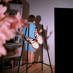
With some of these new pieces, I scan the original found image and use InDesign to make a much larger, segmented version of the file. Once that was printed out and arranged on the studio floor, I then re-build the images with various objects and shoot the piece from above. Working this way, I was able to get much deeper into the details and the tones of the original printed matter.
Incorporating these different techniques further confuses what’s already a complicated viewing experience, where each image initially reads as a kind of collage, but upon closer inspection is revealed to be a photograph of a still-life arrangement, a single image rather than multiple parts. The tiling approach allowed me to introduce another imaging technology into the process: these pictures now go from found pieces of printed matter to digital files, to low-quality laser prints, and back to high-quality analog film negatives before they are finally printed.
CS: As you’re composing these still-life arrangements, are you selecting items thematically? Do you expect your audience to find—or to invent—associations between those particular objects or images?
SC: What ties them together isn’t necessarily their specific content, but rather that they show how content and function can change or be lost over time. I think a lot about how these images were once the height of style, or that these objects once served a particular function. They will inevitably lose their relevance and get left behind, but they never physically go away. They’re still around, clogging up household junk drawers and remaining in our collective psyches, and that’s what I’m looking to as my source material.
I’m working with this huge, democratic archive that’s waiting there to be drawn from, making still-lifes from the debris I’ve collected, and re-presenting it all in a contemporary art context. Having said that, it’s also possible that certain aspects of the content might work its way into my pictures. I am drawn to the modernist idealism you find in mid-century printed matter: this sense of optimism that seems foreign, even naïve to us today. If you look through old issues of Life or National Geographic, it’s palpable, and it really captures something about the culture at that time. The same goes for book covers. I like to think that in reconstructing those images, my work might somehow retain that tone, because the truth is that I love this material. The items may be considered “tasteless,” but they genuinely appeal to my own taste, and I like the idea that by resurrecting them as subjects for art, I’m putting them back in “good taste,” so that others might find value in them again.


All images courtesy of the artist and Rosenwald-Wolf Gallery, University of the Arts, Philadelphia. © Sara Cwynar
CS: Your first New York solo show opens at Foxy Production later this week. What can audiences expect from this new set of images?
SC: I really wanted the work in this show to span the tropes of the photographic canon, so I worked with a much broader range of imagery: there are commercial still-lifes, floral arrangements, nature photographs, tourist landmarks, encyclopedia images, printing tests, images from how-to manuals, and, for the first time, portraits. I think it’s a much more comprehensive overview of the medium. I’ve also been experimenting with new ways of approximating the tones of the original printed matter. In the “Display Stand” pictures, for instance, I isolate individual sections of the original image and construct still-lifes of those details using other objects. I then shoot those arrangements, shrink the photos down to 4×6 quick prints, and place them on top of the original image before making the final photograph, combining up to thirty different still-lifes to produce a single work.
—
Christopher Schreck is a New York based writer and poet.
