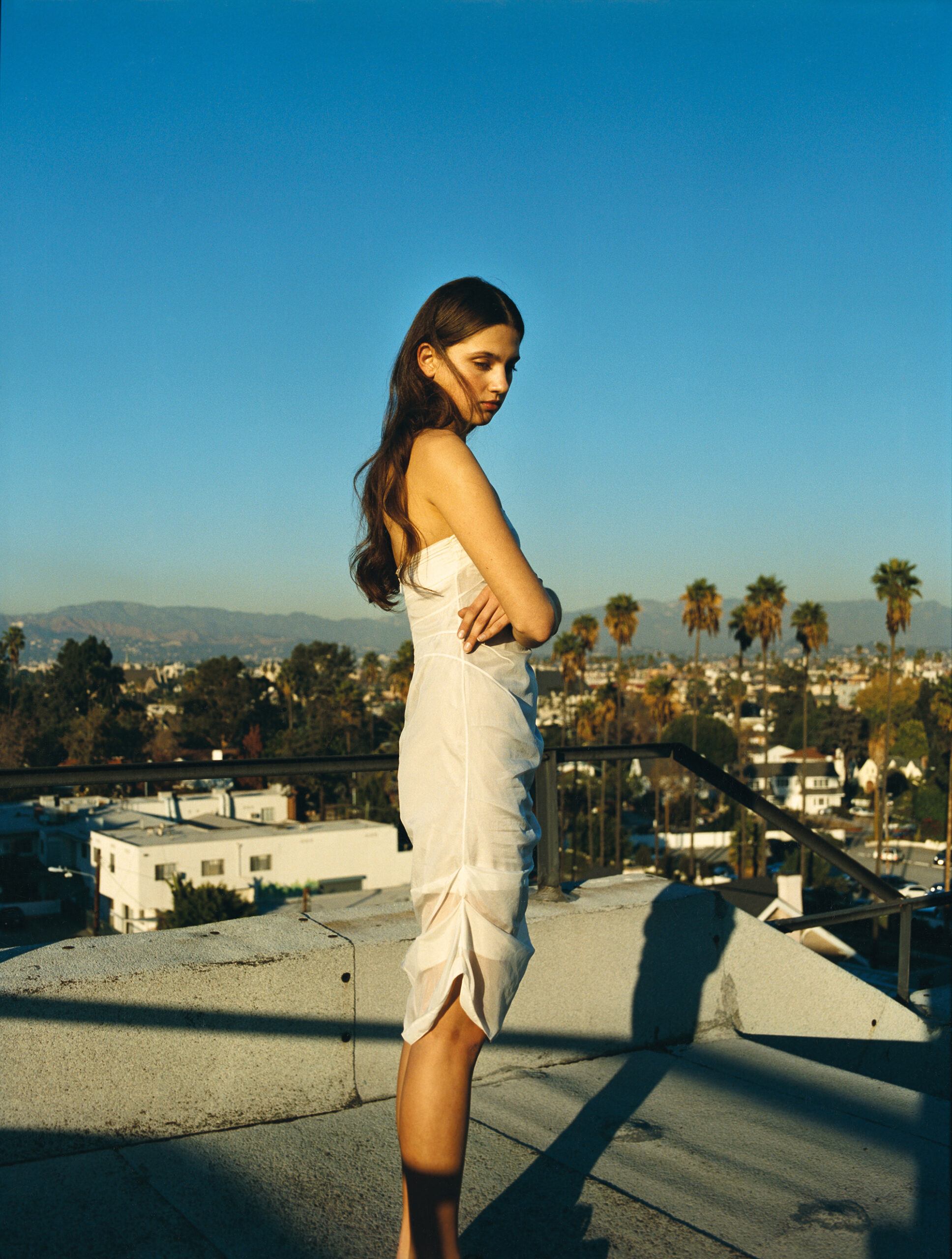
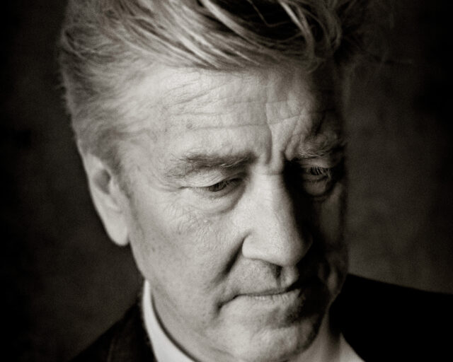
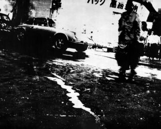
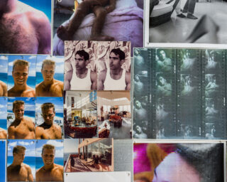
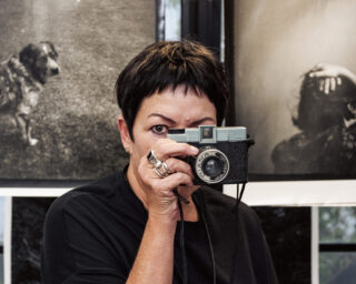
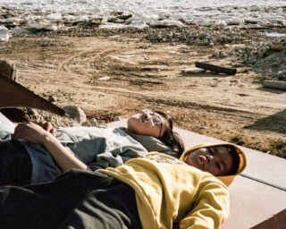
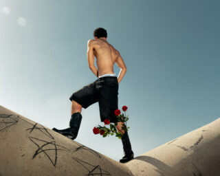
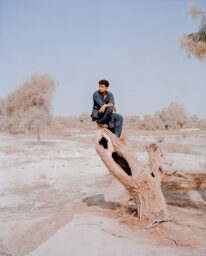
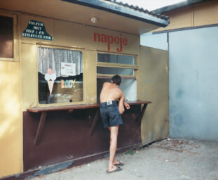
Paul Jasmin, Laura, Los Angeles, 2009
Courtesy the artist and WM Artist Management
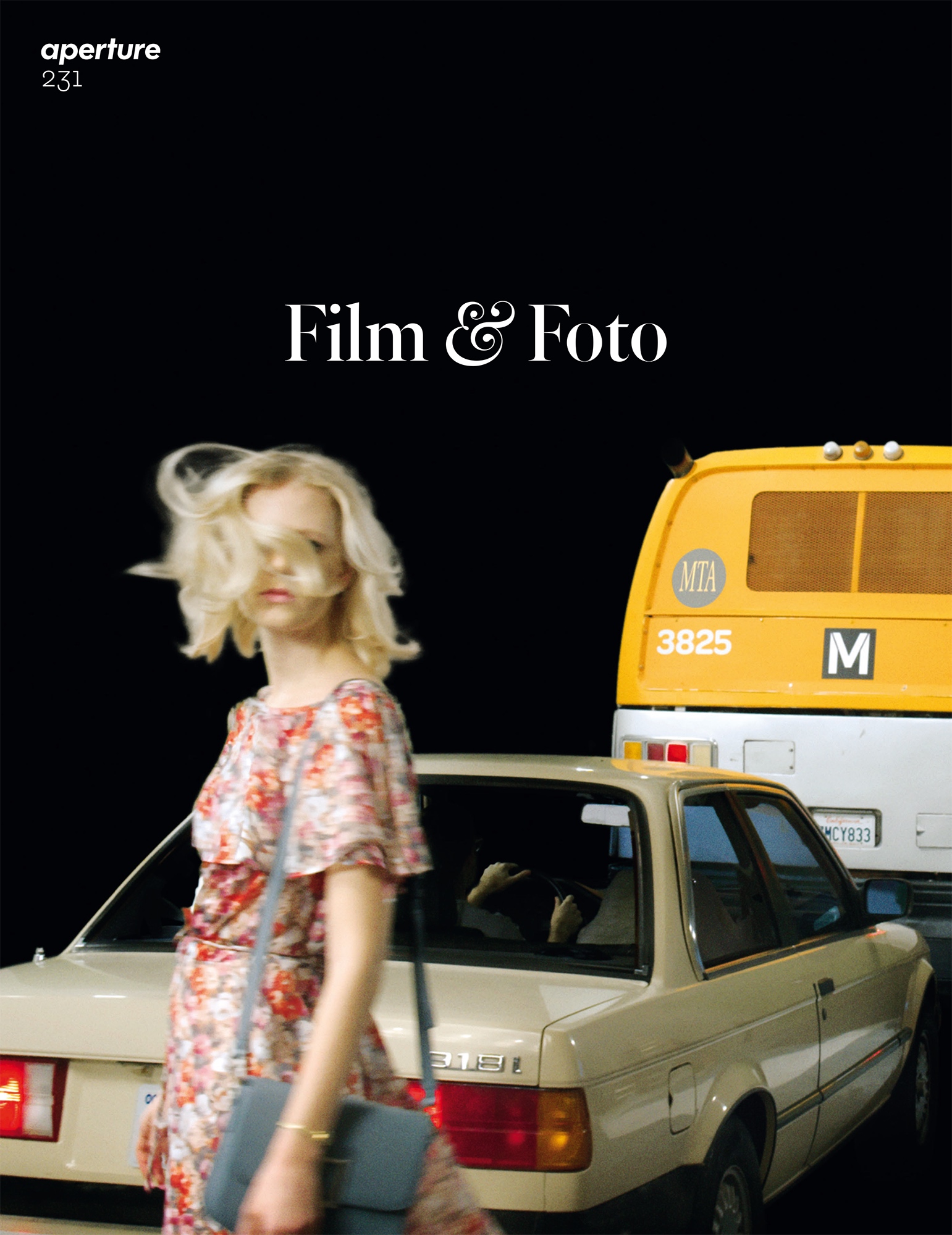
This article originally appeared in Aperture, issue 231, “Film & Foto,” summer 2018.
“I never thought I would be a filmmaker. It wasn’t something I ever planned,” Sofia Coppola recently told the Guardian. “I felt frustrated at art school. I had so many interests—design, photography, music.” By turning to film she no longer had to choose. The form allowed Coppola to engage all her passions, especially photography, which has been central to shaping her cinematic language. From Coppola’s debut with The Virgin Suicides (1999) to Lost in Translation (2003) to Marie Antoinette (2006), the filmmaker has turned to the history of photography for inspiration for the interiors, costumes, and atmosphere of her films. Storyboards, replete with photographic references, were key to Coppola’s most recent—and controversial—film, the Civil War–era The Beguiled (2017), for which she won the Best Director Award at last year’s Cannes Film Festival. Each of her six feature-length films is visually distinctive, and yet it’s possible to identify in all of them a directorial signature, one that might be characterized by visual calm and compositional clarity.
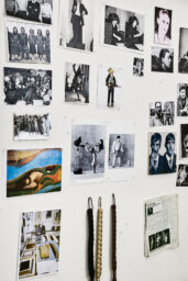
For Aperture’s summer 2018 issue, “Film & Foto,” writer Philip Gefter sat down with Coppola at her home in Lower Manhattan to discuss the influence of photography on her filmmaking. On the walls hung a number of framed photographs: a William Eggleston of a girl lying in the grass holding a Brownie camera; a Tina Barney from the series Theater of Manners (1997); a Lee Friedlander nude; an Andy Warhol polaroid of Tina Chow. These pictures provided clues not only about Coppola’s knowledge of photography, but also about the subtlety of her sensibility—and became a starting point for their conversation about the look and feel of film.

© The Guy Bourdin Estate
Philip Gefter: I wonder if you think that there is a tension between photography and film—the still image versus the moving image. Is photography threatened by film? Will video render the still image extinct?
Sofia Coppola: For me, photography and film are two totally different things. My filmmaking begins with images from photography, so I think of it as a starting point for making a film. I love photographs.
Gefter: Yes, I can see that by looking around the room. You mentioned, too, that you have a print upstairs by Helmut Newton of Charlotte Rampling, nude, sitting on a table; also, a picture by Larry Sultan of his father swinging a golf club indoors. So, obviously, you collect photographs.
Coppola: But not in a serious way.
Gefter: Did you study photography or film?
Coppola: I went to CalArts in the fine art program. I wanted to be a painter but I wasn’t good at it, and my teacher wasn’t encouraging, so I went to ArtCenter, in Pasadena, where I met Paul Jasmin, who taught photography. I sat in on his classes. Then I started spending time in Japan, where a kind of girly snapshot photography was popular in the early ’90s. A friend of mine had a magazine called Dune, and he would hire me to do little fashion jobs in Tokyo—snapshot-like pictures of my girlfriends. I never had the patience to learn very much technically, but I could take snapshots. That’s the extent of it.

Courtesy Paramount Pictures
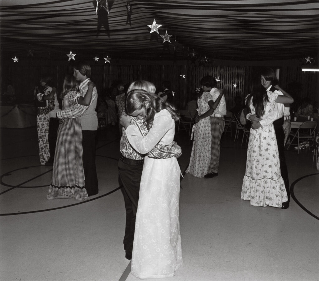
Courtesy the artist
Gefter: Your first film, The Virgin Suicides, was about teenage girls. How did you make the transition from taking snapshot- like photographs to making movies?
Coppola: Paul Jasmin encouraged me. He thought I had a point of view that was worthwhile, and Dad [Francis Ford Coppola] was always talking about writing. I wasn’t planning on being a filmmaker, but when I read Jeffrey Eugenides’s novel The Virgin Suicides (1993), I loved it and thought I would try adapting it. I ended up writing the script and putting a book of visual references together—photographs—to show how I wanted to make the film.
Gefter: Where did the visual references come from?
Coppola: My relationship with photography started as a teenager in the ’80s, looking at fashion magazines. I would also go to art fairs with my mother. Mom encouraged me to start collecting photography because it was the more affordable art at that time. At one art fair, I first saw the photographs of Bill Owens—his series on suburbia—so when I started working on Virgin Suicides those Bill Owens pictures became a reference. I bought one print—an image of girls at a school dance with stars hanging from the ceiling. That picture was definitely in my mind when I worked on the film.
Gefter: And, so, the book of photographs you put together—how did you use it for the look of the film?
Coppola: I made these color-xerox books, which included Bill Owens’s photographs from Suburbia (1973); also ’70s Playboy photography, with the nature girl, soft style; and Eggleston colors. The story in the film is a memory, recreated in faded snapshots. I worked with Ed Lachman, the cinematographer, showing him photographs of what I wanted the film to feel like. That’s how I start every movie, sitting with the cinematographer and the art department, looking at photographs, and saying, “This is the look or feeling,” so everyone is informed by it. It’s always the starting point for me, the images.

© the artist
Gefter: You and Harris Savides, the cinematographer, worked together on two films, Somewhere (2010) and The Bling Ring (2013). I heard you would come up with a master shot that was almost photographic: the camera didn’t move as a person walked through the frame.
Coppola: In Somewhere, it was a kind of exercise to make the most minimal movie we could make. We wanted the shots to be as simple as possible. The part I like least about filmmaking is coverage, where it becomes like a math problem to figure out all the camera angles and how they add up. You can have too many cameras and do too many shots out of insecurity, just to make sure you have the scene. So to be elegant and poetic—we were trying to be as simple as we could. I love it when the camera doesn’t move very much. For Somewhere, the first image I had in mind when working on that script was a Bruce Weber photograph of Matt Dillon in bed, and also a 1958 picture by John R. Hamilton of Clint Eastwood in bed having room service in a hotel room.
Gefter: Of course, Somewhere was about a young actor living in a hotel—the Chateau Marmont. And weren’t Paul Jasmin’s pictures also a visual influence for Somewhere?
Coppola: Yeah, Paul Jasmin has two books—Lost Angeles (2004) and California Dreaming (2010). He took a lot of photographs of young actors in LA, so the movie has that feeling, and the color—just being aware of that California sun, but in a faded way.
Courtesy the Estate of Larry Sultan, MACK Books, and Casemore Kirkeby, San Francisco
Gefter: Lost in Translation, which takes place in Tokyo, has a completely different look and feel. What were your source photographs for that film?
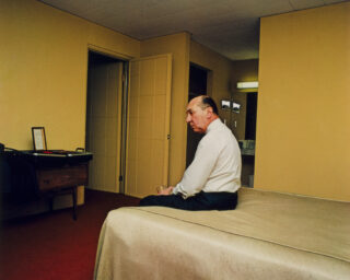
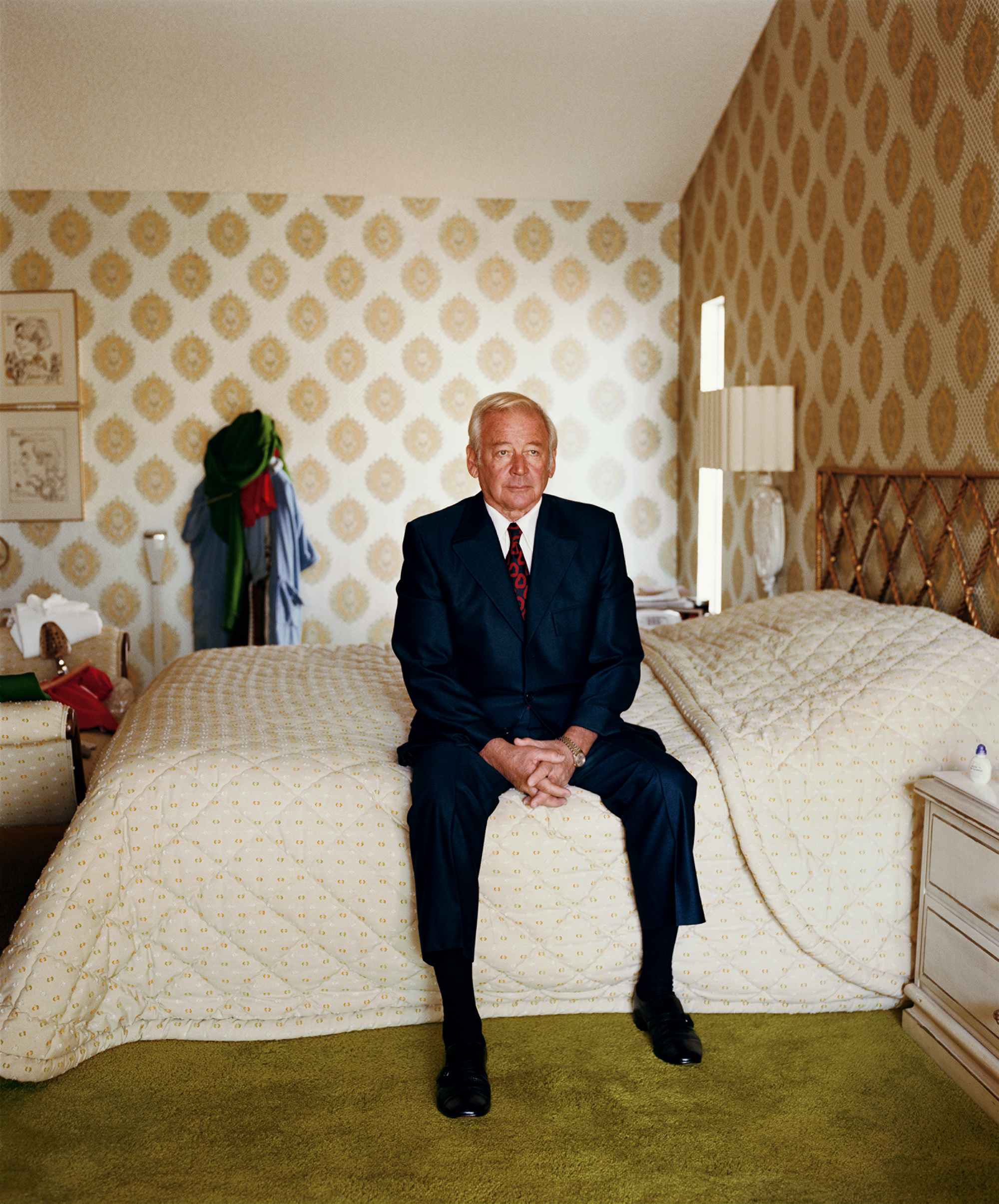
Coppola: The picture by Larry Sultan of his father standing inside golfing, or putting, from his series Pictures from Home (1982–91). There’s a scene with Bill Murray putting with a golf iron in the hotel room.
Gefter: Also Bill Murray sitting on the bed in his hotel room, which seems like a direct reference to another Sultan image, too.
Coppola: That one is very much like Bill sitting on the bed in the movie. So I must have had that in my mind.
I tape photographs right into the script, so when we’re shooting I have direct visual references.
Gefter: How about the look of Marie Antoinette, which is so different from your other films?
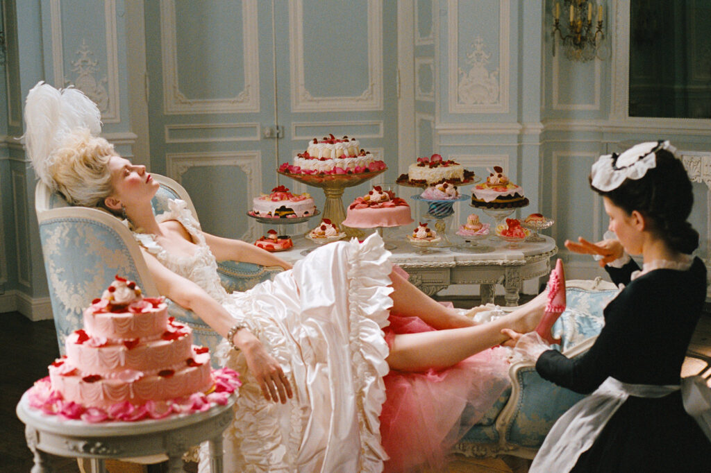
Coppola: Marie Antoinette was very fanciful, decorative, and elaborate; I pulled this photograph by Guy Bourdin as a Marie Antoinette reference. In the opening shot of the film, she is lying down like this, eating cake.
Gefter: It looks so much like the movie.
Coppola: Usually, I love not very saturated colors. That’s something in my films—I always want low contrast. But not always. It depends on the subject matter because when we made Bling Ring it was really garish, and it was this awful kind of Us Weekly subject.
© Sony Pictures Entertainment and courtesy Photofest
Gefter: There’s a paparazzi aesthetic to Bling Ring, a kind of harsh light that seems appropriate to the subject matter—teenagers robbing celebrities’ homes.
Coppola: Appropriate to that world. That was the only film I shot on digital. Everything else has been on film. I feel like they’re two different media, digital and photographic film. Film just has a different quality.
Gefter: Can you talk about the difference in quality?
Coppola: You know, it’s funny, they always say digital can do the same thing as film, but to me it’s like the difference between acrylic and oil.
Courtesy Sofia Coppola
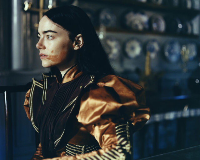
Gefter: That’s a good analogy. What about your most recent film, The Beguiled, which takes place during the Civil War? That was definitely shot on film.
Coppola: Oh, The Beguiled. Whenever I start writing, I think about the color palette and the way it looks, so I thought about going back to The Virgin Suicides with this kind of faded, gauzy blending, these girls all blending together, which reminds me of a very feminine, pastel world. I’m trying to think about actual photographs. Anne Ross, my production designer, and I looked at Roman Polanski’s Tess (1979) for the look of it.
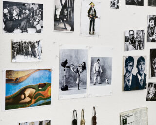
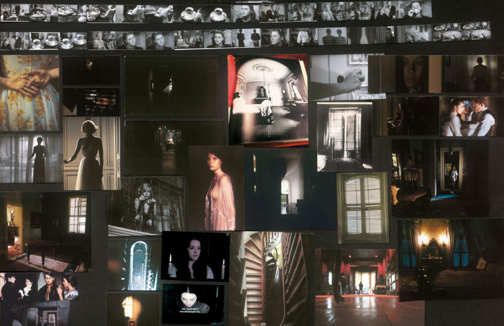
Gefter: I know that you used mood boards in The Beguiled. Can you tell me what they do for you and how you use them?
Coppola: To me that’s the most fun and inspiring part, just to start putting images together that give me ideas for shots. I tape photographs right into the script, so when we’re shooting I have direct visual references. For The Beguiled, there’s an Eggleston picture of two girls talking on a sofa, in color, that I showed Philippe Le Sourd, the DP. I said, “This is what I had in mind for that,” and then we designed the shot from there.
Gefter: I love that you tape pictures to the script.
Coppola: They all have color printouts taped in.
Gefter: Do you think you’re more grounded in the visual than the verbal?
Coppola: Definitely. With everything, I’m definitely visually based. I can only remember things by where I see them. That’s what I like about filmmaking. It’s putting images together. I love making collages, so it’s an extension of that.

© Eggleston Artistic Trust and courtesy David Zwirner, New York, London, and Hong Kong
Gefter: The mood boards are collages.
Coppola: I know fashion designers use mood boards too, but mine start with making these little photobooks where the images kind of come together, and you can start to see the whole story. With The Beguiled, we had different boards for each section. There are three acts to the story. The first section is dreamy and soft and very feminine, and we wanted it to feel unthreatening so that you have no idea where the story is going or how it is going to turn. The last section gets more Gothic and dark and the angles are more extreme, with those white dresses and dark backgrounds. Anne had the idea of making the walls darker, so everything gets darker. When we make the boards, you can see the different sections of the movie and see where you’re going in the different acts. It helps because you’re shooting out of order, so you can bring up these boards on set, the collages, and they remind you of the tone of the part of the movie the scene is in.
Gefter: Does Anne make the mood boards or do you do it together?
Coppola: She put those together. I like to do that too, and if I’m working on a short—I did a little Cartier commercial—we make mood boards, and I can show people what I have in mind so everyone working on it gets it. There’s something about the sum total of all the images, and that’s what a movie is—grouping together these images and having an overall feeling. It helps the team working on it, too. I’m not a great photographer, but I like it when I get my pictures back and I can lay them out and make a collage or a book. I enjoy the layout part, so maybe it relates to my filmmaking—getting a feeling from the totality of all the images, as opposed to just one image telling the whole story.
This article originally appeared in Aperture, issue 231, “Film & Foto,” summer 2018. Sofia Coppola: Archive was published by MACK in September 2023.
