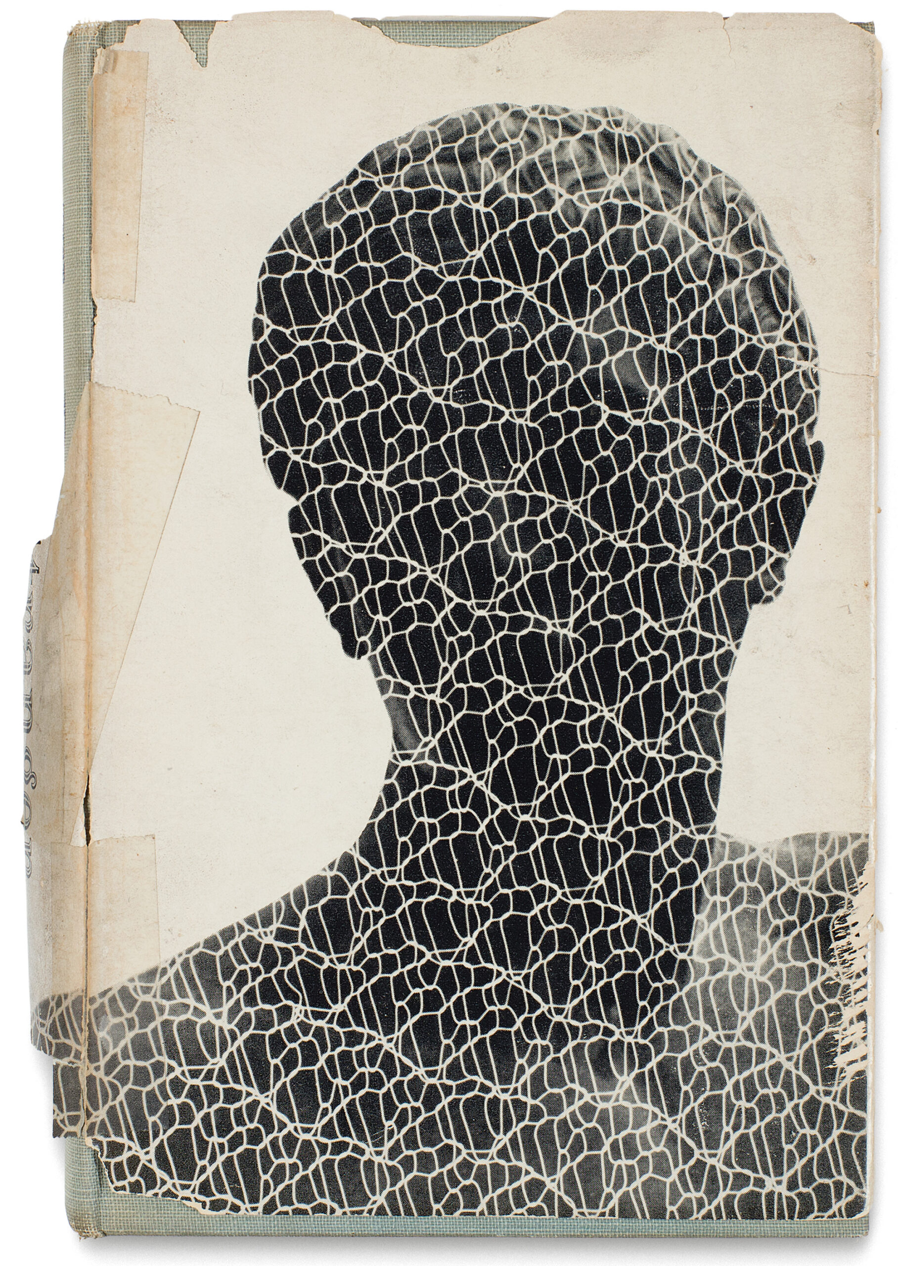
Cover of Henry Miller, The Cosmological Eye, 1939
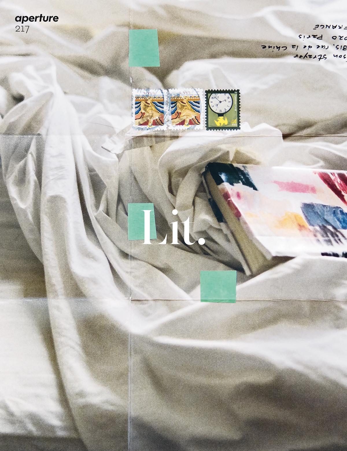
This piece originally appeared in Aperture, issue 217, “Lit,” winter 2014.
New Directions, one of the most significant publishers of modernist literature, was founded on a failure. In 1933, James Laughlin, a twenty-year-old Harvard freshman and aspiring poet, traveled to Italy to study with Ezra Pound at his so-called “Ezuversity.” After assessing the younger man’s work, Pound deemed him hopeless and suggested Laughlin “do something useful. . . . Go back [to school] and be a publisher.” Three years later Laughlin took his advice, which surely would have demoralized most young writers, founding New Directions in his college dorm room. Using a hundred-thousand-dollar familial gift—Laughlin was a Pittsburgh steel heir—his first publication was titled New Directions in Prose and Poetry. An anthology, it featured William Carlos Williams, Elizabeth Bishop, Marianne Moore, e.e. cummings, Henry Miller, and Pound himself.
Laughlin would go on to publish a coterie of twentieth-century writers, including T.S. Eliot, Djuna Barnes, Tennessee Williams, Edith Sitwell, Nathanael West, John Hawkes, Kenneth Rexroth, Octavio Paz, Robert Duncan, Gary Snyder, Gregory Corso, Lawrence Ferlinghetti, Gertrude Stein, and Robert Creeley. Unlike some other American presses, Laughlin was interested in publishing foreign writers, and New Directions reprinted Herman Hesse, Rainer Maria Rilke, Franz Kafka, and Guillaume Apollinaire; Laughlin was Nabokov’s first American publisher. This whole article could be about those books and how they came to shape an essential cultural ethos. Instead it is about their significant, if less examined, covers and how they came to do the same. Ironically, given how influential the New Directions look came to be, Laughlin morally objected to the idea of people “buying books by eye.” In the preface to a 1947 collection of New Directions book jackets, he wrote, “It’s a very bad thing. People should buy books for their literary merit. But since I have never published a book which I didn’t consider a serious literary work—and never intend to—I have had no bad conscience about using [designers] to increase sales.”
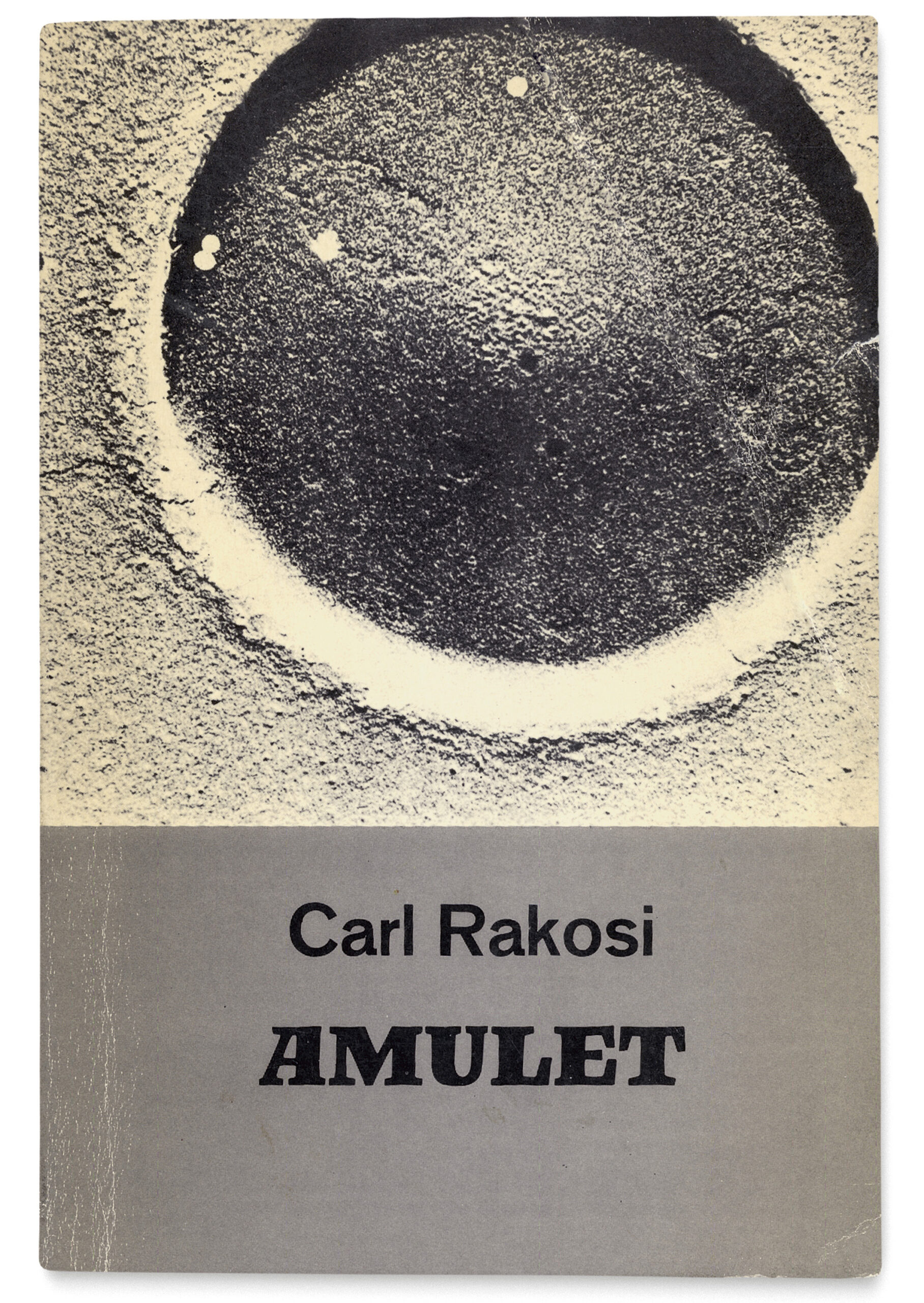
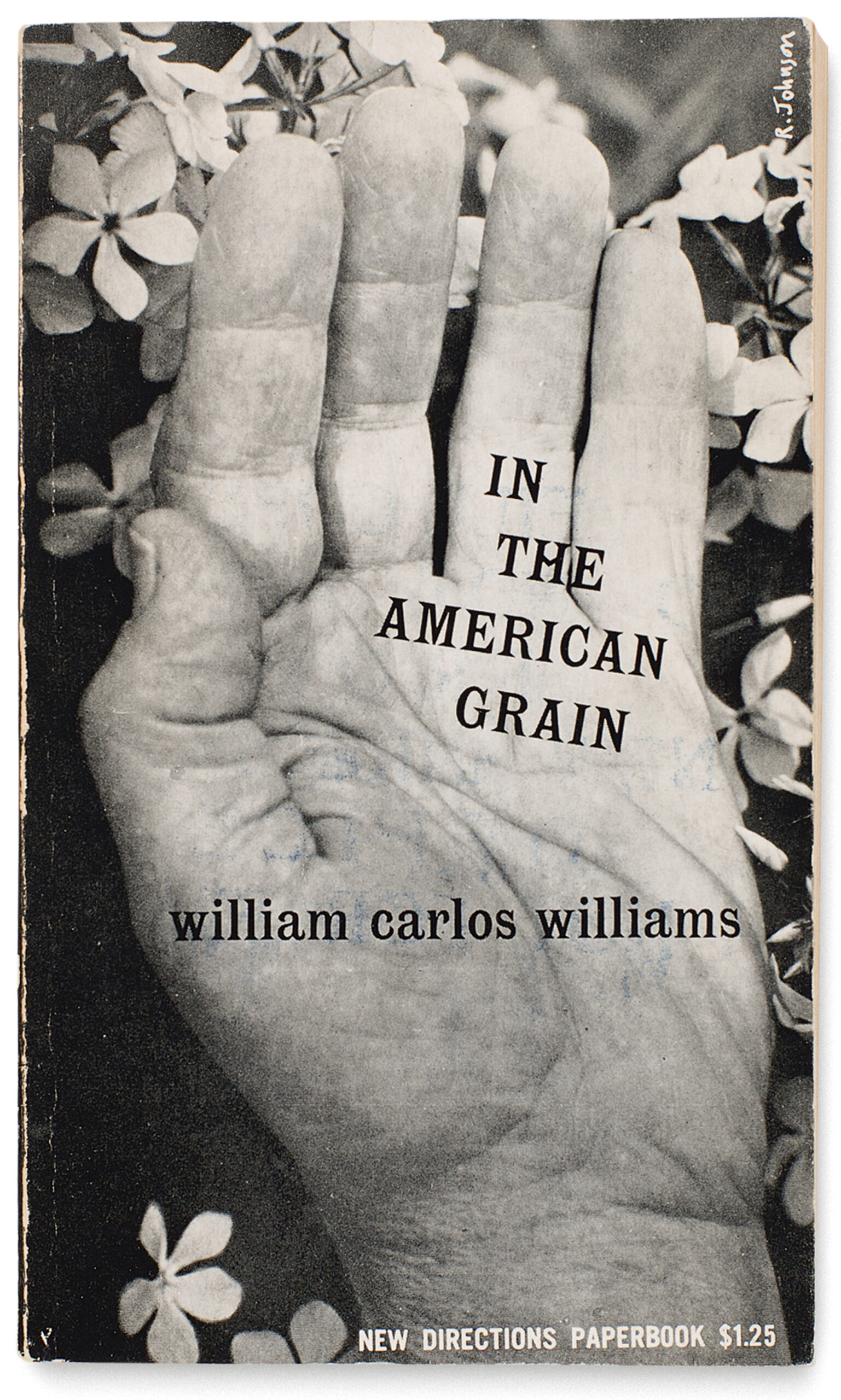
New Directions covers are easy to spot but difficult to describe. They are black-and-white. They are stark, contemplative, inky, and dreamlike. They often feature cropped images—usually taken by the designers themselves and rarely credited—printed full bleed, appearing to strain against the margins that hold them. From the 1940s through the mid-1960s, the covers were designed by a small handful of art directors and freelancers, most notably Gilda Hannah, David Ford, Rudolph de Harak, and Gertrude Huston (Laughlin’s wife). In some cases, they are simple and straightforward, illustrating the title (Stand Still Like a Hummingbird by Henry Miller, which features . . . a hummingbird arrested in flight), or picturing the author (Selected Cantos by Ezra Pound).
These early photographic covers are arrestingly original—and influential in their use of photography as integral to the cover design.
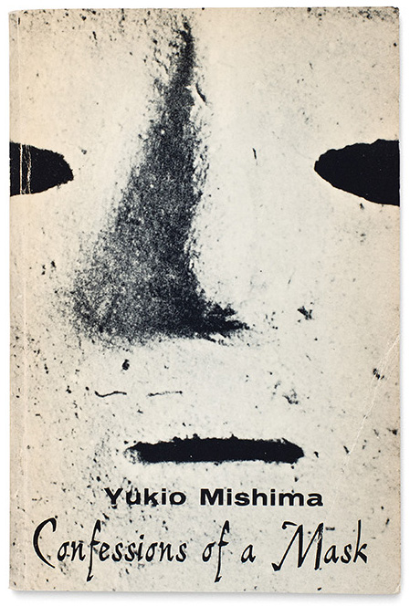
In other cases, they flirt with abstraction: double exposures (Nausea by Jean-Paul Sartre), extreme close-ups (Confessions of a Mask by Yukio Mishima), long exposures (A Season in Hell by Arthur Rimbaud), negative images (Unfair Arguments with Existence by Lawrence Ferlinghetti), reticulated negatives (Confessions of Zeno by Italo Svevo), blur (The Lime Twig by John Hawkes), photogram and photo-collage (A Dark Stranger by Julien Gracq), and heavily contrasted images (The Happy Birthday of Death by Gregory Corso) proliferate within their ranks. In rare cases, the covers feature pure photographic abstraction (New Poems by Eugenio Montale). Titles and author names are at times marginalized, pushed to the edges of the frame or otherwise worked into the composition of the image. These early photographic covers are arrestingly original—before this point in publishing, book covers tended to feature billboardesque typography on a plain background—and influential in their experimentation with the plasticity of the printed image and use of photography as integral to the cover design.

Perhaps due to Laughlin’s lack of interest in visual appeal, New Directions never had an institutionalized creative mandate. Instead, its earliest book covers reflect the vision that emerged from one man’s sensibility, Alvin Lustig. Laughlin met Lustig in 1940 while visiting Tennessee Williams in Los Angeles. At the time of their meeting, the young designer was working as a freelance printer and typographer, doing jobs on a letterpress that he kept in the back room of a drugstore. (Their mutual friend, the noted writer, intellectual, and bookseller Jacob Zeitlin introduced the men.) Less than a year later, Lustig designed his first New Directions cover. In an interview for this article, Lustig’s widow, Elaine Lustig Cohen—who also worked at New Directions and photographed for, designed, and collaborated on a handful of covers herself—explained that her husband had full creative reign. “There was no such thing as an art director,” said Lustig Cohen. “James did it all. Every time there was a new book, he told Alvin to do the jacket. James either liked the result or he didn’t.” This lack of interference was in keeping with Laughlin’s treatment of manuscripts, which were barely edited before being sent off to print; perhaps Laughlin’s response to Pound reflected a tendency to trust other people’s instincts with his life project.
Lustig is not especially known for his photographic covers—he worked with largely abstract collage strategies that referenced, and sometimes used, type metal from a print shop—but he did set the tone for New Directions (and indeed, the book design industry) by moving away from purely text-based covers and utilizing pared-down, graphic images that referenced the printing process. When he died at the age of forty in 1955, Gilda Hannah (then Kuhlman) succeeded him as the in-house designer. During her tenure, New Directions covers became almost entirely photographic. It was an all-in-one, streamlined job: Hannah took the majority of the photographs, occasionally commissioning an image or buying from stock, made the design and type decisions, and chose the book’s paper. She produced the cover image for The Selected Poems of Federico García Lorca using “a defective Leica” in order to achieve lens flare, went uptown in Manhattan to photograph a “relatively non-responsive” Jorge Luis Borges in his hotel room for an early edition of Labyrinths, and collaged her photograph of the Statue of Liberty for Kafka’s vertiginous Amerika cover. By the time she parted ways with the publisher in the early 1960s, citing Laughlin’s notorious lack of prompt payment, New Directions had established a recognizable and effective formula for its covers, begun by Lustig and propagated by Hannah and a small handful of freelancers (including the early Pop artist Ray Johnson): a graphic black-and-white photograph matched with modest text.

In addition to New Directions, there were other pioneering, modernist publishers during and after this era. Knopf, and their imprint Pantheon Books, published significant fiction and poetry, including Ezra Pound; Grove Press published Samuel Beckett, Harold Pinter, and the majority of the Beat writers (including Henry Miller’s Tropic of Cancer, which New Directions had turned down for being too sexually explicit). Meridian Books printed writers like Grace Paley, Thomas Pynchon, and Ralph Ellison before going out of business. Independents such as the Jargon Society, Capra Press, Black Sparrow Books, Graywolf Press, and North Print Press, founded between 1951 and ’74, each modeled themselves in some way on New Directions. While these other publishers also tried out new design strategies—Grove Press was particularly innovative—they did so inconsistently, shifting back and forth between black-and-white and color, abstract design, photographic images, and text-only covers. New Directions managed to experiment with design without losing uniformity; they articulated a recognizable visual treatise that also boosted sales. As avant-garde poet Eliot Weinberger wrote in his 1997 obituary for Laughlin in Jacket magazine, “In my adolescence, the black-and-white photographic covers of ND books were unmistakable on the bookstore shelves, and I would buy any of them at random, knowing that if ND had published it, it was something that had to be read.” This holds true decades later for any reader of modernist literature; an early- to midcentury New Directions book is instantly identifiable on a crowded shelf.
Today, Laughlin’s theory that a cover is just an advertisement for its book, the “serious” content, would be considered diminishing and unimaginative. Covers matter beyond the stores where books are purchased or passed over; readers return to them hundreds of times over as they tunnel through a book. Cover design (especially involving photographic images) has become inexorably entangled with the experience of encountering, and traveling through, literature.
These several decades of New Directions’ photographic book covers, often the most original when they were simplest, did something truly modern: by using pictures to describe words rather than the other way around, they jettisoned the artificial boundaries between the two. They remind us that both text and image require a kind of literacy; we often speak of “reading images,” for instance, and poets challenge us to “see” words on the page. Both text and images have the potential to objectify and document our lives in a different way from, say, painting or sculpture (which are rarely utilized in a “nonartistic” sense). Denise Levertov, who published more than thirty books of poetry with New Directions, put it best in her early-1970s essay “Looking at Photographs,” written in response to a request from this magazine: “I have come to see that the art of photography shares with poetry a factor more fundamental: it makes its images by means anybody and everybody uses for the most banal purposes, just as poetry makes its structures, its indivisibility of music and meaning, out of the same language for utilitarian purposes, for idle chatter, for uninspired lying … photographs teach the poet to see better.” Levertov could have illustrated her essay with the cover of The Cosmological Eye, the first book of Henry Miller’s published in the United States—by New Directions—in 1939. Superimposed atop a full-bleed, black-and-white photograph of clouds is a single, open eye. It belongs to James Laughlin.
