


Design Books to Know
Bruno Monguzzi on
John Szarkowski
The Photographer’s Eye
Museum of Modern Art • New York, 1966
I was asked to select a book that was eye-opening because of its content or its design. The Photographer’s Eye by John Szarkowski is my immediate answer—because of its content and its design.
When I first browsed through the pages of this book at the Museum of Modern Art in 1966, I was fascinated by the way the images had been connected, which for me is the fundamental aspect of photobook design. The page layouts are very diverse, ignoring the logic and rigidity of Swiss grids. Each image is very carefully sized and positioned in order to avoid the problems that often occur when placing images next to each other, particularly because of conflicting inner structures or scale.
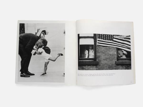
John Szarkowski, The Photographer’s Eye, Museum of Modern Art, New York 1966
What is evident here is Szarkowski’s great capacity to read the photographic language, and his rare sensibility and intelligence in designing a sequence. An amazing lesson on the building of meaning—its definition through sensitive understanding of the complex interactions bridging the images displayed on a double page spread, or with the images of preceding and following spreads.
What is evident here is Szarkowski’s great capacity to read the photographic language, and his rare sensibility and intelligence in designing a sequence.
—Bruno Monguzzi
For decades, as a designer, my major goal when teaching has been to open people’s eyes, and for decades The Photographer’s Eye has been my very precious companion.
Bruno Monguzzi is a designer, typographer, and teacher. Monographs about his work have been published in Europe, the United States, China, and Japan. Member of the Alliance Graphique Internationale (AGI), he is the author of Lo Studio Boggeri, 1933–1981 (1981) and Piet Zwart: The Typographical Work, 1923–1933 (1987). In 2003 he was elected Honorary Royal Designer for Industry by the Royal Society of Arts, London.
Richard Hollis, About Graphic Design, Occasional Papers, London, 2012
Rick Poynor on
Richard Hollis
About Graphic Design
Occasional Papers • London, 2012
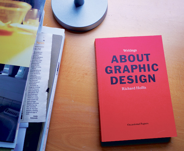
Richard Hollis’s About Graphic Design, a collection of essays and lectures spanning five decades, is not the most obvious choice for this author. A compelling case could be made for his earlier studies, Graphic Design: A Concise History (1994) and Swiss Graphic Design (2006), which any design library should include. As a distinguished practitioner-turned-design-historian, Hollis (born in 1934) is an unusual figure among designers. About Graphic Design, less tightly focused than his two surveys, displays the grain of his thinking, and this helps to lift the lid on the practice for readers without specialist knowledge. In essays about the French postwar designer Pierre Faucheux, Penguin Books designer Germano Facetti, the evolution of the Architectural Review, and many other subjects, Hollis demonstrates the challenge and complexity of page-building. His tone can be didactic, but he writes from deep practical and cultural engagement, and his measured assessments and seriousness are always illuminating.
Produced by Occasional Papers, a small independent publisher in London, About Graphic Design’s editorial direction and page layouts reinforce its arguments. Hollis gave visual form to John Berger’s Ways of Seeing (1972) and here he effortlessly integrates more than five hundred images, running small reference pictures (often all that is needed) in the book’s inner margins, alongside the text. The choice of primary typeface—a bold serif—perfectly complements the economy and directness of the writing, and the entire book seems to speak in Hollis’s voice: calm, refined, rational, and persuasive.
Rick Poynor writes about design, photography, and visual culture. His Exposure column appears weekly on designobserver.com, and he contributes the Photo Critique column to eyemagazine.com. His books include Obey the Giant: Life in the Image World (2001), Jan van Toorn: Critical Practice (2008), and Sergei Sviatchenko: Collages (2014). He is visiting professor in critical writing in art and design at the Royal College of Art, London.

Tom Holert and Mark Terkessidis, Fliehkraft: Gesellschaft in Bewegung–von Migranten und Touristen, Kiepenheuer & Witsch, Cologne, 2006
Sven Ehmann on
Tom Holert and Mark Terkessidis
Fliehkraft: Gesellschaft in Bewegung—von Migranten und Touristen
Kiepenheuer & Witsch • Cologne, 2006
While I spend most of my time on the research and editing of design-related and highly visual books, my favorite publications about design are often text books. Books that widen my perspective. Books that make me reconsider what design is, could be, should be. Books about all sorts of things—sometimes closer to, but often further away from, the core of the term “design.”
Reading about the real challenges of migration … reminds me of the real issues out there—issues that matter, that I hope some of the smartest designers will take on.
—Sven Ehmann
I certainly spend my time with books about design history, theory, and thinking, as well as with numerous books about design trends. But the books on my desk right now are books about learning and migration. Design has opened up so much in recent years and claims to be the right tool to address all sorts of issues, yet for the large part it seems to be stuck with aesthetics. By contrast, reading about the real challenges of migration (as opposed to tourism) in Fliehkraft, a 2006 paperback by Tom Holert and Mark Terkessidis, reminds me of the real issues out there—issues that matter, that I hope some of the smartest designers will take on. One example of the way people are doing this is Workeer, a German job board for refugees which was recently created by two young design graduates.
For design to grow, evolve, and mature, I feel these paperbacks, with anonymous design but serious content, could be very influential.
Sven Ehmann is a freelance creative director based in Berlin. He has coedited over seventy books with publisher Gestalten, as well as working on exhibitions, writing, workshops, and lectures.
Robert Venturi, Denise Scott Brown, and Steven Izenour, Learning from Las Vegas: The Forgotten Symbolism of Architectural Form, MIT Press Cambridge, Massachusetts, 1977 (second edition)
Andrew Sloat on
Robert Venturi, Denise Scott Brown, and Steven Izenour
Learning from Las Vegas: The Forgotten Symbolism of Architectural Form
MIT Press
Cambridge, Massachussetts, 1977 (second edition)
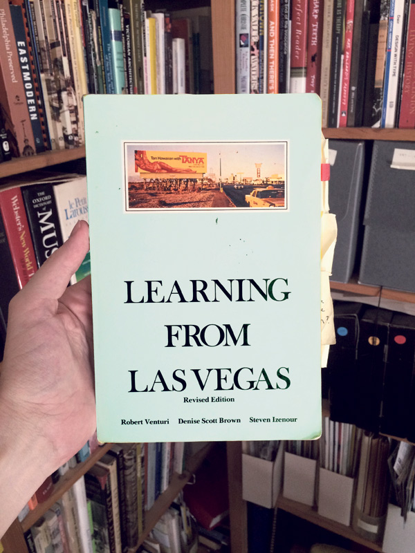
The revised 1977 edition of Robert Venturi, Denise Scott Brown, and Steven Izenour’s Learning from Las Vegas: The Forgotten Symbolism of Architectural Form is no one’s idea of a superficially beautiful book. But the story of how it came to look like this is both a cautionary tale and a corollary to the architectural argument found inside.
The authors were architects who led a studio workshop in the architecture school at Yale in 1968. The first section of the book summarizes their students’ dazzling documentation of late ’60s Las Vegas architecture, via photographic strategies of all kinds, experimental maps, historical images, diagrams, drawings, and collages. They prove that the tacky architectural and graphic mish-mash of Vegas is as rich with formal subtlety and ingenuity as the respectable architectural fantasyland of Rome. The second section builds on the authority of the first, landing wild swings at the monumental modern architecture of the era, in an effort to show that the radicalism of the 1920s had devolved into a repetitive formalism that met no needs beyond proving the architect’s (and client’s) fancy taste. The book’s imagery exemplifies an approach to vernacular and commercial architecture that would be explored by the photographers soon to be categorized as the New Topographics—including Stephen Shore, who would later collaborate with the authors on the 1976 exhibition Signs of Life.
The first edition of the book, designed by the legendary Muriel Cooper in 1972, was a hardcover monument filled with stylish typography and color images, and wrapped in a vellum dust jacket. Consequently it was very expensive, and out of reach of most students. Scott Brown, in the revised edition, dispatches with the hated original design in three dismissive paragraphs. The edition that survives today was designed by the architects themselves and represents the argument in the text: that available materials, inventively handled to serve their purpose, can be as beautiful as the repetitive superficiality of heroic modernist design.
Andrew Sloat is a graphic designer and filmmaker based in Brooklyn, and a frequent collaborator with Aperture’s books program. He teaches at the Rhode Island School of Design and was recently appointed the creative director of the Brooklyn Academy of Music. andrewsloat.com
Irma Boom on
Kunst der sechziger Jahre
Wallraf-Richartz Museum • Cologne, 1970
Jan Vermeulen
Horrible Tango
Meulenhoff • Amsterdam, 1968
Turks Fruit
Meulenhoff • Amsterdam, 1969
I often find inspiration in books from the past. About ten years ago, I found a binder of sorts called Kunst der sechziger Jahre (Art of the ’60s), a catalogue published in 1970 by the Wallraf-Richartz Museum in Cologne. The concept is simple: there’s a brief text about each artist followed by their portrait, then one or two images. The artworks are reproduced on white paper and tipped onto kraft paper pages. Each artist’s portrait is printed on a clear acrylic page. The binding is not very attractive, but very suitable for the book: a plexiglass spine held together with big screws. The cover is also transparent plastic, embossed with the name of the museum.
There are five editions of the book, with more artists and content added to each one. I have always been inspired by this. My own bibliography, which I publish as a small book, follows a similar logic: each time I have a new show, I make a new edition; it grows in size by 3 percent, and more books are added.
These covers were critical to my decision to become a designer . . .
I still think they’re amazing. Anything that is really good stays good.
—Irma Boom
In 2014, I was honored to win the Johannes Vermeer Award. I decided to use the prize money to build a library of my own personal reference books—as a type of research, and as a way of building my own source material. This allowed me to get further into the idea of the book itself and explore how my points of reference and my own work are interconnected. My library focuses on the 1960s, as well as older books from the 1500s and 1600s. Some of the key volumes are novels by the author Jan Wolkers, for which the covers were designed by Jan Vermeulen—Horrible Tango (1968) and Turks Fruit (1969), among others. They are typographic covers, with really vibrant colors. The avant-garde design matches the avant-garde content precisely.
These covers were critical to my decision to become a designer. I originally studied painting, and when that wasn’t working out, I started looking for something else I could do. A professor of mine mentioned book design, and immediately I thought of Vermeulen’s designs and realized I could do something like that—find the right form for content. I still think they’re amazing. Anything that is really good stays good.
Irma Boom is an Amsterdam-based graphic designer who specializes in making books. She has received many awards for her book designs, and was the youngest ever person to receive the prestigious Gutenberg prize for her complete oeuvre. The University of Amsterdam manages the Irma Boom Archive, and the Museum of Modern Art in New York has acquired her work for their permanent collection. She is a senior critic in graphic design at Yale University. irmaboom.nl