INTERVIEW: Scott Williams of A2/SW/HK
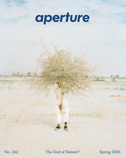
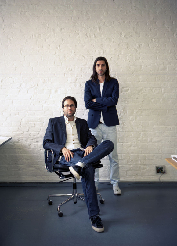
The London-based graphic design studio A2/SW/HK (Scott Williams and Henrik Kubel) is responsible for Aperture magazine’s dramatic redesign. We asked Scott a few questions about process and inspiration.
Aperture: What’s your font-making process like? Do you start with historical samples? Your own sketchbook?
Scott Williams: It really depends on the project and context. Some of our typefaces are inspired by historical forms, others originate through sketching by hand, and others are created with a particular production method or outcome in mind (neon, laser-routing, weaving, etc.). In the case of the Aperture suite of fonts, our starting point was a work-in-progress sans-serif typeface that was inspired by the hot metal fonts Futura and Memphis. This modern, geometric typeface echoes the Aperture logotype and also acknowledges the original incarnation of the magazine from the early 1950s. By contrast Aperture Serif, developed parallel to the redesign of the magazine, is rooted in the classicism of the sixteenth century and has been designed to contrast and complement Aperture Sans across multiple weights and to offer another flavor to the pages of the magazine. The process of designing typefaces, and working with them, is one of trial and error, of testing various typefaces and weights with one another, across various point sizes. You’re searching for an optimum interline space and line length, hoping to arrive at a point were it just looks “right” and creates a balanced “color” when printed.
Aperture: How did the two of you meet, and how did you begin working together?
SW: We met as post-graduate students at the Royal College of Art in 1998, and started working together, informally, on various projects almost immediately. We opened our design studio in London in 2000.
Aperture: How do the two of you work together? Does it start with a conversation, is a file passed back and forth, or does one partner shepherd a project while another focuses on something else?
SW: It’s like cats and dogs! Only joking!
Aperture: You’ve designed many art magazines and journals as well as several book series. Can you talk about the difference between designing for a single project (like a book) and designing for a series or multi-issue publication?
SW: There is a unique rhythm to working on magazines and multiple-series publications, particularly periodicals. Natural lulls, between issues, are punctuated by intense periods of work as teams of people focus on what seems to be a “moving target.” The sheer pace and intensity of working this way can be exhilarating, though a little stressful, too!
Aperture: Name a dream future project for the studio.
SW: A newspaper redesign would be a challenge, but one that we’d embrace.
Aperture: How has your practice changed (if at all) since websites and digital publications have become more prevalent?
SW: Technology has changed, but our design process remains largely the same. Our focus is still upon crafting design for specific purposes, whether that takes the form of print, screen, or interiors.
Aperture: How do you stay inspired?
SW: Reading.
Aperture: Name three things you must have when you’re working.
SW: Clients, calm, and caffeine.
Aperture: Are there any past or existing designers that you look up to?
SW: To choose a favorite designer, working in any discipline, is difficult. But if I have to choose one, it would be Yves Saint Laurent for his groundbreaking work, creative flair, sensational use of color, and longevity.
