


The Darkroom Master Keeping Diane Arbus’s Vision Alive
Neil Selkirk—the only person authorized to print from Arbus’s negatives—shares rare insight into the photographer’s extraordinary breakthroughs.
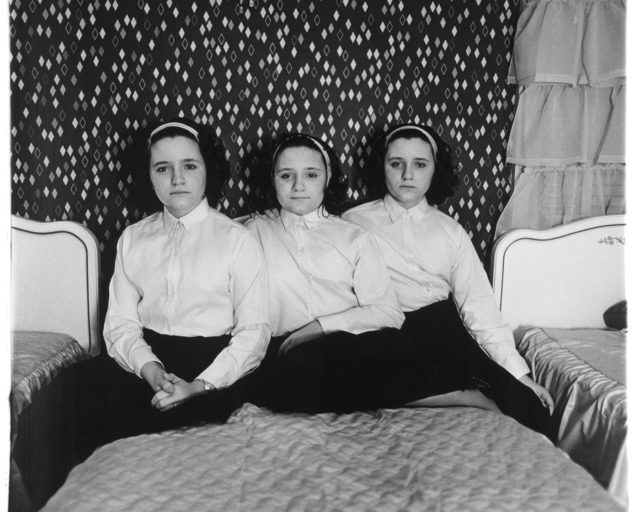
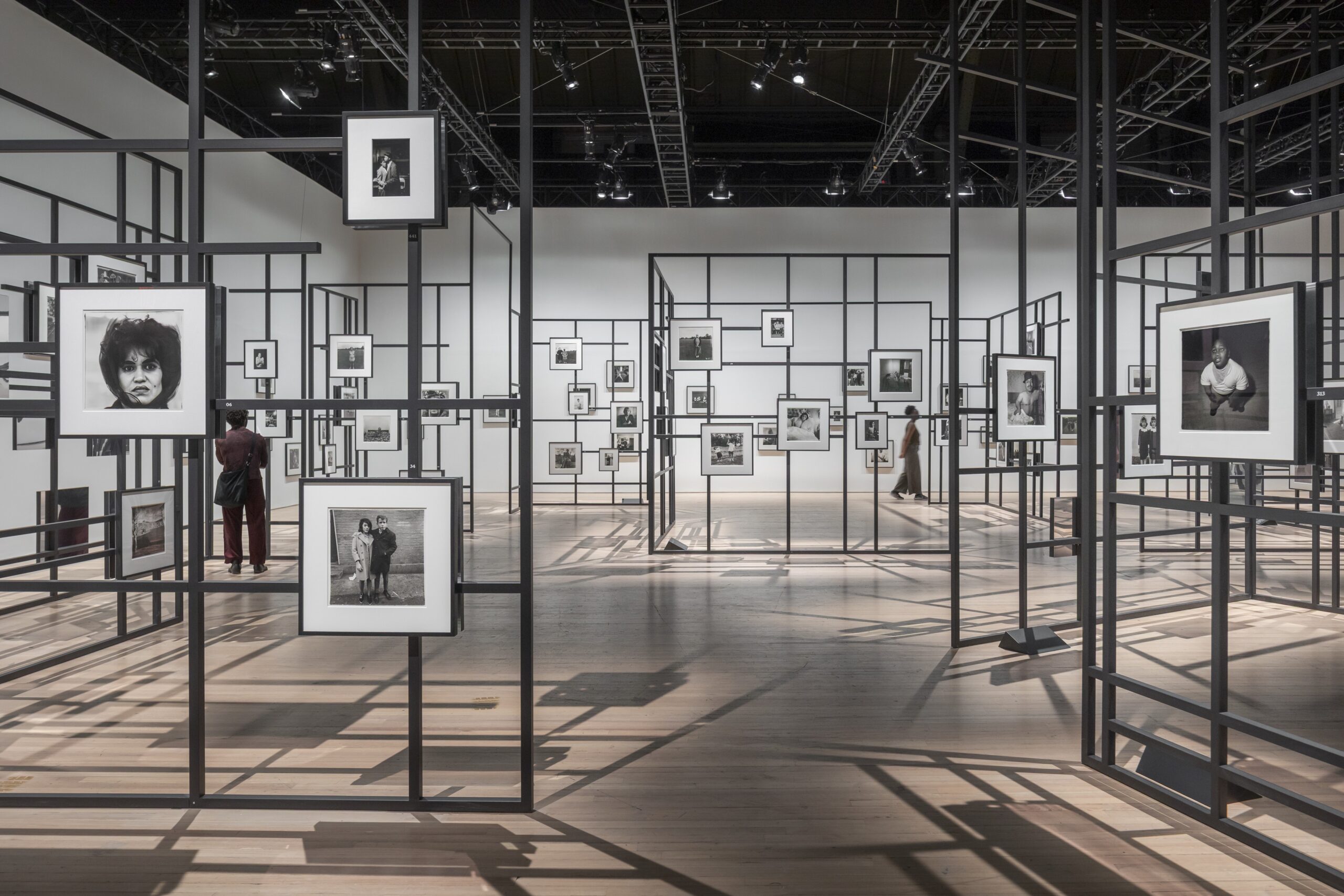
Installation view of Diane Arbus: Constellation, Park Avenue Armory, 2025. Photograph by Nicholas Knight
All artworks © The Estate of Diane Arbus exhibited courtesy of Collection Maja Hoffmann/LUMA Foundation
Neil Selkirk, photographer and darkroom wizard, is perhaps best known as the only person who has printed Diane Arbus’s work since her death, in 1971. Working closely with Doon Arbus, Diane’s eldest daughter and executor of the estate, Selkirk has served as a longtime consigliere on matters pertaining to Diane Arbus’s prints and their reproduction. During her time as Aperture’s creative director, Lesley A. Martin worked with Doon and Selkirk to maintain the faithfulness of reproduction in Diane Arbus’s books—from the remastering of Diane Arbus: An Aperture Monograph, first published in 1972, to the publication of the close study of Arbus’s Box of ten portfolio, and the reissue of Revelations, in 2022. In late June, on the occasion of two major exhibitions of Arbus’s work, one in Los Angeles and one in New York, Martin sat down to talk with Selkirk about the more than fifty years he has dedicated to channeling the artist’s intentions as experienced through the prints of her work.
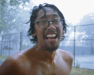
© Stephen A. Frank
Lesley A. Martin: Thank you for taking time to speak with me, Neil. It’s a big Arbus moment, with Cataclysm: The 1972 Diane Arbus Retrospective Revisited at David Zwirner in Los Angeles, and of course the amazing Constellation show on at the Park Avenue Armory, New York, which exhibits more than 450 images that you printed from Diane Arbus’s negatives. You’ve written and spoken at length about printing her work, but I realized I didn’t know: How did you learn to print?
Neil Selkirk: How did I learn to print? Oh, no one’s ever asked me that before. Well, I went to photography school in London, to what was then the London College of Printing. It was a printing school, set up by the trade, and it had, incidentally, a small design school and a small photography school. It was a very good trade school—and its attitude to photography then was as a trade. In those days, that was the equivalent of a degree course, a three-year course in England. And when you come out of that, you go to work as an assistant in a studio. I’m not sure how you go from being a beginner student printer to being good at it. I wound up coming to New York, and at both Richard Avedon’s and Hiro’s studios, where I worked, the assistants did the printing. I guess it’s just something you get better at by doing.
However, regarding the Arbus printing, I am becoming increasingly emphatic that it is understood that it was not my skill as “a printer,” in quotes. It was my ability to duplicate her prints as precisely as possible, which was the issue. Meaning, there was effectively no creative input whatsoever. It was all about having the patience to figure out how she did it. And then, once one had run out of her exhibition prints to duplicate that, turning the process into a philosophy that could produce other prints that would be what she would have done. Which, in fact, in Diane’s case, was significantly more straightforward than would be the case for someone printing anybody else’s work, because she didn’t dodge and burn. Which meant that all I had to do was come up with something that was philosophically right in terms of density and contrast, and we were winning.
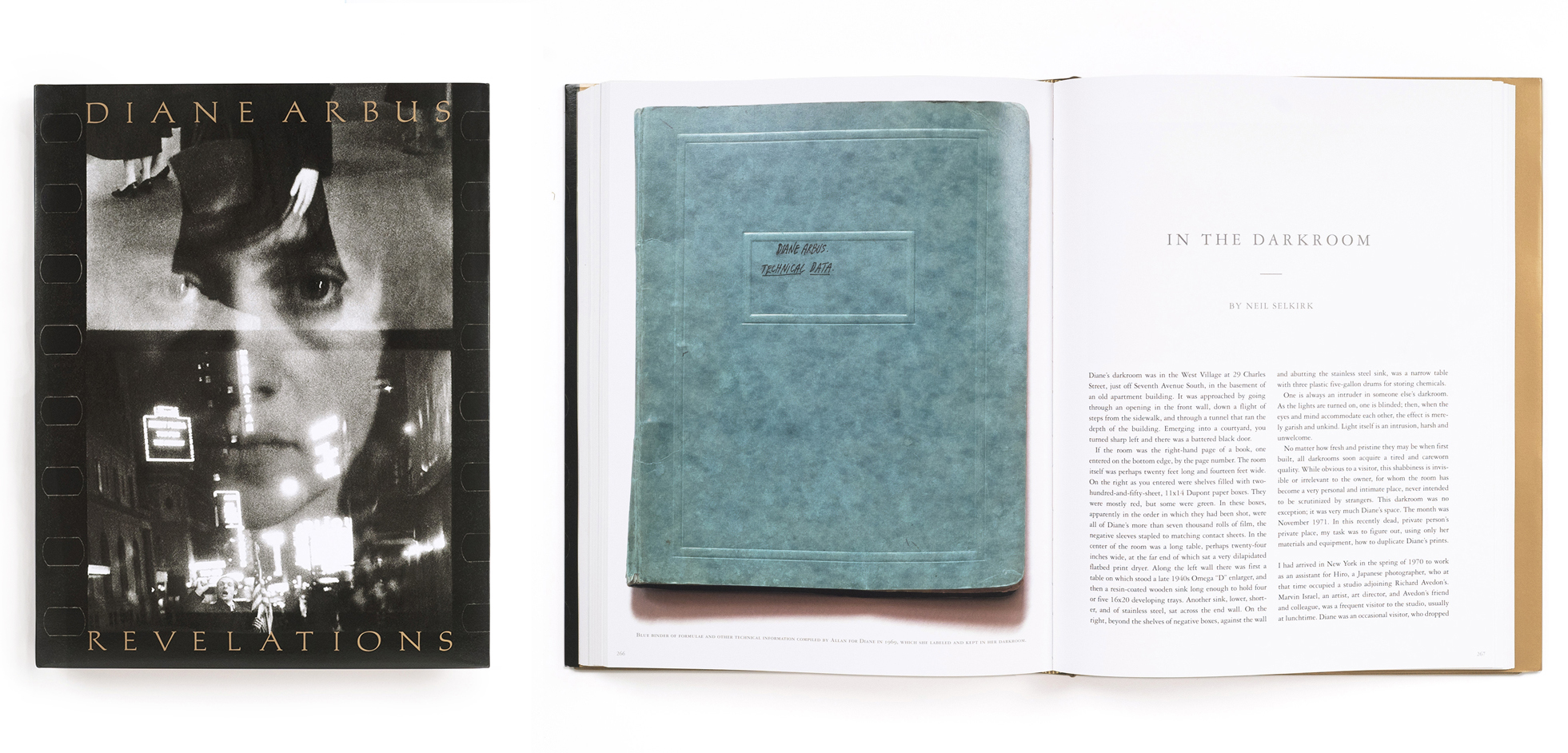
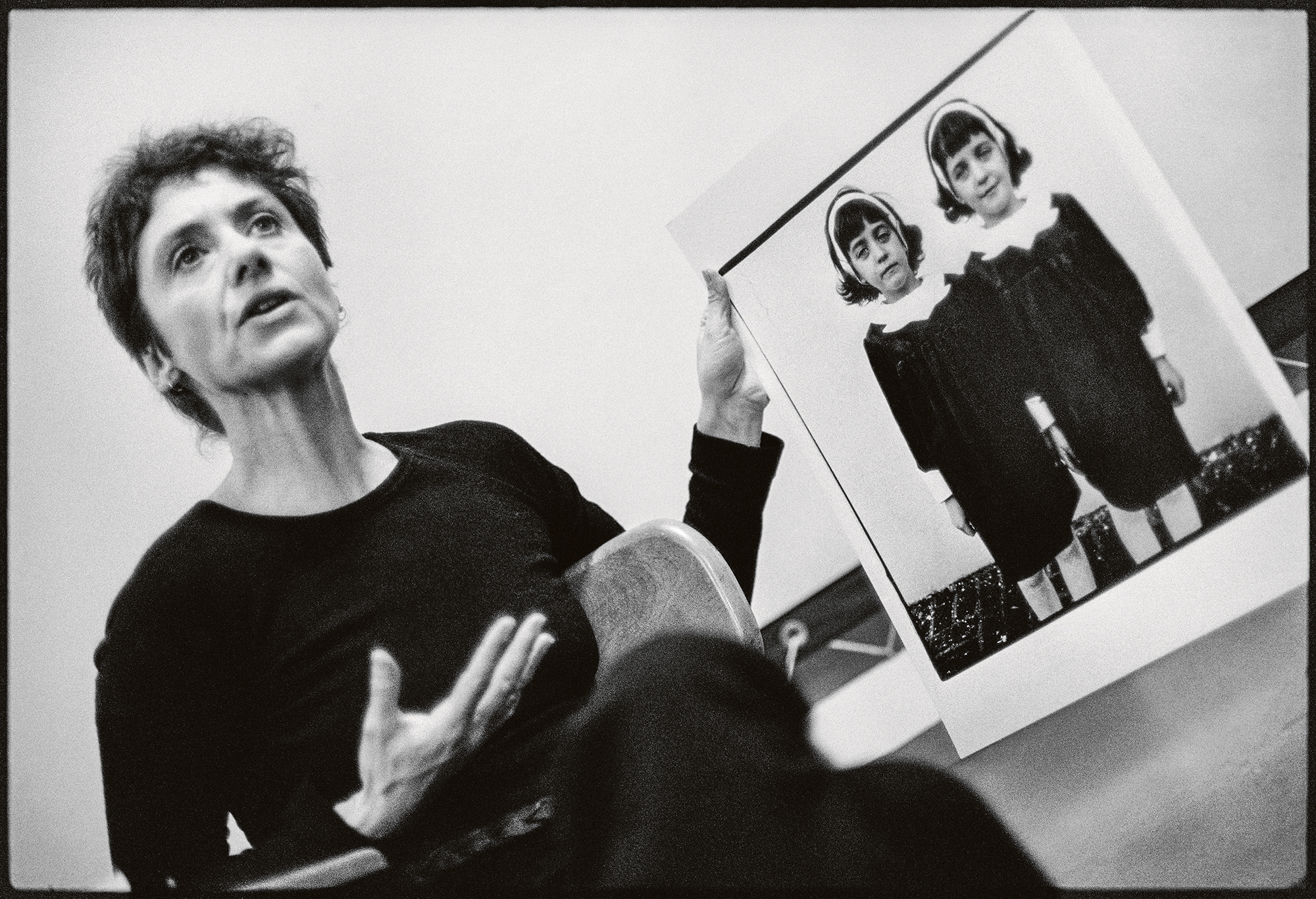
Martin: In the essay you wrote for Revelations, “In the Darkroom,” you also talk about finding the right way to duplicate the edges of the images on the paper; about the little pieces of cardboard you had to find in order to be able to replicate her softening of the edges of her image—that it took not just any cardboard, but a particular type of cardboard, with a particular depth, and dampening down the edges with saliva, etc. The essay is illustrated with iterations of the identical twins photo [Identical Twins, Roselle, New Jersey, 1967], showing the different types of edges that Arbus experimented with—one with crisply squared-off edges, one with ragged black borders from a filed-out negative carrier, and one with soft edges. In the end, the estate chose to recreate the prints that had been most recently printed by Diane in the years before her death, which tended toward soft edges. What is the impact of a tiny decision like that, about how to print the edges of an image in a print?
Selkirk: Everybody seems to agree and understand that one of the things she was doing was showing that there was nothing hidden or changed in the printing, by demonstrating that you were seeing to the edge of the negative and that there was no subsequent manipulation. That seems to have become a major element of her whole printing philosophy—of everything she was doing—which was that it was unmanipulated, and thereby credible. This had to have been one of the major factors to the shock of the pictures: an awful lot had gone into making them not appear to be manipulated. People recognized pictures they could believe in. Nobody believes in an Ansel Adams picture. Everybody believes in a Diane Arbus picture, for reasons that had been built into the work. Initially, it was by showing the borders, but she got teed off because everybody was using big black borders showing the edge. So she tried to retain the credibility that the black borders give an image, while making them distinctively hers. And then you get into the whole thing of the print being an object, a thing—which is what you can’t get on your screen. With the soft border, the image becomes the paper. It’s a critical element of the thingness of the object—a treasured entity.
Martin: Doon writes about recognizing that “a kind of history arrives more or less intact in the objects.” I think she was speaking to the preservation of Diane’s archive and legacy as a whole, but that’s also what you’re talking about, in essence. The overlay of this sort of “anti-technique” is also a strategy—or what you describe as a philosophy.
Selkirk: Funnily enough, I only hit on it recently. I’d always understood that there was a sort of reference to snapshots and newspaper photographs in her work. I’d never before realized that audiences tend to set aside photographs by people like Ansel Adams and Paul Caponigro and all those master, super printers, as “art.” Whereas Diane’s work was more about: This is the world. What she meant was that in reality, that’s how photographs are read. Always have been. It’s the photo-establishment that had worked to deny it. And she was incredibly antiestablishment. But she seemed to manage to trample all over the establishment and be embraced by it, ultimately.
People recognized pictures they could believe in. Nobody believes in an Ansel Adams picture. Everybody believes in a Diane Arbus picture, for reasons that had been built into the work.
Martin: It’s interesting that you emphasize the work in relation to the snapshot, because I don’t think of Arbus’s work as employing the snapshot aesthetic.
Selkirk: It doesn’t, except in the unmanipulated appearance of the print. There’s a quote from her about the image of the lady sitting in the room with all the paneling. She’s on the couch, holding a baby monkey. Diane wrote to Allan that she had taken this really dumb photograph, that she was now completely falling in love with because “It looks as if her husband took it.” Which is such a great line. Because again, absolute credibility.
Martin: Arbus is often associated with Garry Winogrand and Lee Friedlander, because they all appeared together in MoMA’s New Documents show, in 1967. Winogrand and Friedlander were each invested in their own versions of the snapshot aesthetic, albeit one increasingly placed within a fine art context. I always thought that her inclusion was an outlier or stood out from those two, though.
Selkirk: In terms of how she took photographs, it’s got nothing to do with snapshots, really. Even when people like Walter Benjamin and Siegfried Kracauer talk about snapshots, they both use the term to denote something “grabbed,” which may be what Kodak meant, too. But mostly it doesn’t really mean that now. It means taken with a certain approach to the subject—and maybe there’s a little bit of Arbus in that. But she also said, “I don’t arrange the picture, I arrange myself.” So you’re looking at a picture which is deliberately not composed, but also deliberately not grabbed.
Martin: Right. There’s a direct engagement with the subject in Arbus’s work that separates it from what I think of in terms of “the snapshot.” And it’s interesting to hear you talk about her approach to printmaking as one of several conscious decisions she made intending to lead the viewer to believe that “what you see is what there was.”
Selkirk: Yes, with enormous intelligence and intensity—and this insanity of her not being able to find a film that she could stand in the United States and going to all lengths to get it from Germany. And the paper she used, the Agfa Portriga Rapid. She really knew aesthetically where she wanted to get and she was absolutely, unremittingly relentless about trying to find it.
All artworks © The Estate of Diane Arbus exhibited courtesy of Collection Maja Hoffmann/LUMA Foundation
Martin: Of course, originally, in photography’s early pursuit of the art world, people rejected things that seemed too easy; too unrefined or inartistically pursued. Then came John Szarkowski, who was fascinated by the snapshot. Artists he chose to show often had some oblique relationship to the idea of the snapshot. William Eggleston’s first show, for example, was deeply reviled and dismissed by so many people (including Ansel Adams) for being “just” snaps—an old shoe under a bed; a ceiling fan. Is there a thread there, do you think?
Selkirk: Absolutely. For the longest time, there had been a total collusion between the art establishment, the critical establishment, but most importantly the photographers themselves, to make photographs into paintings. What photography actually offers is spontaneity, incredible detail, the element of chance, reproducibility. All of which were rejected as defining what made photography “not” art.
Friedlander, Winogrand, and Arbus revert and resort to photography’s original qualities and dared people to think of it as art, for want of a better term—the innate qualities of photography, which had been annihilated. Even when you get somebody like Eadweard Muybridge, it was considered intriguing, but as science. It didn’t occur to anyone that photography was a medium that would enable you to see. There’s a fabulous quote from Dorothea Lange, that the camera is a wonderful device that enables you to see without a camera.
Martin: In the early 1960s, Clement Greenberg popularized the idea of media specificity as something foundational to painting as an art form—there was a strenuous effort to drill down and to identify the essence of painting’s inherent properties, fueling the discourse around abstraction by focusing on the surface materiality and flatness of a painting. A decade later, in the ’70s, we’re on a similar track in the critical discourse around American photography, aren’t we? Szarkowski, in particular, was very committed to defining the essential properties of photography.
Selkirk: I think the medium-specificity framework for engaging with a medium as your tool of choice as an artist is very important, in fact. There’s this incredible thing about the frame—paintings are entirely about what’s inside the frame. And photographs are about what’s outside the frame. There is no relationship between the two media except for their propensity to appear on museum walls.


Martin: Many people, of course, don’t have the experience of getting to know Arbus by looking at prints on walls. They’ve experienced the work in a book. Were you involved in translating the prints into separations for reproduction and the printing of Diane Arbus: An Aperture Monograph in 1972?
Selkirk: Absolutely not. I made the prints for reproduction, but Marvin Israel, who designed the book, worked with Sydney Rapoport, the first printer of the book. Syd prepared the separations. He told Marvin that under the densitometer, the blacks in the prints were the blackest blacks he’d ever come across. Which again, you know, it’s that Portriga paper and her technique. The first printing of the monograph, which everybody loved and thought was amazing, in fact, I thought wasn’t very good.
Martin: Now, of course, you’re deeply involved, with Doon, in supervising the printing of each new Arbus publication. Is there anything in particular that you are looking for in the proofs or the printed page versus the print that makes it good or less good?
Selkirk: Usually when we’re looking at book proofs, we take the preferred printing to compare them to. We almost never take prints for reference. I mean, it seems to me that offset printing has more to do with the differences between the relationship of the paper and the ink and the surfaces of both than it does with the print density. It’s almost to do with handling it and the angle at which the light is falling on it.
All artworks © The Estate of Diane Arbus exhibited courtesy of Collection Maja Hoffmann/LUMA Foundation
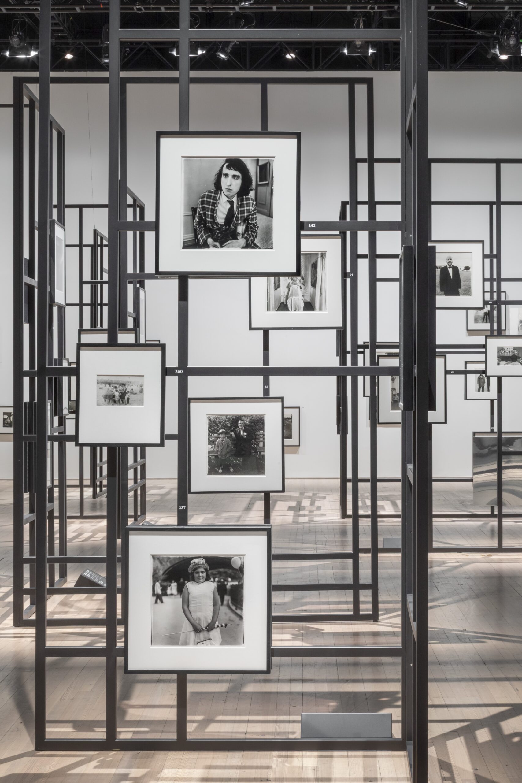
Martin: The classic reference point for Arbus’s work, of course, remains the 1972 monograph. But the style of presentation of her work in exhibition has changed dramatically over the years. Currently in LA you have Cataclysm, which recreates the original 1972 retrospective—clean, matted and framed prints linearly presented in a white-box space. And at the same time, one can see a fairly radical presentation of many of the same works in a very different experience of viewing at the Armory here in New York.
Selkirk: What’s always been important is to make sure that no picture impinges on the next one. The exact opposite of what most curators are dying to do, which is to explain the relationship between the images. This is one of the things that blew Doon and I away when we first saw the Constellation show in Arles. Matthieu Humery had, on his own, drawn exactly the same conclusions.
Martin: I was also curious about the relationship of Constellation’s almost jungle gym–like installation to the method of display that was used for the exhibition at the Met Breuer in 2016, In the Beginning, which was also a sort of constellation or thicket of images.
Selkirk: Yes, In the Beginning was superb. Each print was given its own totem or monolith pedestal within the presentation, off the gallery walls. And, philosophically, it’s not unrelated to the idea of giving each image its space.
Martin: In viewing both Constellation and In the Beginning, one feels as though you are out on the street—catching glances across the room. They both gave you a sense of swimming through the world via the photographs, of being in the photographer’s shoes.
Selkirk: Certainly. You have a sense of exploration.

All artworks © The Estate of Diane Arbus exhibited courtesy of Collection Maja Hoffmann/LUMA Foundation
Martin: In my recent rereading of parts of the 2003 edition of Revelations, I noted that Doon describes her own strategy of releasing a “surfeit” of material from Diane Arbus to create a context for viewing the work that is as fully textured as possible. She describes her work as building “a safe place for anyone who cares to wander around at will and play detective, to peer into dark corners . . . to invent a path without the interference of a tour guide, making independent discoveries.” And that describes In the Beginning, I think, and even more so, perhaps, Constellation. Contained but also open–ended.
Selkirk: The pictures, in fact, were not curated in Constellation. Just about everything is included. In a sense, the photos were “disencurated.” The complaint that one hears about the Armory show is that the viewer is not guided. A couple weeks ago, I was taking Madonna through, and she was initially disconcerted at not being directed. People very badly want direction.
Martin: My last question: You have your own practice, Neil. And you have an incredible depth of experience and engagement with photography. Over the past fifty years, however, you’ve become a conduit for another artist. I imagine there’s a sense of tremendous responsibility that comes with this role. Could you speak to that and do you see this role as interpretive in any way?
Selkirk: This is really important. It’s absolutely not interpretive. I’m very aware that almost everyone in the world only knows Diane Arbus’s work through the prints I’ve made. Meaning, if you discount people who’ve been to shows, but consider the half million people who bought the book, they were all looking at my attempt to duplicate, replicate, or simply present. Of that, I’m pretty confident. You know, when Revelations opened in San Francisco, some knowledgeable writer about photography said he thought my prints were better. And I just said, if you can tell the difference, I failed. And basically, they can’t.
Diane Arbus: Constellation is on view at the Park Avenue Armory, New York, through August 17, 2025.