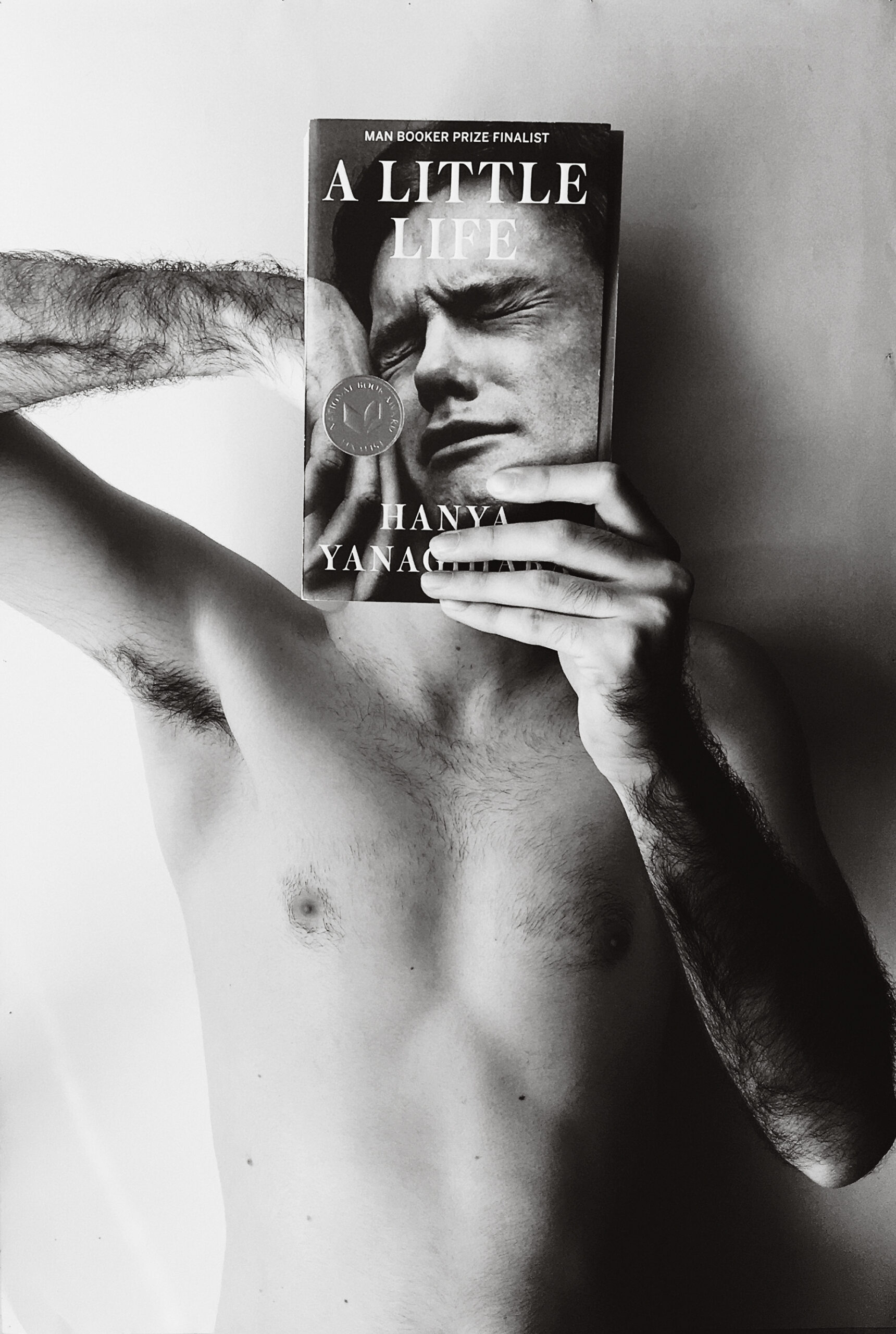
Marc Garcia Vilella’s Instagram post of himself with a copy of Hanya Yanagihara’s A Little Life (2015), with photograph by Peter Hujar
Courtesy Marc Garcia Vilella
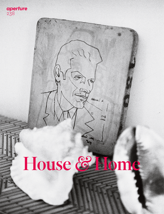
This piece originally appeared in Aperture, issue 238, “House & Home,” spring 2020.
The British writer Rachel Cusk’s celebrated Outline trilogy, published between 2014 and 2018, concerns a series of journeys a writer named Faye takes in Europe. In one, Faye encounters a woman who is obsessed with the works of a painter. “What she was trying to say was that she wasn’t interested in them objectively, as art,” Cusk writes. “They were more like thoughts, thoughts in someone else’s head that she could see.”
A recent spate of well-regarded novels has taken the use of photographs in book jacket design into new territory, structuring a relationship between word and image. The U.K. Faber and the U.S. Picador editions of Cusk’s trilogy, designed by Rodrigo Corral, make use of still lifes by the fashion photographer Charlie Engman. The thick white border and the bold black all-caps text frame an image that offers a way into thinking about what the individual titles of the trilogy might refer to—Outline, Transit, Kudos. But after reading the book, you realize how provisional the cover’s illustrative nature is. Corral’s design was in reaction to reading Cusk’s prose: “It isn’t super linear,” he says. “It’s more about being part of the journey.”

The U.S. edition of the American writer and T Magazine editor Hanya Yanagihara’s novel A Little Life (2015) and the U.K. edition of the British writer Olivia Laing’s first novel, Crudo (2018), turn this observation concrete. Both novelists were inspired to use photographs for their book jackets after seeing them in galleries. Yanagihara saw Peter Hujar’s Orgasmic Man (1969); Laing saw Wolfgang Tillmans’s astro crusto (2012). Laing has noted that Tillmans’s image of a postprandial crustacean shell connects to a scene in the book where her lead character, Kathy, smashes a crab open with a hammer.
But the principle of using someone else’s work to frame your own rises above the evident linkage. Laing’s use of the American writer Kathy Acker as her protagonist—partly quoting Acker’s work, largely fictionalizing her life—is a feature of her style of autofiction, but it is also bound up with how writing is described in the novel: “She wrote fiction, sure, but she populated it with the already extant, the pre-packaged and ready-made.” Laing’s Kathy is described as “Warhol’s daughter,” someone who is “happy to snatch what she needed but also morally invested in the cause.”
It’s a description that is as much about image use in publishing as it is about writing. The cover of A Little Life reproduces Hujar’s photograph of a close-up of a man’s face at the point of orgasm; although shorn of its title, the ambivalence about whether it’s a face in agony or ecstasy is ramped up. Yanagihara has described the cover as a “sensation—of witness and also of trespass—that I wanted the reader to feel as well.” A Little Life opens in New York in the early 1980s, a time when Hujar was still working, and chronicles the lives of four young men with a tight focus on private and inner worlds as represented by the cover. One of the four, JB, is an artist, and the photographs he takes of his friends—depicting them in his artworks without their consent—is what begins his distance from them. “Tonight, I am a camera, he told himself, and tomorrow I will be JB again.”
The novel’s Instagram account, set up by Yanagihara and her social-media manager, has spawned similar reactions in readers—not through posting portraits of their friends as the book’s character does, but by posting portraits of themselves with the book itself. As one London-based reader’s body extends out from the jacket, it’s as if a novel can be slipped on and off like an alternate, temporary identity or a thing worn. It’s a performance that resonates with something the feminist art historian Linda Nochlin wrote: “That the self is a condition of disguise and that we can move back and forth in terms of sexualities, in terms of social being, in terms of all kinds of sense of who we are.”

What these book jackets illuminate is the way the contemporary novel, both in content and cover, performs the idea of the self continually collapsing back onto other ideas, other images—as if somehow the prose operates as a written means of interconnectedness between visual ideas, a kind of long-form resort to the pictorial. It’s a queer way of defining things, a privileging of final looks over how things might first be written down. It seems somehow reminiscent of record covers and not book jackets, of the photographs Steven Patrick Morrissey once chose for the singles and albums The Smiths released, or of the covers Peter Saville once designed for Joy Division and New Order that made use of sourced photographs. Perhaps it is the realization that novels are now the sleeve notes of our time.
