The Designer Translating Photographers’ Visions into Inventive Books
Drawing upon a range of aesthetic sensibilities, Studio Lin has made award-winning photobooks by Tyler Mitchell, Ren Heng, Naoya Hatakeyama, and more.
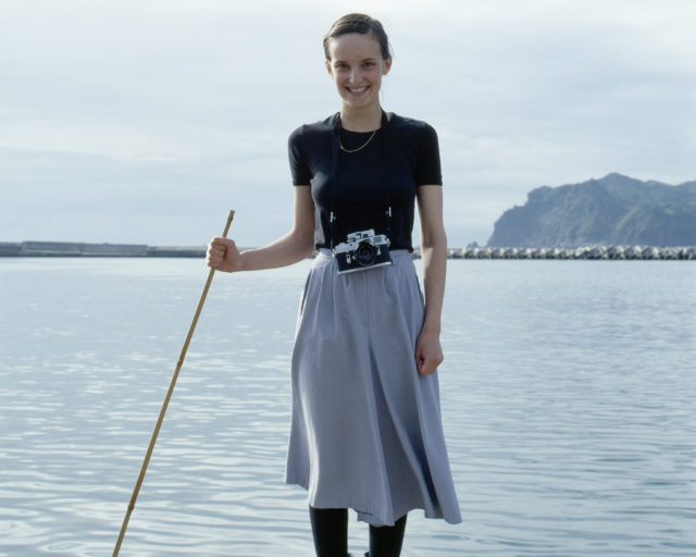
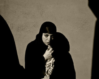
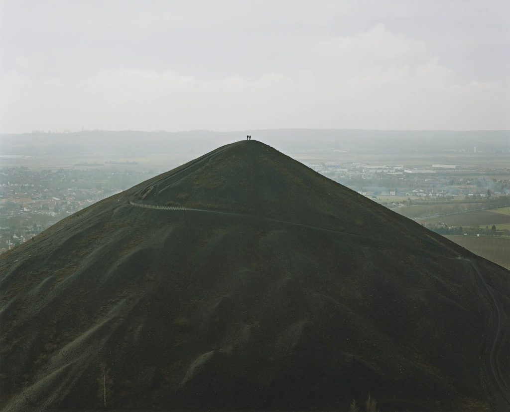
Naoya Hatakeyama, Untitled/Osaka, 1998, from Naoya Hatakeyama: Excavating the Future City (Aperture, 2018)
Session Press was founded in 2012 in response to the ongoing demand for photobooks and my belief in the book as a perfect platform for photography. We also recognized a role for independent publishers to play in meeting and satisfying collector demands. In particular, Session Press has worked hard to support Japanese and Chinese voices through our publishing program, which is focused on introducing these photographers to English-language audiences.
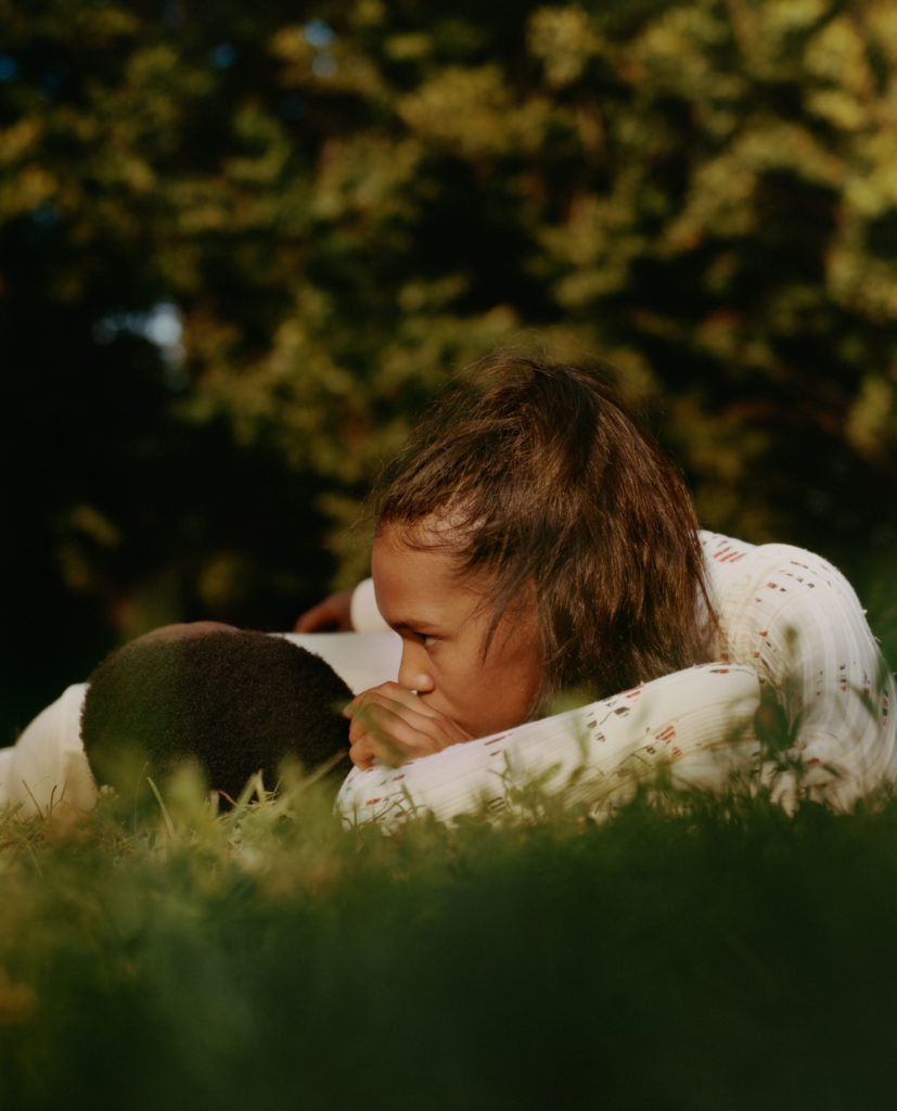
Working with printers, lithographers, and designers that I trust is key for successful book making. If I gain critical acclaim for my publications, it’s in large part thanks to the world-class collaborators with whom I work. Alex Lin is one of my favorite designers in NYC. I’ve worked with his studio for Mao Ishikawa’s Red Flower (2017) and Ren Hang’s Athens Love (2016) and New Love (2015). In my time as the manager at Dashwood Books, we have carried many publications that Studio Lin designed, including Hello Future by Farah Al Qasimi (Capricious, 2021), Tyler Mitchell’s I Can Make You Feel Good (Prestel, 2020), David Brandon Geeting’s Neighborhood Stroll (Same Paper, 2019), Mark Ghuneim’s Surveillance Index Edition One (self-published, 2016), John Edmonds’s Higher (Capricious, 2018), and Naoya Hatakeyama’s Excavating the Future City (Aperture, 2018), among others.
Courtesy the artist
As a New York–based publisher, Session Press wants to create books with a team that understands both Western and Eastern aesthetic traditions. I don’t want to make books that feel like those published by Japanese designers or publishers. But it’s also important for me to team up with a designer who understands and respects Eastern design philosophies. Alex has this and melds his understanding with a strong, rigorously trained design practice based in contemporary Western theories. For example, he studied traditional Chinese calligraphy as a child, and it’s important for me that he has a capacity to see Asian language in a creative and intellectual sense, not just as typefaces available on a computer. I appreciate working with Studio Lin because they always contribute unique ideas that are respectful to the photographer’s work, even in very difficult circumstances. I am excited to interview Alex Lin of Studio Lin and share his ideas about design here.
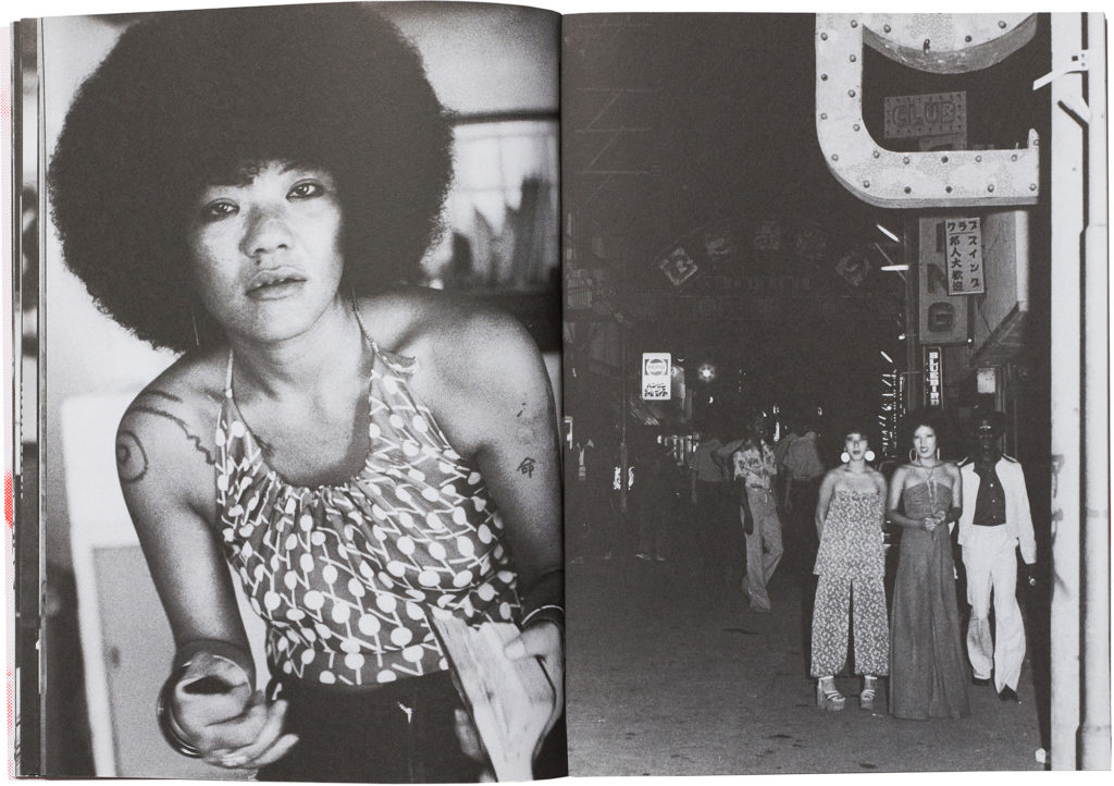
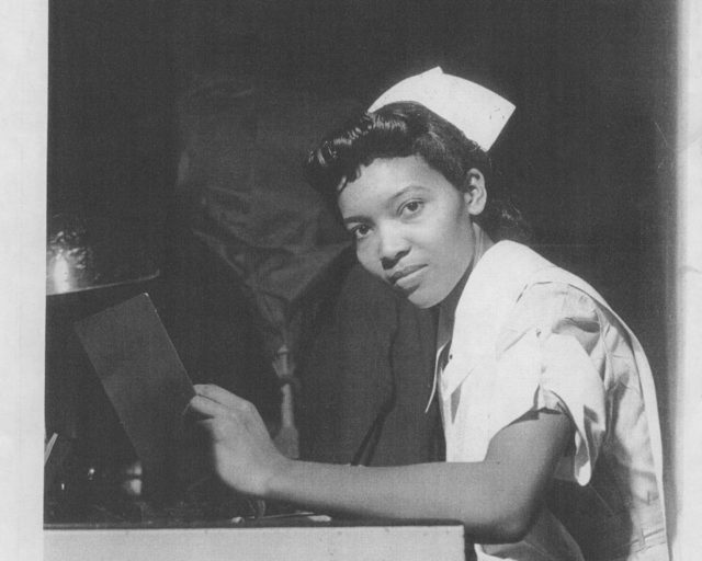
Miwa Susuda: One of my favorite books you’ve done with Session Press is Mao Ishikawa’s Red Flower. Can you tell me how you arrived at the final design?
Alex Lin: Red Flower is a collection of photos Mao Ishikawa took from 1975 to 1977. The photos capture intimate relationships between Japanese bar women and soldiers stationed in Okinawa, Japan. We started with poor quality scans of physical prints; in fact, we weren’t even sure we could work with these scans since they had dust all over them. Thankfully, our frequent collaborator Sebastiaan Hanekroot was able to remove all the dust and duotone the images for printing.
The photos were printed full bleed in a chronological sequence in five undivided chapters. We chose Munken Print as the interior paper stock because of its rough texture and high ink absorption. The wood content in the paper causes a beautiful yellow patina when pages are exposed to light. We were after a design that felt timeless, so you wouldn’t necessarily know when the book came out. Typography is often the element that dates a book, so we intentionally left that off the cover. Instead, we silkscreened a primary character from the book in fluorescent red for the cover. The exact color came from a parking sign in Manhattan that I walked by every day; it felt like the perfect supercharged red. We sent a piece of the sign to the printer, who was able to mix a custom silkscreen ink to match. A statement from Ishikawa is printed on the opening spread in the same fluorescent ink, directly on top of an image. The tactile and imperfect quality of the silkscreen ink gives the book a special feeling when held.

Courtesy the artist
Susuda: You’ve worked with many young photographers, often on their first monographs. I’m thinking about Tyler Mitchell’s I Can Make You Feel Good and Farah Al Qasimi’s Hello Future. Can you talk about that?
Lin: I feel fortunate to have been trusted with the design of many young photographers’ first books. It is a humbling experience, as I’m often in awe of the work that I’ve been charged with giving physical form to. In each case, I try hard to incorporate as much from the photographer as possible.
Tyler wanted to create a special object within the constraints of a large commercial publishing house (Prestel). We achieved this through various tweaks in the binding and cover design. The cover is a printed book cloth that wraps onto the front and back cover boards. Since there are no endpapers, you can see exactly how the cover image folds over, giving the book a handmade quality. The cloth adheres directly to the book block along the spine, allowing the book to be exceptionally limber despite being a hardcover. All surfaces of the interior are printed full bleed on uncoated paper; there is no white space. And lastly, we printed the title of the book on a ribbon that is attached to the inside back cover instead of along the spine.
Hello Future is published by Capricious, a small independent publisher. Farah Al Qasimi was the winner of the third annual Capricious photo prize (previously, John Edmonds and Sasha Phyars-Burgess). Her work is incredibly playful and references things ranging from SpongeBob to postcolonial structures of power, gender, and aesthetics in the Gulf Arab states.
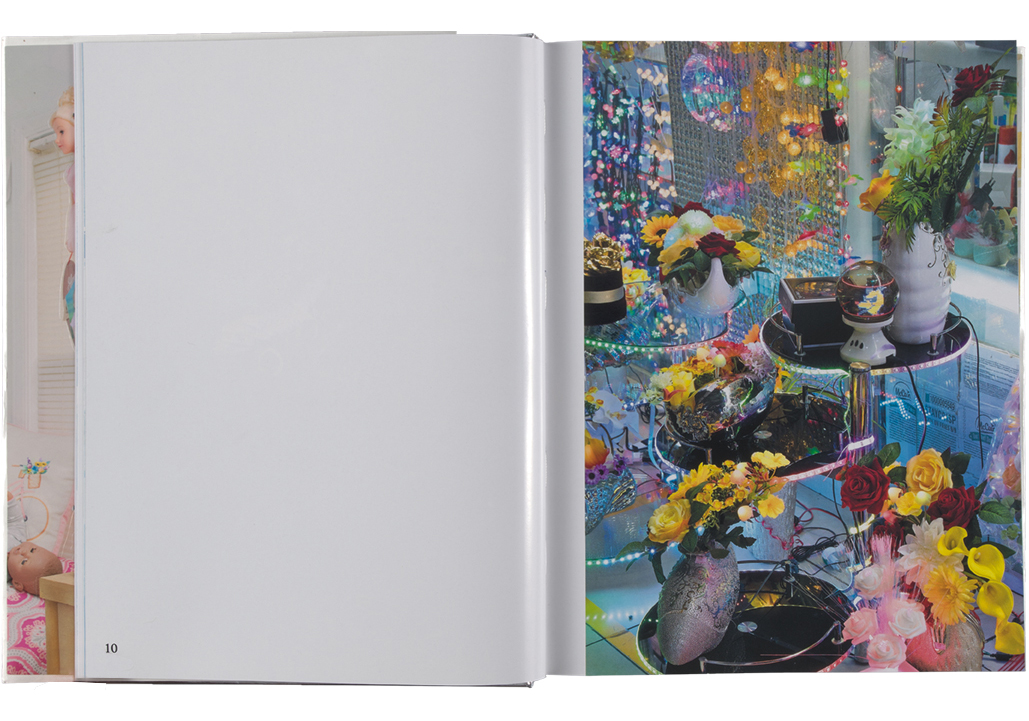
The primary body of photos is presented one per spread. Occasionally, the sequence is interrupted by research images that are printed with only the cyan channel, giving them clear separation from the main body of photos and also referencing how printed images often fade in UV light. For the cover, we looked at an exhibition Farah had at Helena Anrather gallery (New York). The frames around her prints were a reflective chrome metal, which we thought worked incredibly well with her work. We sourced a similar material for the cover and endpapers. Farah wanted to do something with stickers from the very beginning, but we were struggling to find a way to incorporate these that didn’t feel too gimmicky or separate from the book itself. We thought a book jacket would be the perfect place for this. The book jacket features four large images and a series of thumbnails on the spine. Each image is kiss cut around elements within the photo, allowing Farah’s work to live in any place you can adhere a sticker. We also left the chrome hardcover under the sticker jacket blank to encourage each book owner to create their own cover image.
Susuda: What do you think has changed in the last five years in the world of photobooks?
Lin: Prior to Instagram, once you designed the book, you didn’t really have any insight into how it lived in the world. Now you can literally follow it into the hands of the people who have purchased it through images posted. My favorite is seeing people’s photos of the object; you can see the book in ways and places that you’d never imagine.
Mark Ghuneim, who we worked with on his Surveillance Index (Mediaeater, 2016) book, told me that unless something is printed, it doesn’t exist. Paradoxically, I believe this is even more true with the rise of digital media and social networks.
Susuda: Can you give a brief summary of your design philosophy when it comes to photobooks? What, in your mind, makes a great photobook stand out from the many competing titles that get published every year?
Lin: Books are an obsession for me. My favorite place to be is where the best books are, like Dashwood, the Strand, or McNally Jackson. I’m always on the hunt for old books that still feel contemporary or fresh, despite being twenty, forty, or even sixty years old. Sometimes it is the layout or typography, sometimes the material, binding . . . you never know. Quite often, I literally decide which books to pull out of the rows and rows of shelves by what the typography on the spine looks like. The way the type looks on the spine supersedes anything else, so it doesn’t even matter to me what the book is about!
I strive to design books that have lasting value. I want to capture the idiosyncrasies of each photographer. I seek to make decisions that are meaningful in some way. Sometimes when faced with an important decision like binding method or paper choice, I’ll ask myself how I’d tell the design story when the book is done. That often helps me make a more meaningful decision.
This interview originally appeared in The PhotoBook Review, issue 019, under the title “Designer Spotlight: Studio Lin.”