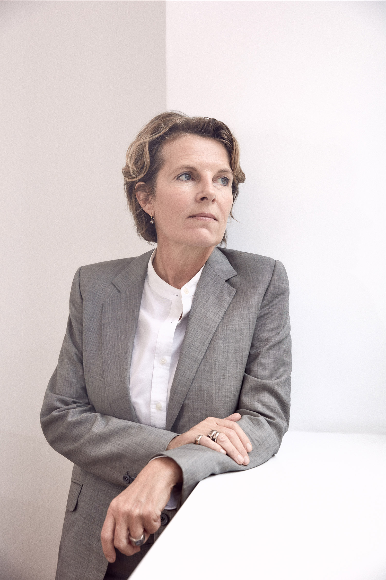
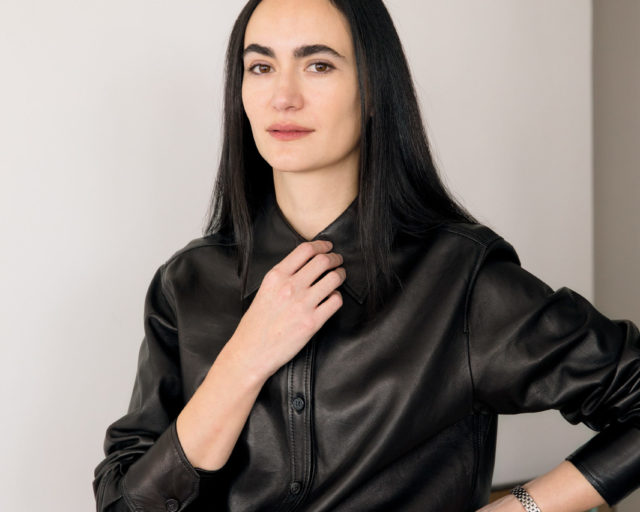
Annabelle Selldorf, New York, October 2019
Photograph by Balarama Heller for Aperture
Annabelle Selldorf is the art world’s favorite architect. But her work is nothing if not subtle—rather than the splashy icons we have come to expect from the starchitects long chosen to design art galleries and museums, Selldorf prefers to craft what she modestly calls “functional” settings for art. Rooted in an understated modernist aesthetic, with an updated material palate and innovative geometries, Selldorf ’s exhibition spaces have remade the white cube for the twenty-first century. Small wonder, then, that she is frequently sought out to design the homes of high-profile art collectors, or that she has now designed major museums and galleries for over two decades, from the Neue Galerie and the Swiss Institute to David Zwirner and Hauser & Wirth.
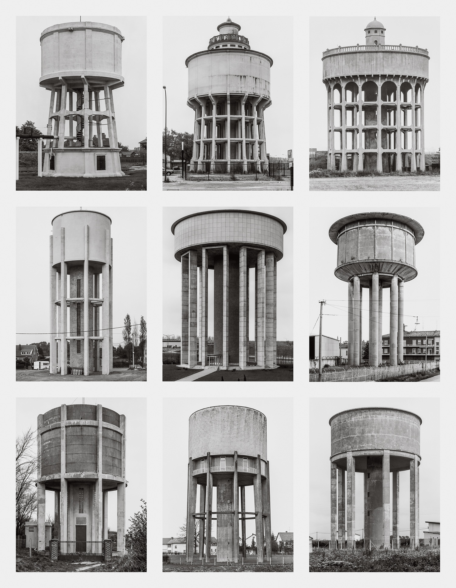
Given her sensitivity to art, it’s not surprising that Selldorf ’s practice is also engaged in an ongoing dialogue with artists. She has collaborated directly with contemporary artists such as the photographer Todd Eberle, and she readily acknowledges the influence of a generation of postwar photographers who examine the modern metropolis and industrial landscape—particularly Bernd and Hilla Becher, whose work hangs on the wall of her light-filled New York office just north of Union Square. That’s where the architecture critic Julian Rose visited Selldorf last fall to talk about her relationship to photography, both professional and personal, and the intriguing challenges faced by architects who design homes for art.
Courtesy the Estate Bernd & Hilla Becher, represented by Max Becher, and Die Photographische Sammlung/SK Stiftung Kultur–Bernd and Hilla Archive, Cologne
Julian Rose: Let’s start with the photographs right here in your office. You have works by Bernd and Hilla Becher on the walls. I’d love to hear what they mean to you. Of course their subject is architecture, and they’re gorgeous photographs, no question, but I could argue that they’re critical of architecture too.
Annabelle Selldorf: They are all of that. They have a kind of face value that draws you in. It’s not just what you look at, but how you look at it. The Bechers look without drama, in a way. And the “without drama” is one of the things that I am interested in, because it takes away our need for the sentimental hyperbole that accompanies practically everything people do. We always need to find hyperbole for our architects, for their work: it’s “amazing,” it’s “incredible,” and on and on.
Rose: So what you’re getting from those images is not so much an aesthetic per se, certainly not a style. You’re talking about photography as a mode of looking, an approach to the world— a kind of methodology.
Selldorf: Right. I don’t believe I’ve ever had a conversation with anybody about this, but it is a process of clearing away layers that allows you to look at something straight. Mies van der Rohe once said, “One doesn’t invent a new architecture every Monday morning.” Rather, you develop a methodology.
Courtesy the artist and Archivio Gabriele Basilico, Milan
Rose: What other photographers are important to you?
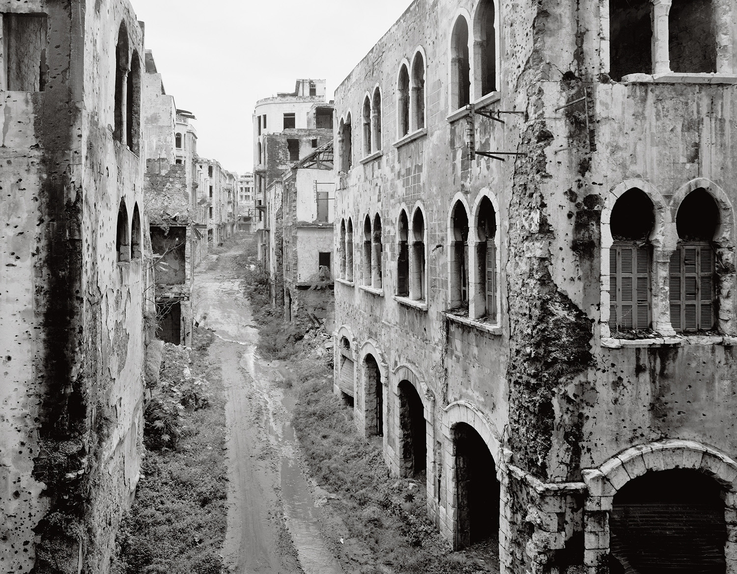
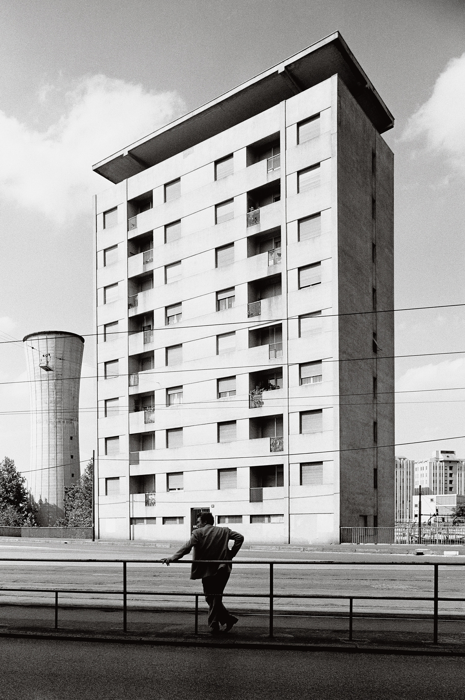
Selldorf: I love the work of Gabriele Basilico—he has the eye of a humanist, and, at the same time, I think it’s the eye of an architect. He did a series of pictures of war-torn Beirut, and they were riveting.
Rose: He did study architecture, after all, and there does seem to be a level of sensitivity—an insight into how people and buildings relate—that an architect can bring to photography.
Selldorf: In a funny way, the Bechers don’t have that because to them buildings are objects—they just categorize and anthologize. Whereas with Basilico, I always feel that his photographs are about people and how they interact with architectural environments. Whether it’s images of bombed-out Beirut, or buildings in Milan, or the amazing, very moody photographs he did of the industrial park in Dunkirk, France, his work is unbelievably powerful because it has this human dimension. I’d always hoped that one day I could get him to photograph one of my projects. That’s so naive and silly, but it was a measure of my admiration.
Courtesy the artist and Archivio Gabriele Basilico, Milan
Rose: In general, architectural photography is not often done by the same photographers we think of as artists in their own right. Is that something you think about in relation to your work?
Selldorf: Absolutely. We did a book a couple of years ago, Portfolio and Projects (2016), and I asked my friend the photographer Todd Eberle to do the photography. I think he is one person who negotiates between the two categories. I just asked him to put together a portfolio of images of my work. He went to all these different buildings, and he took pictures.
Rose: With minimal direction from you?
Selldorf: Yes. But we’ve known each other for a long time. And I wanted the portfolio to be as much about his eye as it is about our buildings. In the beginning, I really wanted him to photograph in black and white, because I find that lends a particular focus. But he didn’t want to do that. Early in his career, he photographed a lot in black and white, but now he thinks in color. So I had to make a decision. If I was going to work with an artist, I couldn’t tell him what to do.

Photograph by Todd Eberle, 2015
Rose: Was it hard to let go?
Selldorf: Not at all.
Rose: What did you learn from seeing your work through his eyes?
Selldorf: He discovers the composition right away. Often the work we do comes from a utilitarian, almost wishful idea about how people will move in a space, and I start to think that this idea is guiding how the spaces should be proportioned, and all of the rest of the design. But, of course, eventually it does return to the question: what does it look like?
Rose: It’s intriguing that you feel his images almost tease out the underlying intention in your designs. I think frequently it’s the reverse—projects are designed for the photograph.
Selldorf: Absolutely. I remember from when I was a young architect people would say, “This is a three-picture job.” It makes you want to weep.
Rose: Does photography play a role in your own process?
Selldorf: It has a lot more than I necessarily intended because of what we were just talking about. Nicholas Venezia, who works in the office in communications, is a photographer, and he has brought his sensibility to our relationship with the outside world. He has learned to understand what we do, and he channels his own talent and his own eye to participate in our process. Sometimes when we’re starting a project, I ask him to document the site, and that is so much better than relying on my own amateurish photographs— I always think that I take such great photographs, and then I look at them and I realize I’m really not very good at it after all.
Courtesy Ashmolean Museum, University of Oxford
Rose: I know you’re also something of a collector. What is the difference between the art you work with and the art you live with?
Selldorf: It’s an interesting question, because it has become so fashionable for people to display their personality through a collection—usually an eclectic collection that portrays them as someone eclectic. But I am not a collector. That’s very important. I have a lot of things, but that’s just because I’m getting old—I’m only half kidding. I have never thought of myself as a collector, but over time, I have discovered things that I respond to. I love drawings, because drawing is something that I can relate to.
Rose: It’s part of your own practice as an architect.
Selldorf: Part of my process, yes. But sometimes I am envious of artists, like when I see a Paul Klee drawing—I can feel his immersion in the drawing process, I marvel at the exploration of color, the detail, the wit. That’s the difference between an artist and an architect. An artist makes a drawing about drawing. I make a drawing because it’s a step toward making something else.
Rose: It’s interesting to me that we haven’t discussed painting yet. Painting was really the preferred medium of modernist architects. Le Corbusier is the most obvious example—he actually fancied himself a painter as much as an architect—but any number of his contemporaries also cited modern painting as an important source of inspiration. Has painting’s importance for architects been usurped by other media, like photography or drawing?
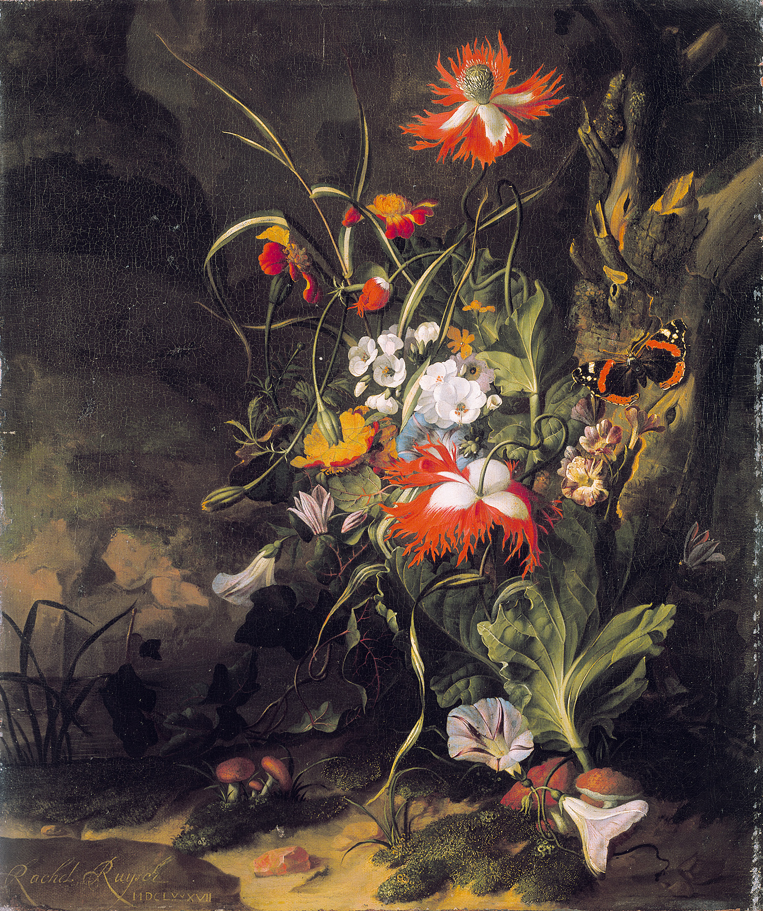
Selldorf: Well, I do have some paintings too. I have two seventeenth- century Dutch still lifes that I like very much. One is a scene in the forest ground. Strictly speaking, it’s not a still life because there is a salamander in it, and a fly, and a butterfly. But the painting takes you into a different world—it’s an almost surrealist setting, but it has been depicted with total realism. There’s something so unfamiliar and unexpected about it; it’s like it opens up a new space in your brain.
Photograph by Todd Eberle, 2015
Rose: You’re saying that this kind of image, whether it’s the Klee drawing or the Dutch painting, can transport you into a different world.
Selldorf: That’s exactly right, and actually very different from how I tend to think about photography. Photography, more than anything else, captures a moment in time. I have a photograph that I bought from Fraenkel Gallery a long time ago. It’s of one of those automated photographs from a British bombing mission during the war. The pilots documented the before and after as they flew over. I’ve always found this image fascinating, because it shows the crazy idea that we force change in such a brutal, sudden way, in such a violent and inhuman process.
Rose: I can see how this distinction plays into your own relationship to different kinds of art and affects what you might want to hang in your own home or your own office, but I’m curious to know if it also carries over into the spaces you design in which other people look at art. You’ve done a lot of houses for collectors, for example. Are there certain principles—certain ideas about what it is like to live with art—that add up to a common approach to this kind of project? Or does each one evolve on a case-by- case basis depending on the particular client and the particular collection?
Selldorf: I think that all our work has a kind of specificity that relies on getting to know the client. I also think that many people call themselves collectors when they are not. A lot of people have the money to buy a lot of things they like and to hang them on the wall. A collector is somebody who has a specific mind-set, somebody who pursues art with rigor and a specific intellectual disposition, who systematically fills out a thesis, if you will. Very few people do that. But it’s fun to find someone who is actually putting thought into a collection, because then they think about space differently.
Photograph by John Chelsey, 2013
Rose: And I imagine that in these cases, your work can essentially become another formulation of the thesis. You’re shaping the collection, perhaps not in a direct way, but you’re helping to bring a particular vision to life. But this question of having a thesis—or not having one—raises the question of architecture’s neutrality, which I think we should talk about in relation to your gallery architecture. It’s always seemed ironic to me that the term neutrality has become so controversial in this context. Take the white cube, which we all know is a bit of a straw man but is still a dominant typology of exhibition architecture today. On one side, you have artists complaining that their work is always shown in a white cube. They’ll say that the white cube isn’t neutral at all, that it’s ideological and constricting. On the other side, you have architects bristling at the fact that they’re always asked to design white cubes. They’ll ask why architecture needs to stay neutral. You seem to have found a way beyond this binary in your work. I don’t quite know what to call the gallery typology you’ve invented—I wish I could come up with a good neologism.
Selldorf: A good hyperbole?
Rose: Exactly! But what I’m trying to get at is that your gallery spaces aren’t always white, and they’re not cubes either, but they still feel very sensitive, almost respectful to the art that’s displayed in them.
Selldorf: They’re not respectful. They’re functional. I don’t think that neutrality exists. Take the white cube: It’s interesting because it’s a foil, right? I don’t think that’s limiting. It’s not inherently good or bad. Or rather, it’s good only if it’s good architecture, and that has to do with a host of things that have to do with proportions, with light, with the way you place a human being in the middle of it.
Photograph by Nikolas Koenig, 2015
Rose: So would you say that you’re more interested in designing a certain kind of gallery experience than a gallery aesthetic?
Selldorf: I tend to think that distraction is not desirable. I think that noise takes away from focus. In the most primitive way, when we design spaces for art, we facilitate concentration. We give people the opportunity to focus on what they are meant to see. I don’t care whether somebody doesn’t like white, or doesn’t like green, for that matter. What I care about is a kind of calm, or tranquility, that creates a setting. We live in an age where everything is event-driven, and, for me, that’s overwhelming.
Rose: Often this calm seems to be expressed through the details of your architecture. At David Zwirner gallery, I’ve always been struck by the warm wood accenting the concrete.
Selldorf: Zwirner’s gallery is a very good example. It’s about looking at art in the best circumstances, but it doesn’t deny itself a measure of personality or presence. I think it’s in dialogue with the art. It’s not a neutral space.
Rose: It’s not neutral, but also not overpowering.
Selldorf: I want people to feel welcomed by these spaces. That’s not an event-driven sentiment, for me, but more about longevity. These spaces should last. Today, we are questioning how museums function, and everyone agrees that beaux-arts museums are bad and big open spaces are good. But I think exactly how and why we’ve decided this are worth examining.
Rose: It’s definitely worth emphasizing that a neoclassical, beaux- arts museum is not inherently any more an expression of power than an ultracontemporary one. But you’re also suggesting, I think, that there are fundamental continuities in the experience of art. Traditionally, museums were designed to be spaces of quiet contemplation, and we still need spaces without distraction. Maybe there is a sense in which going to a great nineteenth- century museum, say [Karl Friedrich] Schinkel’s Altes Museum, is not materially different from going to any museum that has been constructed in the twenty-first century.
Selldorf: Well, it isn’t to you, and it isn’t to me, because we have the confidence that comes from always being afforded that access.
Rose: That’s a good point.
Selldorf: I really think that’s a very, very important thing to understand. We need to ask: How do we create places that are inclusive? And if they are inclusive, they have to be inclusive of everybody, which is by necessity very complicated, because everyone is entering from a different place. How does the architecture of the museum contract or expand in ways that communicate openness?
Rose: So rethinking the institution starts with the architecture, in a very fundamental sense.
Selldorf: I think so. In a way, this gets back to photography. Today, because we are so image-driven, everybody thinks they’re an expert on architecture because they’ve seen photographs of it. But that’s not what architecture is about. Architecture is about being there. Architecture is not about powerful images, it’s about a building actually doing something. When I was in architecture school, we would do field trips to visit buildings, and that was a very different experience from seeing them in photographs. And I think that is no different now.

Photograph by Todd Eberle, 2005
Rose: Architecture has a tortured relationship with images, though. There are so many important buildings that are known almost entirely through photographs. The most extreme example might be Mies’s Barcelona Pavilion, which was built in 1929 and destroyed within a year. It was eventually rebuilt in the 1980s, but its impact on the development of modern architecture—which was enormous—was almost entirely through its circulation in the form of photographic images. Is there a tension between architecture’s reliance on the image and the idea that you just expressed, that a building will always exceed an image somehow? Images can be very powerful tools in the hands of architects, but their work is also supposed to be about specificity, about a relationship to a place—precisely the things that we can’t circulate, that can’t be captured in a photograph.
Selldorf: There is a tension, but today I see it less in photography than in the production of renderings. Everybody wants you to show them, in advance, exactly what they’re going to see when the building is finished. And because it is now possible to make renderings of such high quality that they are truly photo-realistic, that is what everyone expects. I find this incredibly depressing— it’s a fake reality. I know that sometimes we do a rendering that looks exactly like the building, and after it’s built, we don’t have a really good photograph of that particular angle, so we continue to use the rendering because that represents it better. What I really mind about that is a kind of consumer attitude we’re creating. It’s like everyone is telling us, “Give it to me NOW.” We just lost a competition because I didn’t think of providing teaser images. I am heartbroken, because it’s a job I wanted. And I didn’t want this job because I was going to make amazing images; I wanted this job because it was an opportunity to do something with architecture that I haven’t done before.
Rose: What seems so problematic today is that often the image precedes the architecture, and the building is merely catching up. But obviously architects aren’t going to stop making renderings anytime soon. Can you use images in ways that are still surprising?
Selldorf: One interesting thing is that you cannot make a school anymore. Architects like Robert Venturi and Denise Scott Brown used images to represent a way of thinking.
Rose: And that way of thinking became a broader architectural movement. It’s true that the entire generation of postmodern architects was, on some level, united by a shared interest in certain kinds of images.
Selldorf: There is no longer any interest in that kind of intellectual community. I think architects are valued only as individuals. Sometimes people ask me if I’m a modernist, and I don’t even know what that means. How could I represent something like modernism by myself? The irony is that when I started my office, I was alone, and I was unbelievably intimidated by my colleagues—I really did not seek the company of other architects. Today I do. Because I think, in small ways, I can contribute to changing our conversation.
Read more from Aperture, issue 238, “House & Home,” or subscribe to Aperture and never miss an issue.
