Announcing The Paris Photo–Aperture Foundation PhotoBook Awards 2014 Short List
Aperture Foundation and Paris Photo are delighted to collaboratively present the third annual Paris Photo–Aperture Foundation PhotoBook Awards, with support from amana. There is something tremendously clarifying about looking over hundreds of new photobooks over the space of a few days; patterns emerge, revealing current thematic, design, and format trends. In this round of photobook jurying, it became evident that we have reached a highly sophisticated level of photobook production, in which there is a tremendous plurality of styles—from the most baroque to the extremely minimalist. As juror Anne Wilkes Tucker points out, “People are thinking increasingly in sequences and bodies of work, and of the book as their primary form of presentation.”
This reveals itself in particular in the instances of the Photobook as Novel—like the short-listed book The Epilogue by Laia Abril, in which a combination of text, images, and ephemera builds a complicated narrative, or those with more of a short-story arc, such Alberto Lizaralde’s everything will be ok. Photobook as Puzzle is another recurring form: a smattering of clues has been assembled, and it is up to us to figure them out, as in Jannis by Cecilia Suarez, or The Meteorite Hunter by Alexandra Lethbridge. Another common and interesting form could be called the Photobook as Reimagined Document. 19.06_26.08.1945 by Andrea Botto, or Miklós Klaus Rózsa by Christof Nüssli and Christoph Oeschger, both invest primary documents with new meaning via the juxtaposition of images, archival and otherwise. And then there are those titles that are fundamentally unique, even while working within (or against) the default parameters of bookmaking, such as Christopher Williams’s interlocking set of catalogues, The Production Line of Happiness and Printed in Germany.
It is with pleasure that we announce the short-listed candidates for this year’s PhotoBook Awards. It’s an astonishingly strong selection of many sizes, flavors, and intentions, including an embarrassment of riches submitted to our newest category: Photography Catalogue of the Year. Many thanks to all those who entered and to my dedicated and tireless fellow jurors, Julien Frydman, Todd Hido, Mutsuko Ota, and Anne Wilkes Tucker.
—Lesley A. Martin
Photography Catalogue of the Year:
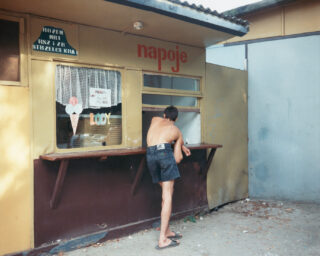
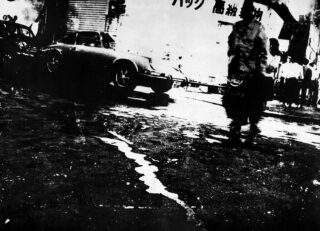
Mark Cohen, Dark Knees
Éditions Xavier Barral and Le Bal / Paris / Designed by Xavier Barral and Clémence Michon / exb.fr / lebalbooks.com

It is not easy to make it through this seemingly innocuous book. The simple gray card cover and exposed binding house war photographer Christoph Bangert’s most gruesome, painful images: dead children, corpses shrouded or left exposed, men mutilated or dying in hospital beds, fresh blood on sheets. The book’s raw design is “not intended to glorify or beautify what he is presenting,” says Anne Wilkes Tucker; instead, it asks why we accept conflict if we can’t bear to see its results. As Tucker notes, “If anyone is going to send men or women to war, they should look at these pictures.”
Horacio Fernández, Photobooks: Spain 1905–1977
Museo Nacional Centro de Arte Reina Sofía, Acción Cultural Española, and Editorial RM / Barcelona and Madrid, 2014 / Designed by Jaime Narváez / museoreinasodia.es / editorialrm.com

“What attracted us to Photobooks: Spain 1905–1977 is that it presents a slice of photobooks that are largely unknown, even to the most sophisticated people in the field,” says Anne Wilkes Tucker of this book-of-books, which was edited and written by Horacio Fernández and accompanied an exhibition at the Museo Nacional Centro de Arte Reina Sofía, in Madrid. Chronological and exhaustively introduced, it contextualizes and dissects publications ranging from an illustrated popular poem to street photography to jaunty 1930s fascist propaganda, with spreads of each clearly presented. The “wealth of information” included here is immensely important, says Tucker. “This is the platform from which new, further histories will come.”
The Photobook Museum, The Catalogue Box
Kettler / Dortmund, Germany / Designed by Frederic Lezmi, Okay Karadayilar, and Kummer & Hermann / verlag-kettler.de

Published on the occasion of the inauguration of the PhotoBook Museum, this catalogue takes an innovative approach to the form. It is a box containing an introductory booklet with thirty additional posters and/or booklets, one for each of the exhibitions featured during the six-week pop-up residency of the museum in an abandoned cable factory in Cologne. “The PhotoBook Museum itself is designed to be de-installed and packed into a shipping container for easy travel,” observes Julien Frydman, “so a catalogue in a box—a mini container full of posters and booklets that replicates the contents of the museum in printed form—is perfect.” Whether poster or booklet, each of the items offers reproductions of key images, quotes, or additional information about the featured project, allowing for the installation of your own mini PhotoBook Museum in your home.
Munemasa Takahashi, Tsunami, Photographs, and Then: Lost and Found Project
AKAAKA / Tokyo / Designed by Bunpei Yorifuji / akaaka.com

This unique humanitarian catalogue, which documents what Mutsuko Ota calls “one of the most important projects for Japan,” was undertaken after the 2011 earthquake and tsunami that devastated a swath of that country’s coastline. Under the project name “Memory Salvage,” volunteers assembled by a Japanese university cleaned and scanned family photographs recovered from the wreckage, with the aim of returning them to their rightful owners. Those that were too heavily damaged were thrown into a “hopeless” box—before photographer Munemasa Takahashi, a project volunteer, turned them into a traveling exhibition to raise funds for tsunami survivors. The highlights of this large-format paperback publication are the diverse installation views of the exhibition’s different incarnations, which demonstrate both the scale of the undertaking and the power of the personal snapshot to humanize tragedy.
Christopher Williams, Christopher Williams: The Production Line of Happiness
With Mark Godfrey, Roxana Marcoci, and Matthew S. Witkovsky / Art Institute of Chicago / Chicago, 2014 / Designed by Petra Hollenbach / artic.edu
Christopher Williams: Printed in Germany
Walther König / Cologne, 2014 / Designed by Petra Hollenbach / buchhandlung-walther-koenig.de

Two perfectly matched, separately published volumes by Christopher Williams successfully meld artist book and exhibition catalogue. The Production Line of Happiness, which accompanied an exhibition at the Art Institute of Chicago and Museum of Modern Art, contains relatively few photographs. But it does include a collection of curatorial statements, excerpted writing from select influences, old press releases, footnotes, and a smattering of didactic, instruction-manual style texts, including a list of “basic rules for the design of a catalogue,” a definition of a barcode, and colophon and usage guides for each of the copublisher’s logos.
The second volume, Printed in Germany, is a thick book filled with a slew of blank pages and images pushed into the gutter, bled around pages, or repeated, with nary a stitch of text save for the words “Printed in Germany” on the back page. Both are scaled to the same trim size, come in multiple colors, are based on the same system and format, and offer interlocking systems for viewing the work. “This is a maddening, compulsive set of books,” comments Lesley Martin, “obsessive and self-conscious, perfectly in keeping with the material-obsessed nature of Williams’s work and the opaque but beguiling experience of the exhibition itself.”
PhotoBook of the Year:
Christoph Bangert, War Porn
Kehrer / Berlin / Designed by Teun van der Heijden, Chiho Bangert, and Klaus Kehrer / kehrerverlag.com

It is not easy to make it through this seemingly innocuous book. The simple gray card cover and exposed binding house war photographer Christoph Bangert’s most gruesome, painful images: dead children, corpses shrouded or left exposed, men mutilated or dying in hospital beds, fresh blood on sheets. The book’s raw design is “not intended to glorify or beautify what he is presenting,” says Anne Wilkes Tucker; instead, it asks why we accept conflict if we can’t bear to see its results. As Tucker notes, “If anyone is going to send men or women to war, they should look at these pictures.”
Jim Goldberg, Rich and Poor
Steidl / Göttingen, Germany, 2014 / Designed by Jim Goldberg / steidl.de

When Jim Goldberg created this project, between 1977 and 1984, it was a “major shift in positioning the text accompanying a picture,” explains Anne Wilkes Tucker. After photographing both the wealthy and the destitute in San Francisco, Goldberg presented each subject with their own image and asked them to write a response directly onto it. The original book has been out of print nearly thirty years, and this beautiful new edition of Rich and Poor has preserved its unfiltered voices while sizing up, improving the printing, and adding previously unpublished portraits—plus an Every Building on the Sunset Strip–style accordion insert of San Francisco streets. “It strengthens the prior presentation of the photographs, which were already strong,” says Tucker. “It’s richer: there is more information, more context, more depth.”
Rafał Milach, The Winners
GOST Books / London, 2014 / Designed by Rafał Milach, Ania Nałęcka, and GOST / gostbooks.com

The text-only cover of The Winners features a decree from the president of the Republic of Belarus concerning the organization of the state work force, while the images inside include portraits of people in uniform and seemingly random objects like a stuffed moose head, pink curtains, cornfields, and larger-than-life sculptures of fish, unified by their no-frills framing and composition, and bleak post-Soviet palette. Careful inspection reveals that each image is tipped onto the page; lifting them up discloses a caption announcing that this is an award-winning kaleidoscope, the classroom wall of the best teacher in Minsk, or the winner of the best welder and of the Brotherhood of Russian and Belarusian Nations competition. “It’s a small but effective gesture, carried through consistently and intelligently, that renders the collection of images all the more surreal,” says Lesley Martin.
Davide Monteleone, Spasibo
Kehrer / Berlin, 2013 / Designed by Hannah Feldmeier / kehrerverlag.com

Spasibo starts with a bang: an official fireworks display celebrating Chechnya’s Constitution Day in the capital, Grozny. The charade continues with photographs of well-heeled couples in a newly constructed square; sunlight glints off skyscrapers and black SUVs. But Davide Monteleone, a runner-up for the 2014 Aperture Portfolio Prize and winner of the 2011 European Publishers Award, quickly bypasses officially sanctioned narratives. He captures the anxieties of a persecuted culture at odds with Russia and itself: its newly politicized religiosity and accompanying misogyny, its disabled veterans, and the omnipresent visage of its Putin-vetted president, Ramzan Kadyrov. “This book stands out for its narrative sequencing and the intensity of the printing,” says Julien Frydman. “Despite being relatively classic in form, small design touches—including short-trimmed, sage-colored pages on which historical, personal photos appear, and a gorgeous silk-screened cloth cover—give this book extra impact.”
Daido Moriyama, Marrakech
SUPER LABO / Kamakura, Japan, 2014 / Designed by Koichi Hara / superlabo.com
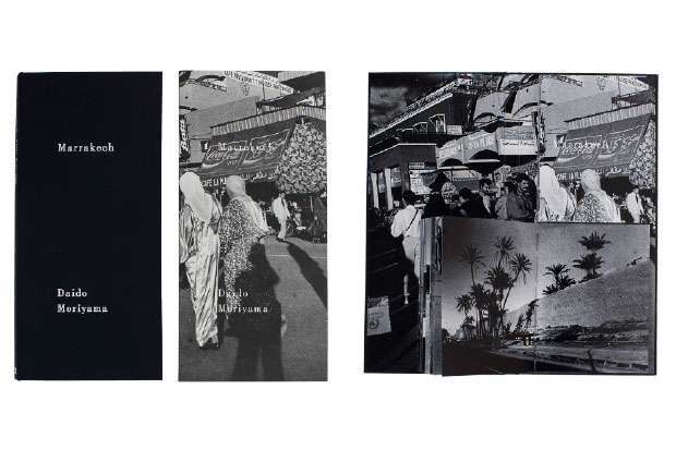
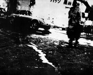
Marrakech injects a shot of energy into a body of work Daido Moriyama made decades ago when he visited Morocco. This long, narrow book comes enclosed in a slipcase and opens to reveal two book blocks stacked on top of each other. The reader is invited to mix-and-match the full-bleed, high-contrast, black-and-white images according to his or her whims—an experiment in what Todd Hido calls “exquisite-corpse-style” sequencing. Lesley Martin points out, “This approach is very much in keeping with Moriyama’s own practice of revisiting and ‘remixing’ his own work, with less emphasis on the single image than on the visceral experience of viewing a series or combination of images. The inclusion of the viewer in this is another recent strategy of Moriyama’s, so all the more appropriate as a way of organizing the book.”
Oliver Sieber, Imaginary Club
Editions GwinZegal and BöhmKobayashi / Brittany, France, and Düsseldorf, Germany / Designed by BöhmKobayashi / gwinzegal.com / boehmkobayashi.de

Oliver Sieber’s photographs of young people from underground subcultures across Europe, the U.S., and Japan are collected in this substantial tome, which intersperses these quasi-ethnographic color portraits with snapshots of concerts and street corners. Diverse sequencing creates the impression of a wide-ranging, uncategorizable global movement, and the design echoes the series’ revelations: the thick paperback cover drops away from the left side of the book block when it’s opened, exposing the glued and bound spine hiding under a smooth exterior. “We’ve seen different iterations of this project over the years, and it’s great to see his images together in a very complete form,” comments Todd Hido.
Eugene Smith, The Big Book
University of Texas Press and Center for Creative Photography / Austin, Texas, and Tucson, Arizona, 2013 / Designed by Erin Mayes, EmDash / utpress.utexas.edu / creativephotography.org

Five decades after it was first assembled, W. Eugene Smith’s survey of his own career has finally been published. This monumental boxed set is composed of three books: two with Smith’s own sequences of both his iconic images and others lesser- or unknown, and one of essays, manuscripts, and captions. Reproduced from Smith’s inexpensively copied maquettes, many of the hundreds of photographs appear murky and dark, but that does not diminish the volumes’ power. “There is a definite rhythm to it, a mood quality, that is so much a part of Smith’s work,” says Anne Wilkes Tucker. “You wouldn’t think that after all the books published on Eugene Smith, all the detailed biographies and monographs, a book could still come out that would be a learning experience. But this is it.”
Vytautas V. Stanionis, Photographs for Documents
Kaunas Photography Gallery / Kaunas, Lithuania, 2013 / Designed by Tomas Mrazauskas / kaunasgallery.lt

This book’s folio design is shaped by its content: Lithuanian identification photographs from 1946, when citizens were required to get new, Soviet documents. What’s distinctive about these images—taken by Vytautas V. Stanionis’s father, also named Vytautas—is that, to save money and materials, each print features two people side-by-side, to be sliced in half for individual use. Photographs for Documents highlights the strangeness of this arrangement by using only gatefold pages, each folding out to reveal a second, silent portrait partner—both “hiding and revealing the gist of the book,” says Todd Hido. The viewer is left to speculate on both the relationships between subjects—are they family? Strangers?—and on their fates.
Mikhael Subotzky and Patrick Waterhouse, Ponte City
Steidl / Göttingen, Germany, 2014 / Designed by Ramon Pez / steidl.de

Johannesburg’s most iconic apartment building is meticulously documented in the monumental Ponte City, which consists of one hardcover book and seventeen small paperback booklets, hidden underneath in a specially designed box. Mutsuko Ota says, “It’s a powerful object, with design that puts all the emphasis on the photographs. It really shows the way life in Johannesburg has changed over the years.”
Peter van Agtmael, Disco Night Sept. 11
Red Hook Editions / Brooklyn, 2014 / Designed by Yolanda Cuomo / redhookeditions.com

“This is a totally personal book. There is no pretense of objectivity,” Anne Wilkes Tucker says of Disco Night Sept. 11, Peter van Agtmael’s phototextual account of his time photographing in Iraq and Afghanistan, and of his and several soldiers’ returns to the U.S. “What separates it from many monographs that present photographs from war is the amount of text, his articulateness, his introspection, his awareness of prior coverage of war, and his understanding of the complexities,” explains Tucker. “It’s an extension—a rethinking—of a classic war book.”
Ruth van Beek, The Arrangement
RVB Books / Paris, 2013 / Designed by Xavier Fernández Fuentes / rvb-books.com

Lesley Martin describes The Arrangement as “a simple, clean book—a deceptively restrained, slight package for a disorienting and seductive body of work.” The publication presents a series of the artist’s collages and images created from the pages of vintage botanical textbooks and gardening guides. In The PhotoBook Review 005, artist and reviewer Penelope Umbrico wrote that these images “become defiantly unbalanced hybrid objects that undergo extraordinary metamorphosis from one page to the next.” There is a carefully controlled surrealism to the work; each element and image has been selected and placed with the thoughtfulness of an ikebana master. The book itself is suitably minimalist, the perfect, sunshine-yellow vehicle for a bouquet of Ruth van Beek images.
Daisuke Yokota, Vertigo
Newfave / Tokyo, 2014 / Designed by Goshi Uhira / newfavebooks.com

“In this digital era we live in, isn’t it fascinating to see a torn negative?” says Todd Hido of the textural photographs in this book. Its board cover and smooth, uncoated paper lend support to photographs built up with dust, scratches, and stray emulsion, with black-and-white flash images of nudes, clouds, and nighttime landscapes filtering through. Full-bleed pages and gatefolds give as much weight to the physical surface of images as to their subjects. “I like its expressionistic quality,” Hido says. “Daisuke Yokota is exploring analogue photographic materials, and diving deep into them and their layers.”
First PhotoBook:
Laia Abril, The Epilogue
Dewi Lewis / Stockport, UK, 2014 / Designed by Ramon Pez / dewilewis.com

Laia Abril tackles the difficult subject of a young woman’s death due to bulimia, as well as the surviving families’ efforts to deal with that loss and piece together a story that is at odds with their memories and hopes for her recovery. “This is a tough story to tell in an engaging way—and an even tougher sell, so kudos to the publisher for taking this on,” says Todd Hido. “I want to emphasize this point because if people only publish slam dunks, we’re all in trouble. Content must not be dictated by salability.” Those concerns are offset by sympathetic portraits, riveting interviews with the families, inset letters and other documents, and a unique set of in-page gatefolds that open to reveal medical reports underscoring the gravity of Cammy Robinson’s struggle with this illness.
Andrea Botto, 19.06_26.08.1945
Danilo Montanari / Ravenna, Italy, 2014 / Designed by Andrea Botto / danilomontanari.com

On June 19, 1945, photographer Andrea Botto’s grandfather, Primo Benedetti, was released from a Nazi prisoner-of-war camp and began making his way back home to Tuscany. This book, which won third place for the 2012 Kassel Fotobookfestival Dummy Award, retraces that journey via online image searches for the names of cities he passed through and dates of his travel (such as “Hanover, 1945”). A sprawling set of black-and-white images are scattered across the page spreads: bombs exploding, bodies in uniform, Nazi weddings, and anachronistic tattooed punks. Small documents scanned from Benedetti’s passport, transfer papers, and letters home are printed on different types of paper and bound into the journal-format book. Lesley Martin calls it “a memory palace astutely built from the flotsam and jetsam of the Internet image archive.”
Nicoló Degiorgis, Hidden Islam
Rorhof / Bolzano Bozen, Italy, 2014 / Designed by Nicoló Degiorgis and Walter Hutton / rorhof.com

The entries to this year’s Awards were rife with gatefolds, and Hidden Islam uses this device on every spread. This hardcover book is a clever survey of the inconspicuous locations where Muslims in northeast Italy have been forced to gather to pray, its pages opening to reveal worshippers assembled behind non-descript facades. Mutsuko Ota praised the way “the smart design brings you closer to the subject”—from the map on the book’s jacket, to the black-and-white exteriors of buildings on the outside of the gatefolds, to the full-color interior shots within. Ota adds, “After seeing this book, you can’t help but think of what might be hidden in your own city. It reads almost as a topological survey.”
Philippe Fragnière, Snowpark
Kodoji Press / Baden, Switzerland, 2014 / Designed by Philippe Fragnière / kodoji.com

“Cool and minimalist,” says Julien Frydman, “this is an impeccably designed and produced presentation of this artist’s work.” The selection of materials, the restrained palette, and the blunt-edged cardboard binding all create a beautiful platform for Philippe Fragnière’s images of snowcapped mountains and snowboard jumps and ramps, rendered in the snow as complex geometric shapes—part land art, part extreme sport. The structures are bewildering and surreal, an aspect that is further highlighted by the sculptural use of inside-out gatefold binding.
Yoshikatsu Fujii, Red String
Self-published / Tokyo, 2014 / Designed by Yoshikatsu Fujii, Yumi Goto, and Jan Rosseel / yoshikatsufujii.com

“Many entries this year featured a dual structure but this one, with two separate bound books, one on either side of the cover’s interior, is both logical and allows multiple readings,” says Anne Wilkes Tucker of this hand-bound, felt-covered volume. The title comes from a Japanese legend about lovers who were born with their fingers tied together with red string, and in these matched books Yoshikatsu Fujii examines his parents’ marriage, its dissolution, and their lives, as well as his own feelings about each of them. The books, which open toward each other, can be flipped through separately or simultaneously, as their sequences of family photos, fragmented text, and Fujii’s own photographs cross and diverge, reflecting and refracting—as do many complex, troubled relationships.
Yann Haeberlin, Inventio
Self-published / Geneva, 2013 / Designed by Yann Haeberlin / yannh.ch

“One of the biggest challenges for contemporary photography dealing with social issues,” says Lesley Martin, “is how to visualize the otherwise invisible forces that define the world—the flow of money, power, and information in relation to global capitalism, chief among them.” Yann Haeberlin uses an astute combination of text and the juxtaposition of seemingly unrelated images—many of which he staged—to tease out some of these undercurrents of the modern, post-colonial world. Inventio is an assemblage of blunt depictions of rocks, natural sites, medical products, and other items that, combined with pointed captions about commodity trading and markets, form lyric micro-narratives that highlight the contradictions and absurdities of global exchange. Martin says, “It’s an ambitious project (not without some wobbles), tied together in a simple, brown-paper wrapping.”
Yuji Hamada, Photograph
Lemon Books / Tokyo, 2014 / Designed by Yoshihisa Tanaka / lemonbooks.jp

In his first photobook, Yuji Hamada seeks to give form to light. Using a homemade smoke machine—a hose attached to his car’s exhaust pipe—he directed a gentle haze through early-morning rays of sunlight to render them visible, then photographed them using long exposures. The results make even nondescript Tokyo street corners, gas stations, and hedged-in parking lots idyllic. “The theme is the essence of photography: to capture light. The printing and binding are especially important,” says Mutsuko Ota. “It’s a simple softcover book, but the fact that it was beautifully printed on this thick, good-quality paper makes all the difference.”
Vladyslav Krasnoshchok and Sergiy Lebedynskyy, Euromaidan
Publisher: Riot Books / Madrid, 2014 / Designed by Ilkin Huseynov / riot-books.com

The opening statement of Euromaidan (Euro Square) reads: “On the 19th of January, 2014 a peaceful protest of Ukrainian Euromaidans on the Hrushevskyi Street of Kiev turned into the possible beginning of a civil war.” For two days, freelance photographers Vladyslav Krasnoshchok and Sergiy Lebedynskyy documented the incipient crisis between Russia and Ukraine as it unfolded. The resulting publication is raw and zine-like, hand-folded and printed on rough, creamy paper. “This is very much in keeping with a long legacy of protest books,” comments Julien Frydman. “In particular, it is a direct descendant of the Japanese protest books of the late ’60s and early ’70s, such as Kitai Kazuo’s Sanrizuka or 10.21 towa nanika.” While slight in number of pages and images, Euromaidan packs a revolutionary punch.
Nico Krijno, Synonym Study
Self-published / Cape Town, 2014 / Designed by Ben Johnson / nicokrijno.com

Nico Krijno’s first complete photobook is “a celebration of color and pattern,” says Julien Frydman. (Some of these images appeared in an issue of the magazine Smoke Room dedicated to Krijno’s work, reviewed in PBR 006.) Still lifes are his preoccupation, whether found—a mangled chain-link fence; remnants of a long-gone structure—or created in his studio, where he assembles swerving piles of colorful detritus for his camera. Occasional human subjects bend and twist in a riot of print, as Krijno splatters them with paint, scatters objects in the landscape, or—if all else fails—splices everything senseless in Photoshop. The book’s comparatively tame design complements the chaos without overwhelming, with pages both matte and glossy, and texts inserted on small leaflets as well as on a removable poster.
Ola Lanko, Brigiet van den Berg, Nikki Brörmann, Simone Engelen, and Sterre Sprengers, ED IT: The Substantial System for Photographic Archive Maintenance
Self-published / Amsterdam, 2013 / Designed by Brigiet van den Berg / editingstandard.com

This compellingly designed, small-format, two-volume set is an in-depth proposal for “a substantial system for photographic archive maintenance” using one’s personal archive of images as a starting point. This system is comprised of four steps: mining, clustering, mapping, and selection, each of which is broken down into further sections, including case studies, suggested rules for archive maintenance, and various stages of image triage. “This is not your traditional ‘first photobook,’” explains Lesley Martin, “but it’s both entertaining in a deadpan way and provocative—part primer on visual literacy and part conceptual exercise.” The main volume is supplemented by an appendix that offers illustrations of image typologies one might encounter while performing maintenance on one’s archive.
Zun Lee, Father Figure: Exploring Alternate Notions of Black Fatherhood
Publisher: Ceiba / New York, 2014 / Designed by Eva-Maria Kunz / ceibafoto.com

In this classic black-and-white documentary series, Zun Lee depicts the tender and sometimes trying interactions between African American men and their children. An homage to the soldiers who took Lee under their wings when he was a child growing up near U.S. military bases in Germany, the book includes quotes from the subjects that reveal their joys and anxieties in fatherhood. While the design and production are rudimentary in nature, “it is in no way sentimental or romanticized,” says Anne Wilkes Tucker, who calls the project a “well-photographed slice of American life. I don’t think I have ever seen a book quite like it.”
Alexandra Lethbridge, The Meteorite Hunter
Self-published with Format Editions/ Southampton, UK, 2014 / Designed by Alexandra Lethbridge and Andrew Pengilly / alexandralethbridge.com

Rocks and space were common themes in this year’s submissions. In The Meteorite Hunter, Alexandra Lethbridge has selected the meteorite as “a metaphor for the fantastical hidden in the everyday,” and its hunter as someone who is able to “locate the ethereal and sublime in the mundane and banal.” This might also function as a suitable analogy for photography and the photographer. The book itself is a stab-stitch-bound paperback volume limited to an edition of nineteen. Lesley Martin describes its printing as “lush, bordering on the indulgent, layering images printed on vellum pages to beautiful and ethereal effect.” The series juxtaposes appropriated images with those created by the artist—one of which may or may not be an honest-to-goodness meteorite. The key to the images (which reveals the secret) is printed on the back inside flap of the cover.
Alberto Lizaralde, everything will be ok
Self-published / Madrid, 2014 / Designed by Alberto Lizaralde / albertolizaralde.com

There are several key elements that are commonly viewed as essential to a great photobook. One of those is sequence, and everything will be ok is all about its taut sequence of fifty-five photographs, in pairs or alone on a page. Lesley Martin comments, “The design is incredibly simple and without fuss—the only frill is the heat-sensitive cover that responds to the reader’s touch. It is an incredibly effective use of juxtaposition and sequence to tell what is palpably a story of trauma and healing, although the exact nature of the experience is only hinted at with one simple line of text at the end: ‘I made these photographs between 2009 and 2013. Jorge died in 2010.’”
Christof Nüssli and Christoph Oeschger, Miklós Klaus Rózsa
Cpress and SpectorBooks / Zurich and Leipzig, Germany, 2014 / Designed by Christof Nüssli and Christoph Oeschger / cpress.ch / spectorbooks.com

This phonebook-sized tome presents a selection of images by the photographer and political activist Miklós Klaus Rózsa, who took part in and documented the radical Swiss youth movement that began in the 1970s and came to a violent head in the 1980s. “An inventive approach to archival images and documents that offers a complicated perspective on historical events,” remarks Julien Frydman. Rózsa’s photographs are layered over documents and surveillance on both the events and those who took part, compiled from police records, including press articles, pictures, and notes from monitored telephone conversations. These documents reveal an often uncomprehending and hostile bureaucratic response, and a tense, oppositional narrative between the surveillant and the surveilled.
Kazuma Obara, Silent Histories
Self-published / Kyoto, 2014 / Designed by Yumi Goto and Jan Rosseel / kazumaobara.com

This tweed-covered album grants individuality and voice to six of the hundreds of thousands of Japanese people injured by U.S. bombing during the Second World War. Kazuma Obara, a young photojournalist, dove into the personal archives of these individuals, many of whom were injured during air raids as very small children; one was badly burnt as a newborn. Snapshots, class photos, and views of Japanese cities in 1945 and today, as well as Obara’s recent portraits of each person, are interspersed with pull-out replicas of government disability cards and wartime magazines. “I’m surprised that it was possible to publish this book, considering its very complicated printing,” says Mutsuko Ota. “It shows photography’s many roles as it moves between record and memory, official and personal.”
Oskar Schmidt, The American Series
Distanz / Berlin, 2014 / Designed by Maria Magdalena Koehn / distanz.de

This book’s flush-cut cover, with its exposed edges, cropped image, and bold title printed directly onto blue paper, hints that its seemingly traditional content is not what it appears to be. A tribute to Walker Evans’s Depression-era still lifes, this series of textural black-and-white photographs features folksy tin cups, utensils, cookware, and paper bags in what looks like a rough-hewn cabin. In fact, it’s a meticulously weathered set constructed inside Oskar Schmidt’s studio and photographed with a large-format camera. Sherrie Levine, this is not. “Because it takes after Evans, its concept seems even more surprising when you find out this is studio photography,” says Mutsuko Ota. “The black-and-white printing is very high-quality, and the layout puts the focus on Schmidt’s technical mastery.”
Sara Skorgan Teigen, Fractal State of Being
Journal / Stockholm, 2014 / Designed by Sara Skorgan Teigen / saraskorganteigen.com

Reproduced from the artist’s sketchbook, Fractal State of Being braids photography and drawing into an intimate look at process. Inside a black journal cover, Teigen’s line drawings of organic, repetitive forms frame and spiral outward from enigmatic photographs of aquatic plants, abstract color studies, and nudes entangled in wet or windblown hair. Slightly dirty masking tape appears to hold scraps and prints in place on the uncoated paper; spot varnish highlights some images for a glossy, developed-at-the-drugstore look. The result feels both intricate and improvised. “There isn’t really a narrative in this,” says Todd Hido. “It almost doesn’t matter where you dive in. I like its quality of unfinishedness and exploration.”
Cecilia Suarez, Jannis
Self-published / Switzerland, 2014 / Designed by Cecilia Suarez / almaceciliasuarez.com

Who is Jannis? Cecilia Suarez’s book-length portrait of him—a young man born in China who moved to Singapore to study—is a collaboration in identity creation. Whether facing the lens dead-on, vamping for the camera, or posing wholesomely in studio portraits from his own archive, Jannis’s steady gaze is belied by the letters, scribbled notes, and Facebook statuses replicated here, in which he lays bare his struggles with transnational and sexual identity. Small reproductions of his official ID cards, passport, and travel visas are inserted throughout the book, providing a more literal answer to the project’s questions. “This book’s exposed binding and mix of documents and photo formats gives it a scrapbook-like aspect,” says Julien Frydman, “a work-in-progress in which Jannis is both subject and participant. It’s a performance in book form.”
Awoiska van der Molen, Sequester
Fw: Books / Amsterdam, 2014 / Designed by Hans Gremmen / fw-books.nl

“Mysterious and sublime,” says Todd Hido of Sequester, a richly printed collection of mostly nocturnal landscapes. Awoiska van der Molen’s traditional approach to analogue photography and printing is complemented by the book’s technical achievements. Moonlit forests, mountains, and vaguely lunar landscapes are underpinned by the blackest blacks and shifting grays, with some pages printed on uncoated black paper that both highlights and dampens the images’ brightest points. Hido praised designer Hans Gremmen’s hands-off layout: “He knows just how to be subdued enough to let [van der Molen’s] pictures speak. It’s a beautiful book.”
Irina Werning, Back to the Future
Self-published / Buenos Aires, 2014 / Designed by Ramon Pez / irinawerning.com

This novel-sized, intricately foil-stamped, clothbound book is the physical iteration of a photographic series which has already gone viral online. Irina Werning asks people to submit their childhood photos, which she then recreates—same outfit, pose, family members, location, and print format—with sometimes hilarious results. The old and new photos juxtaposed side-by-side have an “uncanny” effect, says Todd Hido, as grown men and women assume the unconsciously ridiculous poses of their class photos and baby pics. Some pages are joined together at a perforated edge, which can be opened to reveal behind-the-scenes pictures of Werning’s photo shoots.
_____
Short List Jury
Julien Frydman is the director of Paris Photo, the international fair dedicated to photography. Last year, he launched Paris Photo Los Angeles at Paramount Pictures Studios. From 2006 to 2011, Frydman was general director of Magnum Photos Paris, where he was responsible for a team that developed the careers of eighty agency photographers throughout Europe and the United Arab Emirates. Prior to Magnum, he worked in the French Ministries of Culture and National Education and as a consulting director at the TBWA advertising group.
Todd Hido is well-known for his photography of urban and suburban housing across the United States, and for his use of detail and luminous color. His previous books include House Hunting (2001), Outskirts (2002), Roaming (2004), and Between the Two (2006), all published by Nazraeli Press, and Todd Hido on Landscapes, Interiors, and the Nude (Aperture, 2014). He is a recipient of a Eureka Fellowship and a Wallace Alexander Gerbode Foundation Visual Arts Award, and is represented by Stephen Wirtz Gallery in San Francisco. He is an adjunct professor at California College of the Arts.
Lesley A. Martin is publisher of the Aperture Foundation book program and of The PhotoBook Review. Her writing on photography has been published in Aperture, Foam, Lay Flat, and Ojo de Pez, among other publications, and she has edited over eighty books of photography.
Mutsuko Ota is editorial director of IMA magazine. After graduating from Waseda University, Tokyo, she started her career as an editor at Marie Claire. She then worked at several men’s magazines in Japan, such as Esquire, GQ, and others, as a features editor on travel, gastronomy, culture, art, and photography, among other areas. As well as collaborating with several magazines as a freelance editor, she has been involved with art projects, book and catalogue editing, and film promotion throughout her career. She became the editorial director of IMA magazine in January 2012. In 2014 she produced a space called the IMA Concept Store in Tokyo, aimed at popularizing art photography in Japan.
Anne Wilkes Tucker is the Gus and Lyndall Wortham Curator of Photography at the Museum of Fine Arts, Houston, where she founded the photography department in 1976. She has curated more than forty exhibitions, including retrospectives of the work of Brassaï, Robert Frank, and Richard Misrach, among others, as well as important surveys such as War/Photography: Images of Armed Conflict and Its Aftermath (2012). That exhibition’s catalogue received special recognition from the PhotoBook Awards jury in 2013, spurring this year’s creation of the category Photography Catalogue of the Year. Tucker has published many articles and lectured around the world, and has been awarded fellowships by the National Endowment for the Arts, John Simon Guggenheim Memorial Foundation, and Getty Center. She has received an Alumnae Achievement Award from Randolph-Macon Woman’s College and Lifetime Achievement Awards from the Griffin Museum of Photography and the Houston Fine Art Fair. In 2001, TIME named her America’s Best Curator.
The selected photobooks will be exhibited at Paris Photo in the Publishers Space. After Paris Photo, the exhibition will travel to Aperture Gallery in New York from December 13, 2014–January 29, 2015 and will tour after to the IMA Concept store and gallery in Tokyo from December 9, 2014–January 18, 2015, as well as other venues to be determined.
The short listed books will also be profiled in issue 007 of The Photobook Review, Aperture’s biannual publication dedicated to the consideration of the photobook, to be released in November 2014 at Paris Photo. Copies will be also be available at Aperture Gallery and Bookstore, as well as distributed with Aperture magazine and through other distribution partners.
The short list is also available at Aperture Foundation’s web site at www.aperture.org/photobookawards/ and Paris Photo’s web site at www.parisphoto.com.
A final jury in Paris will select the winners for all three prizes, which will be revealed at Paris Photo on November 14, 2014. The winner of First PhotoBook will be awarded $10,000.
