The Photobook Publisher with a Deceptively Subtle Touch

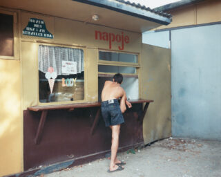
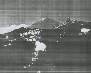
Geert Goiris, Brest, 2017
Courtesy the artist and Roma Publications
Graphic designer Roger Willems and visual artist Marc Nagtzaam (whose work predominantly comprises pencil drawings) knew each other from art school, where they had collaborated on projects. It was a 1998 collaboration that unintendedly launched the career of one of today’s most prolific small publishers of art and artist books: a forty-page booklet titled (SOME), containing text fragments in longhand by Nagtzaam and drawings depicting abstract scenes of his exhibitions. This publication, later known as “Roma Publication #1,” was followed in 1999 by seven more, most of them collaborations between Willems and the artist Mark Manders (who mainly works in sculpture, drawings, and installations), taking the format of newspapers, posters, a collection of poems, and an artist book. Two decades on, the catalogue of Roma Publications—which takes its appellation from the first syllables of the founders’ names—numbers over 330 publications.
Willems has gone on to publish many volumes and artist editions with both Nagtzaam and Manders, while in the meantime Roma Publications has expanded into “a platform to produce and distribute autonomous publications made in close collaboration with a growing number of artists, institutions, writers and designers,” as stated on its website. Most of the releases consist of art and artist books and exhibition catalogues, oftentimes in conjunction with museums and other cultural institutions, but the press’s oeuvre also contains leporellos, DVDs, audio CDs, leaflets, posters, and a website. Editions run from two to 150,000 copies, and volumes from four pages to 32,544. Depending on the subject and purpose of each publication, Willems and his collaborators determine rules for the appearance and type of distribution. Willems is responsible for most of the book designs although other designers have occasionally worked on Roma’s publications. Manders, who has a successful artistic career of his own, still acts as a sounding board for Willems, who regularly seeks his opinion on editorial or design questions.

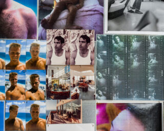
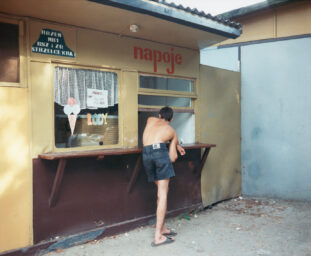
Geert Goiris, Strasbourg, 2017
Courtesy the artist and Roma Publications
Willems’s graphic design style could be called subtle, sober, (deceptively) simple, and in service of the publications’ content. In an interview with Willems for Foam Magazine, Hester Keijser noted the modernist influence in his design practice.* Willems’s preference for minimalist design has been influenced by the Dutch modernist graphic design tradition, including Willem Sandberg, Wim Crouwel, and Willems’s mentor, Karel Martens. Another motivation for his sobriety is the desire of many artists to make focused books, unfettered by external noise such as institutional logos, obligatory prefaces by curators, and so on. Many artists are also put off by designers leaving too strong a mark, so Willems considers book design “an attempt to come to the point.” A subtle design also means that the type of paper, size, and printing and binding techniques are important choices, while Willems sees technical or budget constraints as an invitation to keep carefully designed publications affordable, avoiding the path of the luxury edition.
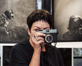
Roma Publications also regularly publishes books that may qualify as photobooks, but Willems prefers not to distinguish between these and other art publications. Whether he works on books with photographers, artists who employ photography, or artists who appropriate archival, vernacular, and other photographic imagery, the process of editing and sequencing differs per project. As a guiding principle, Willems aims to discover and to understand the specific body of work an artist wishes to turn into a book. He thinks it’s important to engage in a collaboration in a playful and creative manner, letting a book grow from the process of looking more than from thinking, as long as a project is given the time it needs to ripen, and shifted into the right focus. For example, Dana Lixenberg’s long-term portrait series about the residents of the Los Angeles neighborhood of Watts was already marked by a crisp and clear story. For what was to become the 2015 book Imperial Courts 1993–2015, Lixenberg and Willems had a large number of high-quality photos at their disposal. They wanted neither to feed four hundred of the photos into a machine-like book, nor to arrive at too small a selection that would miss the point of the overall story. In the end, Willems added an index of medium size images and thumbnails, allowing every image in the book to return in chronological order and clarify the complex interrelationships within the community depicted.
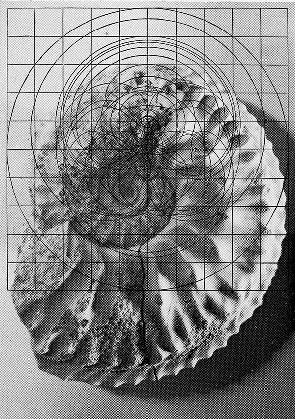
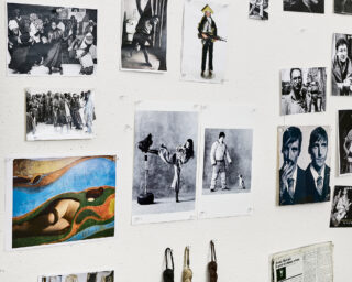
Batia Suter, Ammoniet, 2018
Courtesy the artist and Roma Publications
Artists Geert Goiris and Batia Suter also have each published more than one book with Roma Publications and have established long-term working collaborations with Willems. Goiris first published leporellos and a two-sided printed card before his photobooks Lying Awake (2013), Proliferation (2014), Prophet (2015), and Peak Oil (2017) came out. While Lying Awake recapitulates fifteen years of work, the latter three establish a series comprising works from shorter time frames, published with a corresponding design. Suter, on the other hand, recently published Radial Grammar on the occasion of her 2018 solo exhibition at Le Bal in Paris, as a sort of refreshing interlude after her intense and voluminous Parallel Encyclopedia #2 (2016). While Suter worked on the slideshow film for the Radial Grammar exhibition, Willems designed the book, for which he employed two layers of black in the printing so that image-doubling and fading effects akin to the movie could be produced in the book.
In 2014, photographer, writer, and educator Stanley Wolukau-Wanambwa proposed a photo project to Willems about violence, throughout history and into the present, which would include his own texts. In order for the project to gain a sharper focus, after consulting with Willems, Wolukau-Wanambwa continued adding images and editing his texts without any set deadline. In 2018, the project resulted in the book One Wall a Web (a winner in the 2018 PhotoBook Awards). The process benefited from not being rushed or limited by institutional constraints, so as to arrive at the type of book that Willems values most in his publishing endeavors: serious and earnest, but with a surprisingly light touch.
*Hester Keijser, “Roma Publications: Holding the Course,” Foam Magazine 33, pp. 13–18.
Read more from The PhotoBook Review Issue 015 or subscribe to Aperture and never miss an issue.
