Sara Cwynar's Contemporary Nostalgia
On the occasion of her solo exhibition in Minneapolis, the Canadian artist speaks about color and consumerism in the information age.
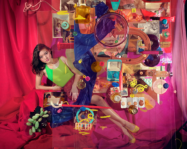
Sara Cwynar, Tracy (Cezanne), 2017
Courtesy the artist, Cooper Cole, Toronto, and Foxy Production, New York
Gabriel Ritter: Can you speak a bit about your latest body of work, the Tracy pictures? Tell us how this series came to be and how you met Tracy.
Sara Cwynar: I’ve been photographing Tracy for ten years, and she is a good friend, but I’d never really shown any pictures of people until a couple of years ago. I picked Tracy because she also comes from a design and art-direction background and she poses kind of ironically, with the knowledge of a history of representations of women in mind. I always hate when people say, “My model was a collaborator,” but in some ways that was actually really true of Tracy.
Ritter: Do you see the current series as an evolution from your earlier work?
Cwynar: I think Flat Death (2014) was more about how photography works, how it tricks us in a way. With the Tracy pictures, I was thinking more about the kind of power dynamics that go into who we see as opposed to just what. I was thinking about how anachronistic portraits are from the 1950s heyday of advertising, which only portray certain kinds of people in objectifying ways. What does it mean to see an ironic, remade version of that? Every artist has their insecurities about their work, and one of mine is that it reads as too design-y or too much about a certain outmoded aesthetic sensibility, which is only a part of what I’m doing. I always try to connect it to lived experience a bit more, and using an actual person was the most immediate way to do that.

Sara Cwynar, Red Rose, 2017
Courtesy the artist, Cooper Cole, Toronto, and Foxy Production, New York
Ritter: There is a flatness to the images you make, but also what I would call an excessive materiality in the way that you build up your sculptural arrangements. I wonder, do you see this duality between the object and the image, or the reproduction and physical reality, as core to image making now in the digital age?
Cwynar: I’m responding to an overwhelming amount of images all the time. The films deal better with that because they can keep up with this influx of information, which is very much of the digital age. That’s partly why I started making films, to try and capture this hectic, insane, macro pace a little bit more—the way that it feels like there’s so much stuff but you can’t grab on to anything.
Ritter: Could you speak a bit about your own collecting and how that figures into your photographic process? How do you go about selecting and acquiring the various objects that then find their way into your images?
Cwynar: For most of the objects that repeat in my work, I find them first in the real world and then obsessively troll eBay to find every other version of, for example, the jewelry boxes or the Avon presidential cologne bottles. I used to think I should only find objects in the real world, and there should be some surprise or chance involved, but now I think that I should use the power of the internet to explore the full range of these objects.
For the Tracy pictures, I had made a bunch of portraits of her and I had them hanging on the walls for a really long time; I would pull from objects that I had saved and see what kinds of connections could be made. For example, the Tracy photos have all these historical representations of women, snapshots of real women, and a lot of discarded, high-modernist-era designed objects. I was thinking about some shared fate of these representations of women and these objects, how they had both faded out of view or become devalued a bit by the time I found them—a connection between the way we treat objects and the way we treat humans.
For this series, I wanted to shoot through layers of glass stacked on the floor and have various objects come in and go out of focus depending on where I placed them on, between, or under those planes of glass. So I actually built these glass structures on my studio floor to photograph through. I put my camera on a giant studio stand, so the camera can be about six feet in the air, and I photographed down through the layers of stacked glass and objects. This creates an intense layering effect and changes the focus of the different objects. It helps to mesh the disparate elements into one image.
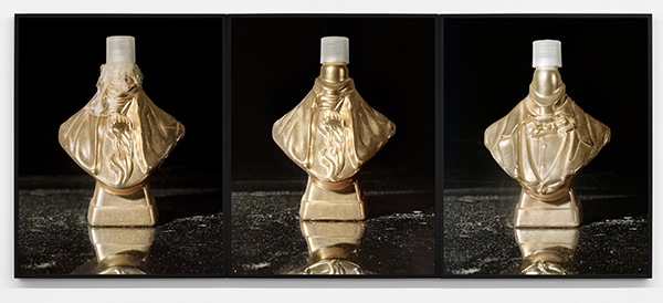
Sara Cwynar, Avon Presidential Bust (Washington, Gold, Lincoln, Gold), 2017
Courtesy the artist, Cooper Cole, Toronto, and Foxy Production, New York
Ritter: What is it about these specific objects or images that draws you to them? What about them warrants further investigation?
Cwynar: I like objects that are lightly faded in color and texture from what they were initially intended to be. Color can take you back to a specific time period, like the way mustard yellow is so 1970s. I’m always trying to find certain colors and textures that do that. I also think a lot of objects from the ’60s, ’70s, ’80s even, have simpler designs, so they’re easier to work with graphically in some ways, which is interesting to me, as a former graphic designer.
I’ve also thought a lot about kitsch and how a lot of what design or advertising does is try to erase the real fact of living: the everyday materiality of us being in bodies, that we’re going to die eventually, and that there are many unpleasant things about being human. Advertising erases that passage of time. It makes everything feel like it’s possible if you just buy the right things and it kind of glosses over the reality of being human in favor of a more idealized view of the world.

Sara Cwynar, Tracy (Gold Circle), 2017
Courtesy the artist, Cooper Cole, Toronto, and Foxy Production, New York
Ritter: You’ve not once mentioned the words “nostalgic” or “sentimental,” but those for me get at what you’re describing. Is there a certain nostalgia or sentimentality that you’re going for?
Cwynar: I’m not trying to make nostalgic work, but I am trying to walk a fine line between what nostalgia means and how design works, and also how we perceive the future versus how we just repeat the same things in slightly different forms. The overwhelming choice of our time is paralyzing for a lot of people. I actually think there’s something really contemporary about this kind of nostalgia.
Ritter: A lot of the work you do looks at color and its relationship to notions of femininity and consumerism. They’re all kind of wrapped up within advertising, as you were describing. What trends do you see materializing from the research you’re doing into color and the beauty industry?
Cwynar: I’ve been researching the beauty industry a lot and especially the way that color has been used to sell things. There’s a long history of inventing new colors to sell the same things. I’m just trying to make clear the ways that color has a politics, how it gets used as a tool to convince or seduce, and how that often gets forgotten about.
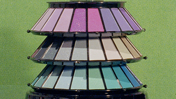
Sara Cwynar, Still from Cover Girl, 2018
Courtesy the artist, Cooper Cole, Toronto, and Foxy Production, New York
Ritter: It’s instrumentalized.
Cwynar: Yes, that’s a good word. All of these things—color and the beauty industry and design—really latch on to creating something that seems like it’s missing, and then solving that problem, like finding a gap. Like the rose gold iPhone, for example. Nobody needed a new iPhone, but they created a gap and then filled it by inventing—but they didn’t invent anything, they just changed the color.
Ritter: In the found images and magazine clippings you use, you often emphasize the use of halftone dots in print reproduction. It’s a specific aesthetic that you like to exploit that connotes a datedness to past forms of reproduction that high-resolution digital printing seems to almost eclipse.
Cwynar: Yeah, that’s true, and Flat Death was sort of about this, too—the way that images congeal into looking good, but could fall apart if you looked closer. Even any billboard that you see now, if you were actually able to get close to it, it looks like shit, but you’re always far enough away from it that you can’t tell. Once something exists in the world, it seems like it was almost inevitable, or it’s right in a way because it was printed or produced or put out there and people approved it. But actually it’s just a series of often subjective human decisions and specific technologies that led to that outcome.

Sara Cwynar, Tracy (Grid 1), 2017
Courtesy the artist, Cooper Cole, Toronto, and Foxy Production, New York
Ritter: Do you see your work as questioning historical concepts of beauty and femininity by reexamining those particular decisions?
Cwynar: Yes, but those are just some elements of it. I’m trying to dismantle this often-idealized kitsch, or often very nostalgic Western context of photography, which tells us who we think we are, and often with great bias. I’m trying to think of all the different ways that that is a false history. But I also love all these materials and I even really loved the rose gold iPhone in a way—I really wanted it. I’m trying to be clear about my own ambivalence, and how you can see the way the strategies of design and advertising are working but still be seduced by them, still want to be seduced by them somehow. Even in exposing some of the problems in the history of image making, I’m still making beautiful images, and I want them to contain some of the pleasure that made those things work in the first place.
Ritter: By drawing attention to that ambivalence, and using it critically, you don’t have to deny yourself that inherent pleasure. Instead, you can rearticulate it in your own vocabulary.
Cwynar: There’s a great pleasure in making this work, and I also want there to be pleasure in looking at it. I don’t want it to be a dry conceptual project; I want it to contain some of the emotional seductive qualities that advertising has. Part of the reason why I started making videos was that in some ways, it’s easier to be seduced by moving images than still ones because they operate in a more emotional register. I want there to be some of the same pleasure that has maybe led us astray at times in the pictures.
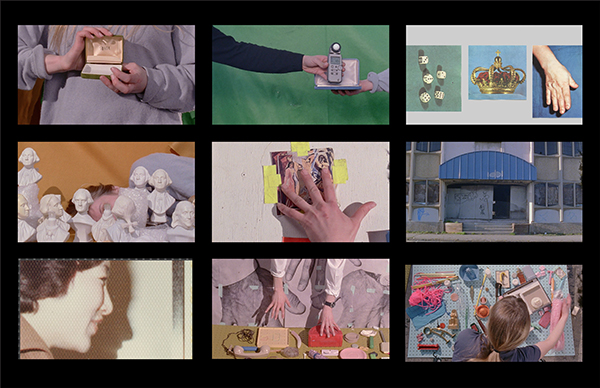
Sara Cwynar, Still from Soft Film, 2016
Courtesy the artist, Cooper Cole, Toronto, and Foxy Production, New York
Ritter: That is a nice segue into speaking about your videos. Could you talk about your shift to filmmaking over the past few years?
Cwynar: It’s been three years since I started making videos. I thought about it for a long time before, though. I wanted to be able to actually say what I mean a little bit more. My book Kitsch Encyclopedia (2014), which is kind of my first art project, has all this text and writing, and I was sort of missing that in the photos. You can access a more heightened emotional tone or valence in video than you can in photography, and that seemed really exciting to me.
Ritter: And, as you were describing, you can have that textual layer, you can have the voice-over. The way that you use these critical texts is somewhat novel because you’re using a mixture of other people’s words and your words. You’re also putting them in an actor’s voice, and at the same time, you’re there, almost like a coach, correcting them. The overlapping voices and constant interruptions break any sense of cohesive narrative, which re-creates much of what you’re working toward visually. It’s difficult to have that richness, that layered experience solely in a photographic image without it becoming too didactic. I feel like critical theory informs so much of your thinking and image making that naturally, when you come to filmmaking, text becomes your dialogue.
Cwynar: I would read and read and then make a photograph, and so much would get lost. I don’t necessarily think that’s a bad thing, but video definitely allowed for the source material to be more present. The same way I’d use a photograph in a different way than it was intended for, I want to think about how theory can become kitsch or theory can become this easily digestible way of understanding the world. In a way, theory is a privileged realm that seems really difficult to access, or at least it did to me for a long time and still does in some ways, but actually it’s just another way of repackaging and representing the world, the same way images do. I wanted to use it in the same way I’d use an image. For example, I’ll misquote people, or use something Lacan said in a way that wasn’t really the way he meant it. I know it drives theory people crazy, but I think there’s a power in it. It’s really satisfying to use words in a similar way to images and have a form that can accommodate both of those things, which can really only happen in video. Sound also changes the way an image looks. To have this kind of didactic, male voice of authority telling you something while you’re looking at the images really changes them. And then I come in and say who’s really in charge.
Gabriel Ritter is curator and head of contemporary art at the Minneapolis Institute of Art.
Sara Cwynar: Image Model Muse is on view at the Minneapolis Institute of Art through January 20, 2019, and at the Milwaukee Art Museum March 8 to July 21, 2019.
