Interviews
Behind the Scenes with the Architects of Aperture’s New Home
Stella Betts and David Leven of the architecture practice LEVENBETTS share details of the new space—from embracing the building’s history to coining “Aperture Gray.”
This week, Aperture opens the doors of its new home at 380 Columbus Avenue in New York City. Situated on the first two floors of a historic building on the Upper West Side, the bookstore and gallery is a place to gather, share ideas, and engage with photography, and will be a platform for a dynamic series of public programs.
Design for Aperture’s new home has been led by the award-winning architecture practice LEVENBETTS. Here, Stella Betts and David Leven dive into five lesser-known facts about our new space, from embracing the building’s history to the nickname “Aperture Gray.”
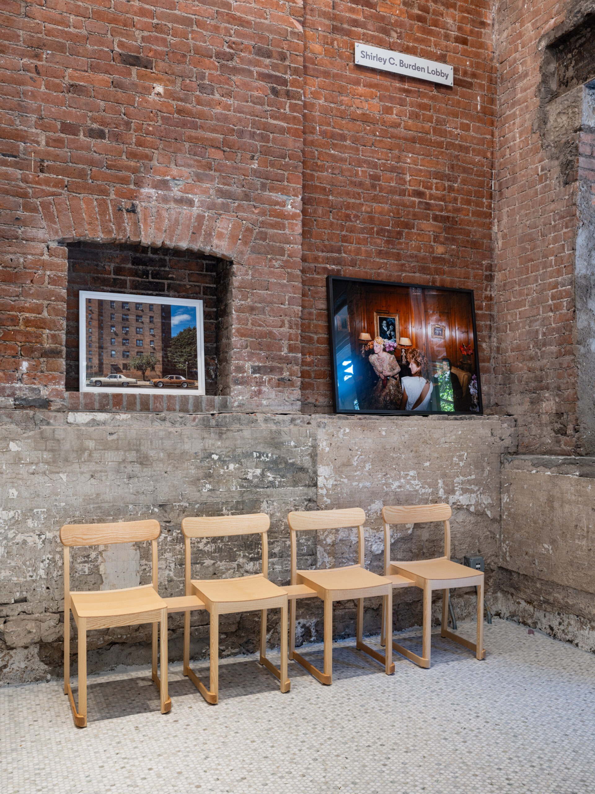
History of the Building
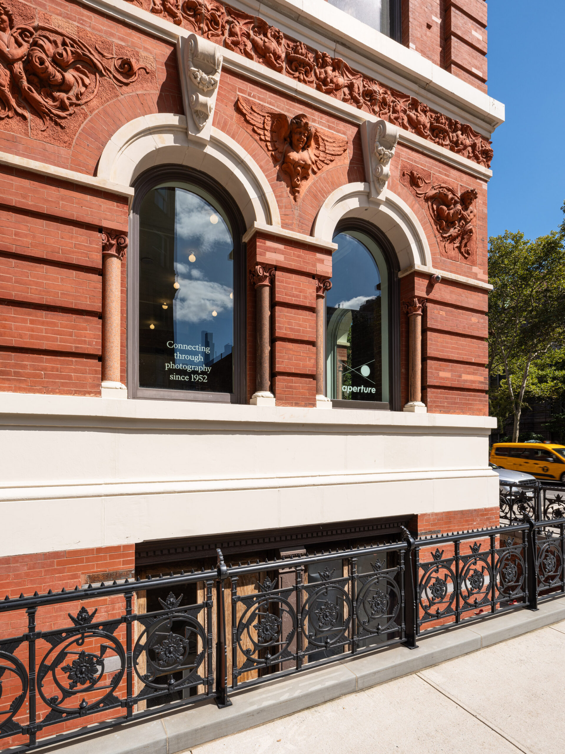
David Leven: The building is historical; it was built in the 1880s or so as a residential building called The Evelyn. It was designed by an architect named Emile Gruwe in a kind of Renaissance Revival fashion. During our research, we discovered that part of Aperture’s space was originally dining and kitchen areas for multiple apartments. It would have been a place for cooking and dining for residents who may not have had kitchens in their own apartments, alongside communal fireplaces and so on. It was a social space. The entry we have created for Aperture is located in this area. We were interested in this idea of socialness and community, which has now been carried from the past to the present, but reinterpreted in a new way within the architecture.
Bookstore & Gallery
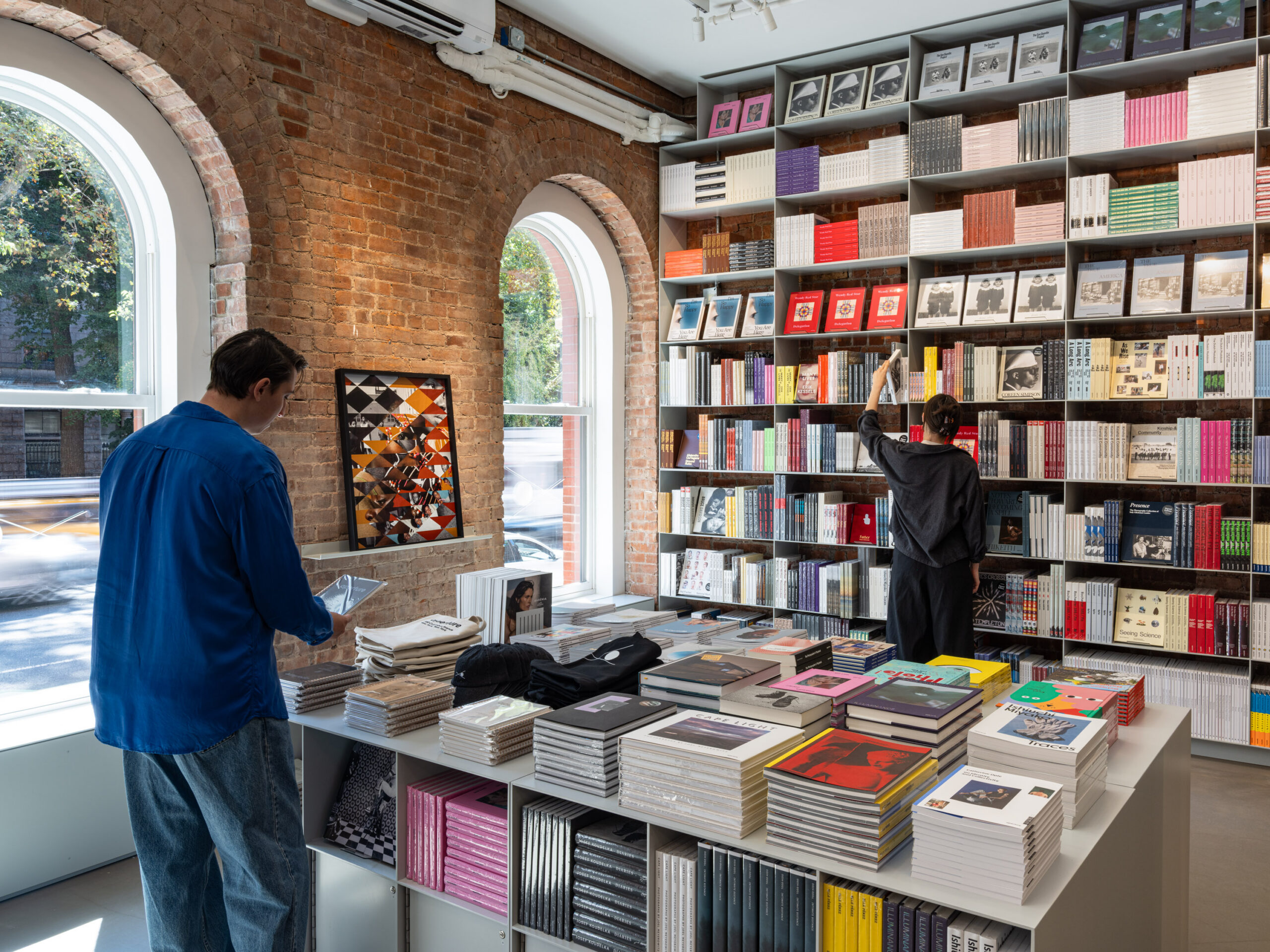
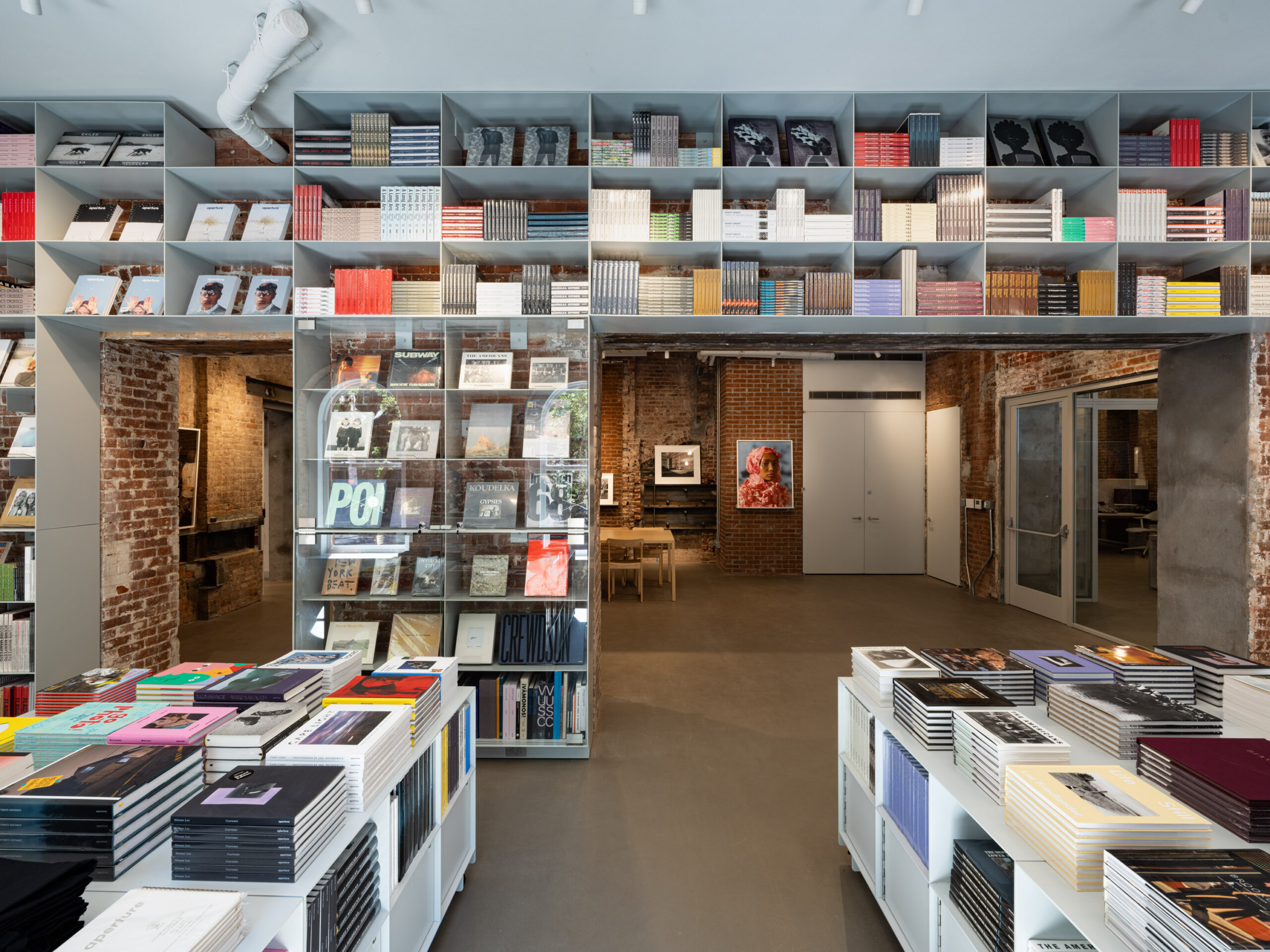
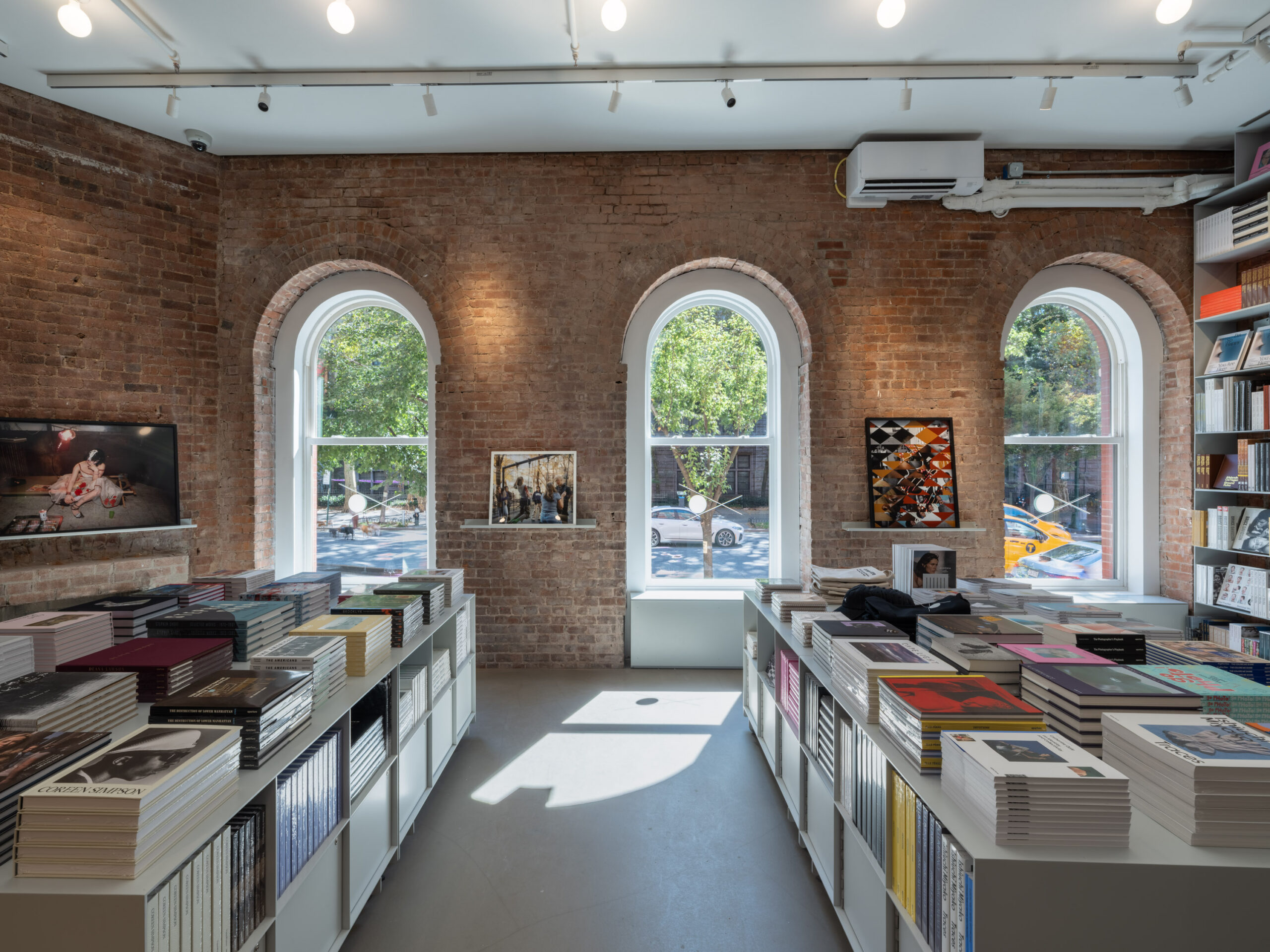
Stella Betts: The bookstore space is really about celebrating the books and the magazine that Aperture does. It’s the public face, and it was vital that you really see it when you’re on the street, and that there’s a visibility as soon as you enter from the lobby.
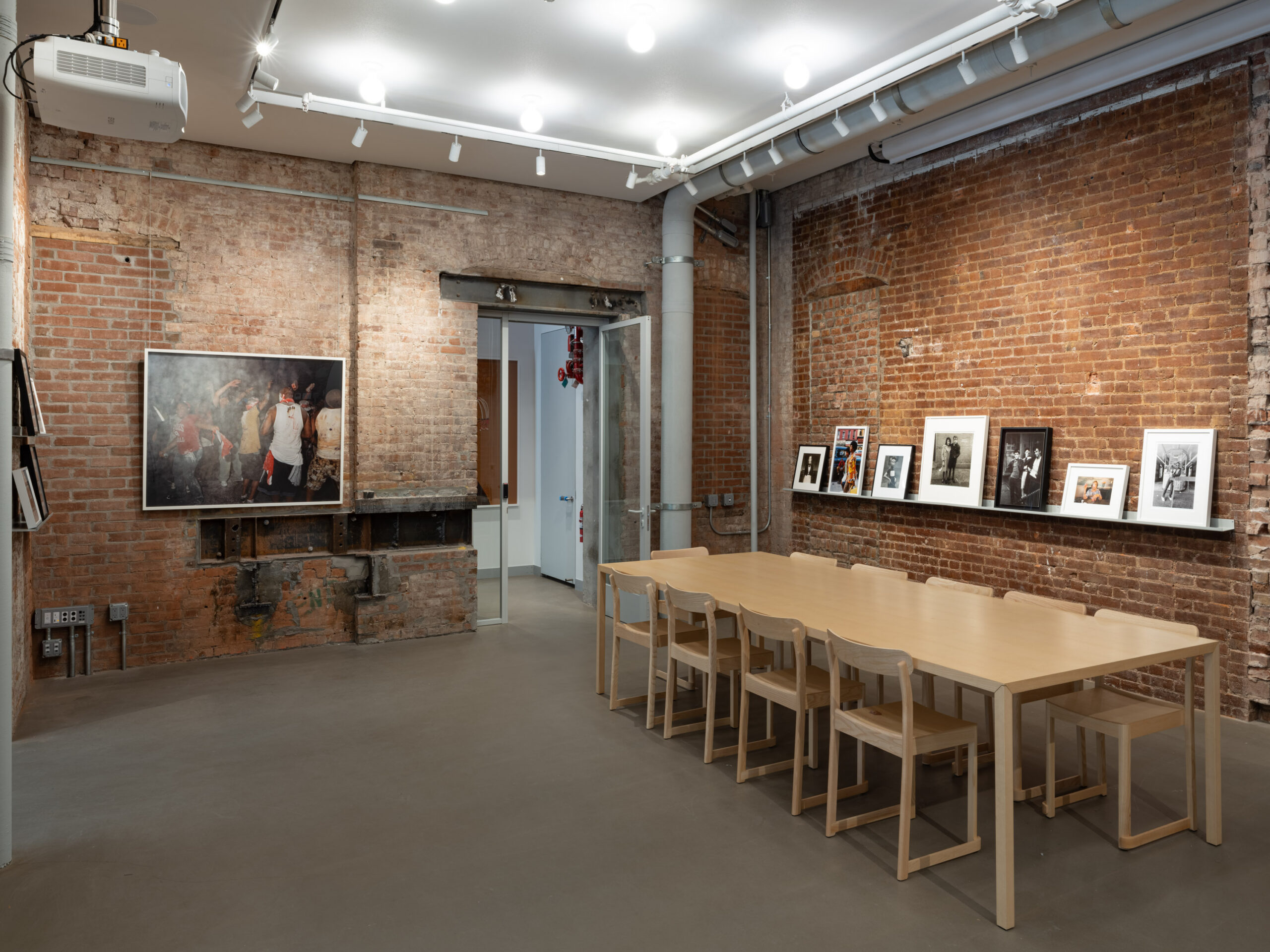
Leven: As soon as you come in, you’re seeing bookshelves and the public space. There will be talks and events that happen in this space, where we’re able to bring in chairs and a projector screen that comes down.
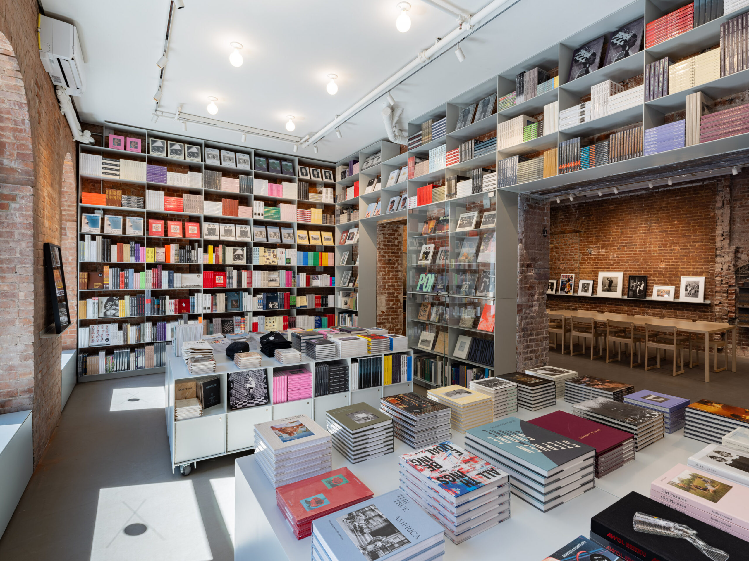
The shelving in the store has very thin lines, as a kind of juxtaposition to the roughness of the brick walls. We took into consideration how thin and minimal they could be and still carry the weight of all the books that are going to go in here.
There was also a lot of discussion with Sarah Meister, Aperture’s director, about whether to paint the gallery and programs area white, or how much do we leave or take away, what gets cleaned or left. In the end, we all decided that we really wanted to keep the markings and the character of the original building. And I think that that still works well with the photography that will be shown here, almost becoming in dialogue with the building itself.
Emphasizing the Existing Materials
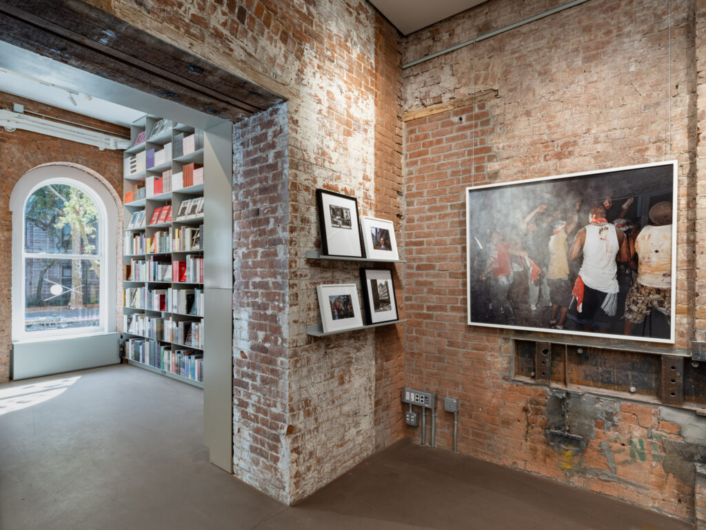
Betts: When we were initially looking at potential spaces for Aperture’s future home, I think the idea of moving to the Upper West Side was a little bit of a leap. For the past twenty years or so Aperture had been located in Chelsea and had even set its sights on SoHo and other neighborhoods. What we all fell in love with about this space and location is the character, the history. And we wanted to continue to capture a downtown loft feeling—what David calls “the rawness of the space.”
To do this, we made an effort to leave a sort of history of the building. That’s also a really important thing for us in terms of what we love about photography, it’s about telling stories. What was significant with this project was to tell the story of the building and to not remove that history.
Leven: We’ve had so many great conversations about how much do we leave, how much do we take away, what gets cleaned, what gets preserved. There are steel lintels holding up thousands of pounds. There are original archways and markings and brickwork throughout. It all goes back to this idea of the history and story.
Betts: A big part of the design process was cataloging every single wall. We photo-documented each wall and made decisions in terms of to what degree certain things were going to be cleaned. For example, many of the walls retain so-called imperfections that in other projects would be removed.
Aperture Gray
Betts: We took this approach of what we are calling “insertions,” where we’re adding to the space and making it distinct from the existing space. These insertions were created in a palette that we affectionately named “Aperture Gray,” which was partially based on the photography Zone System.
Leven: This was also in order to not add too many other elements within the palettes and things you see. The light Aperture Gray color recedes into the space, but it’s also omnipresent throughout: the doorframes are all the same color. The bookshelves are all the same color. The desks pick up that color.
Betts: The books themselves will animate the space, and there’ll be photography in the gallery as well. So, the idea for us was to let the building be present with the photography and books, and the additions that we’ve made are in this neutral Aperture Gray.
Equity of Light
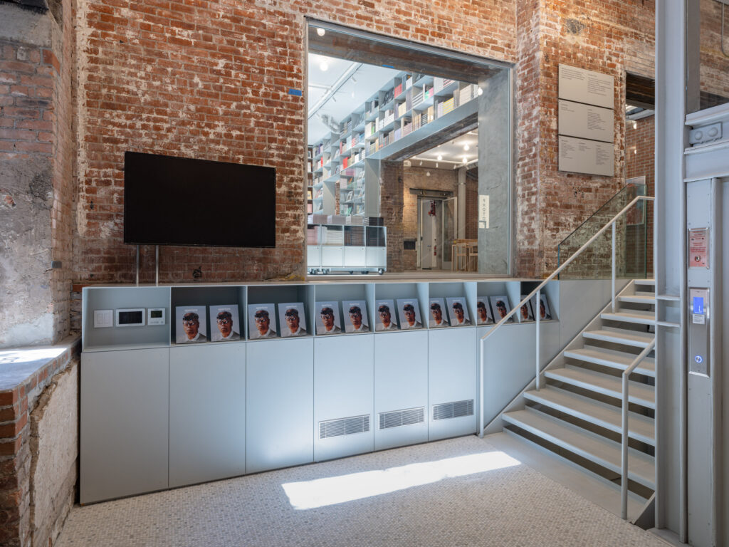
Betts: Aperture’s home has a split between two floors, so you need light for both the lower level and the upper level, and we really wanted to have all areas have some degree of shared light or direct light—an equity of light. The idea of transparency also was really important.
Downstairs there are some very thick, heavy stone foundation walls that have beautiful texture. Although there are windows, the lower level doesn’t get the same amount of light as the upper floor. In order for the light to bounce, we decided to paint the entire downstairs white—while keeping that original texture. When we had conversations during the design process it was very much like seeking a kind of Robert Ryman white-on-white painting where you get just a single palette color, but you get to enjoy the texture of the wall itself. It all goes back to the character of the building.