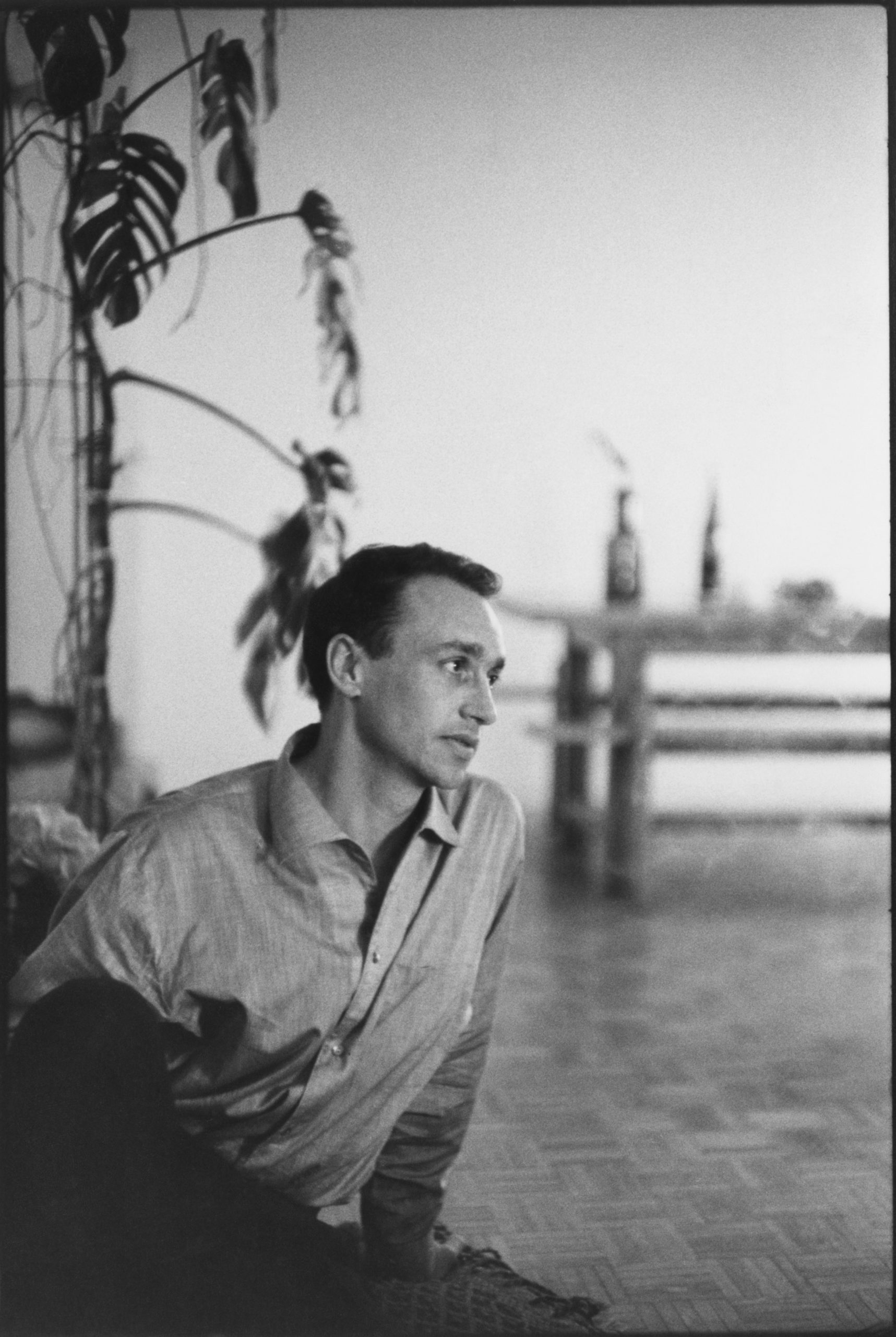
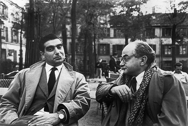
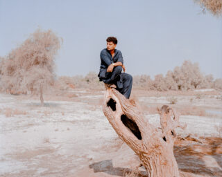
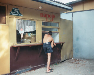
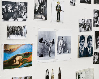
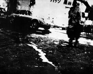
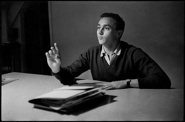
Henri Cartier-Bresson, Robert Delpire, 1960
© the artist/Magnum Photos
Aperture commemorates the life of Robert Delpire (1926–2017), the publisher, editor, and curator, whose vision defined twentieth-century photography. In this interview from 2012, Melissa Harris spoke with Delpire about his projects with luminaries including Henri Cartier-Bresson, Robert Frank, and William Klein.
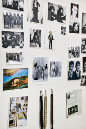
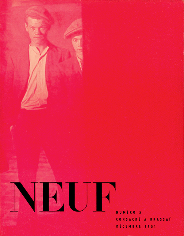
Over the past sixty years, the eyes and instincts of Robert Delpire (1926–2017) have shaped much of the world’s understanding of photography. A prolific publisher and exhibition organizer, with a razor-sharp comprehension of the graphic arts, Delpire has had a defining hand in the careers of many of the master photographers of recent history. He began his own trajectory in the early 1950s—incongruously—as a student of medicine in Paris. At that time, the Maison de la Médicine (like the “houses” of other university faculties) hosted both cultural and sports activities; Delpire had a taste for competitive sports and frequented the place. The Maison—to justify itself to the ministry of education—produced a modest semiannual bulletin, and found itself in need of someone to take over the publication’s production. At the age of twenty-two, Delpire agreed to take the gig, but soon transformed the bulletin into a luxe magazine, which he called Neuf. With the brash confidence of youth, he approached and convinced a stunning array of luminaries to contribute: writers such as André Breton, Henry Miller, and Jean-Paul Sartre; photographers such as Robert Doisneau, Henri Cartier-Bresson, and Werner Bischof.
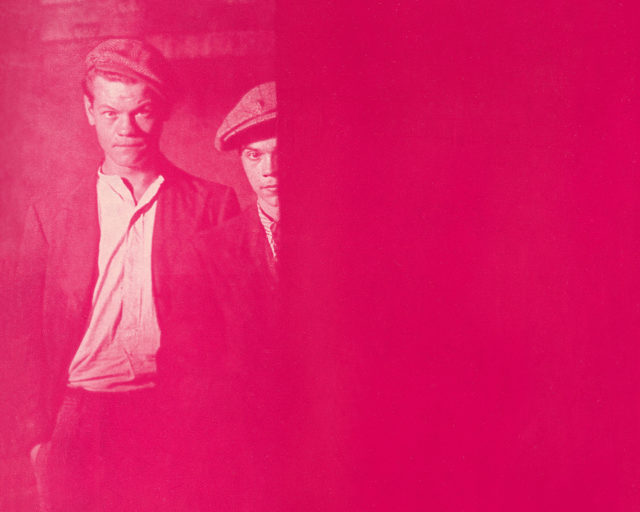
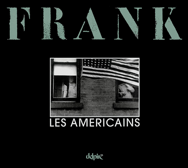
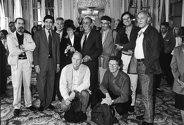
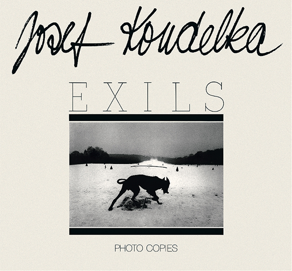
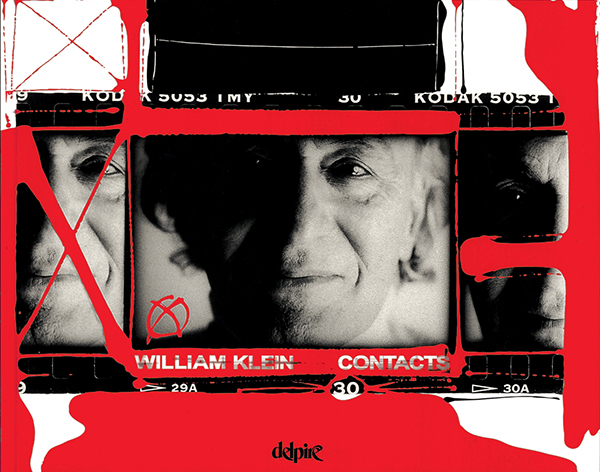
Within a few years, the former medical student realized he had found his calling and launched what would become one of the most important photography and graphic-arts publishing companies of its time: Éditions Delpire. Among its earliest ventures were the publication of Brassaï’s first-ever monograph, and several books with the Magnum pantheon, including Cartier-Bresson, whose close friendship with Delpire over the following half century resulted in countless collaborations, among them the seminal publication Henri Cartier-Bresson: Photographe (1979). In 1958 Delpire took a chance on a project by a little-known Swiss photographer named Robert Frank: that book, Les Américains—The Americans—would of course set the world of photography on fire; more than fifty years later, it remains a provoking standard of the medium. Delpire later worked with William Klein, beginning with his Moscow and Tokyo books of the mid-1960s, and with Josef Koudelka to produce numerous publications, from 1975’s Gitans (Gypsies) to 1999’s groundbreaking collection of panoramas, Chaos.
Courtesy Delpire Éditeur
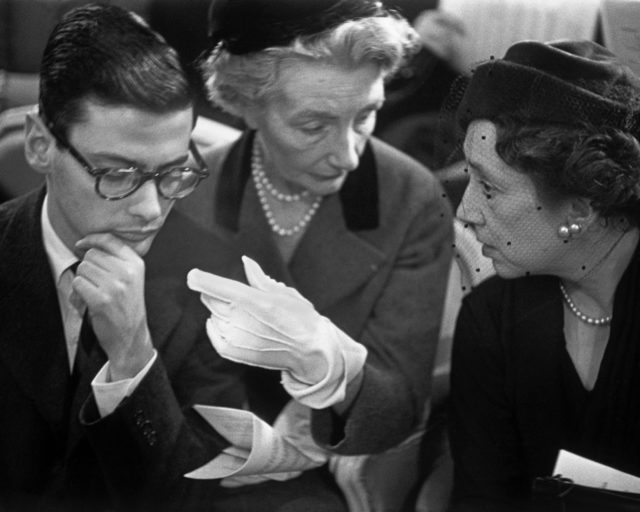
A perspicacious businessman, in the 1960s Delpire initiated a publicity company that soon was managing such lofty clients as Citroën, Cacharel, and L’Oréal. He also found time to art-direct magazines (notably the contemporary-arts journal L’Œil), to produce films (among them William Klein’s Cassius le grand [Cassius the Great, 1964] and Qui êtes-vous, Polly Maggoo? [Who Are You, Polly Maggoo?, 1966]) and to open and run a gallery on Paris’s rue de l’Abbaye, showcasing work by photographers Koudelka, August Sander, Walt Kühn, Duane Michals, Guy Bourdin, and others, as well as a bevy of illustrators. In the following decade, working with editor/publisher of Le Nouvel Observateur Claude Perdriel, Delpire began producing photography-driven special editions of the magazine; these Spécial Photo issues featured a range of powerful images, from the antique masterpieces in the collection of André Jammes to work by more recent artists such as Diane Arbus, Richard Avedon, and Lee Friedlander.
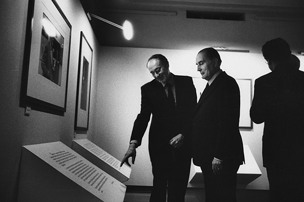
In 1982 French minister of culture Jack Lang invited Delpire to head the newly created Centre National de la Photographie in Paris; over the course of his fifteen years in that position, Delpire mounted more than 150 exhibitions. Also in the early 1980s, Delpire launched Photo Poche books: a series of gorgeous yet modestly tailored publications on photography and graphic arts, engaging and accessible in both price and spirit to the common reader—a milestone in the world of arts publishing.
Melissa Harris conducted this interview with Robert Delpire via correspondence, over the course of a year.
© the artist/Magnum Photos
Melissa Harris: What is the relationship between a book and an exhibition?
Robert Delpire: One might think that it is easy to extrapolate the organization of an exhibition from the layout made for the corresponding book. Curiously, this is wrong. The reading of photographs fixed on a wall is totally different from the one you get in turning the pages of a book. It’s a question of perspective, certainly, but also a consequence of the visitor’s position in front of a panel on a wall. But also, importantly, a photograph printed in a book is received by the reader as a unique offering. In a museum or in a gallery, the visitor’s eye is constantly solicited by prints, which are often of different sizes, and which he or she can choose to look at in a different order than the sequence proposed by the curator.
MH: How do you work with that? Do you sequence an exhibition with multiple entry points in mind?
RD: In planning an exhibition, one can work toward effecting a cinematographic vision—in a succession of images, there is often a narrative—as a way of taking advantage of the three-dimensional structure of the space. The solutions to the problem are quite traditional. In an exhibition, one has the possibility of creating a contrast between medium-size pictures and big prints. This solution is very simple to do—and so it is commonly used.
Still, there are no strict rules. One has constantly to adapt convictions or ideas to the situation, to the lighting, to the size of the room. Another interesting element that allows one to give a special ambiance to a show is the color; it is easy to paint the walls, and it is sometimes very effective. When I was in charge of the Centre National de la Photographie, I decided to paint the walls a flaming red when we presented a selection of Marc Riboud’s photographs of China (1996). The result was amazing. But it doesn’t work every time. For the Robert Frank exhibition (1983), I had the idea to cover the walls with craft paper. I liked the result, but Robert hated it and asked me to take the paper off. He wanted a classic hanging, so that’s what we did.
When possible—but it is rarely the case—it is very exciting for a curator or an art director to create the space itself, by building walls, or making them curved, for instance. It’s a privilege to think not only in terms of flat scenography but of the very architecture of the exhibition. I have had this opportunity in some circumstances. At the Palais de Tokyo, the space is large and I organized a show with this kind of freedom for William Klein’s Le commun des mortels (The common man, 1987). And also at the Bibliothèque Nationale de France for the Henri Cartier-Bresson exhibition (2003).
Courtesy Delpire Éditeur
MH: Do you feel that there are relationships among photography and painting, sculpture, music, mathematics, and so on? Or are there absolute distinctions?
RD: The absolute distinction is due to an obvious fact: photography is made from reality—no matter what distance a photographer wants to create between what he or she is photographing and what he or she has in mind. Of course the painter and the filmmaker also take advantage of a visual basis in reality, but there are many ways to transform a drawing or a film and adapt them to a concept. René Magritte said: “Ceci n’est pas une pipe”—“This is not a pipe.” He was right. And a collage made by Robert Rauschenberg or John Heartfield could be said to be situated at the frontier of photography and painting. But for a photographer, it is impossible to forget about the “performance” of a negative: its first function is to register reality. Consequently there are millions of photographs carefully archived in agencies or foundations or in public repositories that are without any interest—apart from a documentary interest in lifestyles, architecture, fashion.
MH: Do you think about beauty and photography—not in terms of pretty pictures, but something more profound? What is it? Truth? Is there such a thing as a truthful photograph, an evidentiary photograph, an objective photograph?
RD: Beauty and photography. Or beauty in photography? It’s a difficult subject. All the professionals (or almost all) are aware that it is not enough to be in front of a beautiful landscape or an elegant lady to make a good photograph. In a certain sense, it’s too easy to make an image with a camera. And the digital process makes it even easier. This facility explains the enormous success of photography among amateurs.
But to make more than a simple statement in a photograph, one has to enhance the significance of a fact, the psychology of a person, the specificity of a subject. And everything becomes much more difficult. Making a good photograph requires sensitivity, patience, vivacity, graphic sense, not to mention technical knowledge. The talent is “the cherry on the cake,” as we say in French . . . We publishers are looking for the cherries.
I’m also attracted by certain authorless photographs that I’ve discovered. Among the uninteresting prints—badly developed, torn—we sometimes find marvels. Family albums, souvenirs of wars or vacations, portraits, and situations that make up a person’s intimacy, tenderness, passion—sometimes to the point of indecency, because there was no one there witnessing. But I’ve never sought to establish a connection between the work of great photographers and the naïveté of the amateur . . . it’s their status as art brut that has seduced me and not their relation to photography considered as fine art.
MH: What are the possible dynamics between photography and text—how and when do they enhance each other? And how do these considerations enter into your design and sequencing as you are working?
RD: It is generally admitted that a good photograph needs no words, not even a caption. Nevertheless, when working on a magazine or a book, the publisher often hesitates—text or no text? It seems evident that a so-called reportage photograph will benefit by being seen in context. To know that those dead bodies piled on a street curb are victims of the Mafia and not demonstrators killed by the police is no minor detail and will influence the way the image is interpreted.
And when a photograph aspires to formal artistic achievement, and when the author wants to express his or her personal emotions, a commentary may be useful to deepen the reader’s understanding of the image. Positive: it might create empathy. Critical: convincing arguments can cut down any sympathy with what is shown in the photograph.
In the Nouvel Observateur Spécial Photo we chose to accompany images with extensive captions by various writers, who, in my opinion, succeed both in giving adequate information about the photographers and in clearly pointing out the specific features of each document.
In general, I am careful to put text and image together that will function in concert with one another—not text that simply comments on the photographs. Ever since I have been involved in the making of books and magazines, I have tried to find the writer who by nature feels close to a given photographer, and whose analysis will increase the reader’s interest in the subject matter.
MH: What would you cite as a major text on the interpretation of images?
RD: The first ones that come to mind are Roland Barthes and André Jammes. I also am very interested in Susan Sontag.
Courtesy Delpire Éditeur
MH: When you are working, do you rely primarily on your intuition? When, if ever, is your process more intellectual? More emotional?
RD: Fundamentally, I am an intuitive person. Each time I have to make a choice, for instance to select a good photograph on a contact sheet, to build a sequence, even to make a general decision concerning a book to publish, I am always most comfortable if I follow my first impulse. It would be very pretentious to say that I am always right—but if I do make a mistake it’s always in accordance with my feelings, my deep convictions (even if I don’t express them). My way of working is much more emotional than intellectual. I feel more than I know.
MH: When does a photograph—or any kind of image or story—get under your skin?
RD: There are so many elements in a photograph that can get under your skin. Compassion, pity, empathy, seduction. It depends on your mood, on your mental state, on your physical health . . . But in fact, I am not being sincere when I say that! As far as I am concerned, when a photograph touches me profoundly, I do remember it, whatever the circumstances. When we were looking at contact sheets, Cartier-Bresson used to say ironically to me: “You are really stubborn. Twenty years after a first edit, you mark red crosses on all the same images.” My answer was: “That’s the advantage of being narrow-minded.”
But please don’t ask me to list my favorite photographers—there are too many. It’s the reason I sometimes scratch my skin. There are photographers who are mere witnesses, who see things and scoop up events. And those who say what they think in their photos—those are the artists . . . For them, the “I” is so cumbersome that they can’t separate themselves from it.
Courtesy Delpire Éditeur
MH: I interviewed William Eggleston a couple of years ago, and we ended up talking about John Cage and Bach. Music is key for many artists, although not always in a literal way. Does music enter into your process?
RD: When I first met the head of Citroën, Pierre Bercot, he greeted me in an icy fashion. But we started talking about Bach’s Cello Suites—and his opinions changed about the ads I was proposing for the company’s publicity campaign.
MH: In a project, what are the responsibilities of the publisher, the curator, the designer, the artist?
RD: I’d like to change the hierarchy of those responsibilities. The first person responsible for a book project is the artist. The others are the publisher, the designer, the printer, and the separator—the person who makes the film from which the book will print. Each specialist in his field of ability or competence has the same objective: to enhance the specificity of the author’s talent or to make an image more significant. In this respect, the separator and the printer play a very important role in the results—and I am very grateful to them.
Courtesy Delpire Éditeur
MH: Do you like to collaborate?
RD: Yes, I do. I have always liked working on a team.
When I was young, I loved sports at a high level of competition. I was on a team that was five-time champion of France in basketball—and we played against the Harlem Globetrotters! I played only team sports.
The first magazine I did was Neuf. At the time, each of the university faculties had to justify their existence by publishing a little bulletin. No one wanted to take on the bulletin for the faculty of medicine. The department director proposed the job to me—it seemed at first like a punishment, and I said no. And then, oddly, I accepted—on condition that it would be a magazine with good texts and good illustrations . . . There was just one delicate catch: I had no competence. No experience in publishing. Nothing even related. I came from a milieu in which the word “culture” didn’t exist. So why? Honestly, I have no idea what was behind my decision . . . So, in the unconsciousness of youth, I asked for texts from Claude Roy, Jacques Prévert, André Breton; photographs by Cartier-Bresson, Doisneau, Brassaï; drawings from André François, Saul Steinberg. And I was astonished to be so warmly welcomed. I understood only much later that what seemed at the time such a heavy handicap, my young age, was an exceptional trump.
I created a publishing and advertising agency, and the company grew bigger and bigger. In the 1970s we were in charge of the communications for Citroën International, Habitat, Cacharel, L’Oréal, et cetera. But I discovered that I couldn’t stand working with 140 people. I hated to be in an elevator without knowing if the people in there with me were colleagues or visitors! So I reduced our activity to publishing and art direction. But then when Jack Lang asked me to manage the Centre National de la Photographie, I said I’d take the job for two years—and then I stayed for fifteen. It was the best period of my professional life: working again in a team, but with a reasonable number of collaborators.
After all these adventures, I can say that I have the good fortune to collaborate always with people I like.
© the artist
MH: Finally, could you tell us about the genesis of Le Nouvel Observateur Spécial Photo?
RD: Again, this is a story of friendship. I met publisher Claude Perdriel when he had just created Le Nouvel Observateur with Jean Daniel. I found that I was in complete agreement with what Claude was doing—emotionally, literarily, and politically. At his request I became involved in the layout, in particular with the covers. Some years later, when designer Herb Lubalin came to work with me, I asked him—the greatest graphic designer of the century—to revise the type, which he did masterfully.
For a long time, we discussed with Perdriel the place that a magazine like Le Nouvel Observateur should grant to photography—how texts and illustrations could relate to each other, and how to preserve the integrity of the text, but also benefit from the impact of images, which often reveal the context of current events so profoundly. We eventually arrived at the conclusion that Le Nouvel Observateur could publish an issue conceived for and dedicated to photography. Out goals were to show—without excessive didacticism but with the desire to educate about the history of the medium—a selection of photographs that would comprise images from both great, well-known individuals and lesser-known artists, in order to reveal photography’s astonishing history and importance, which has constantly been reaffirmed. This is how Le Nouvel Observateur Spécial Photo came to be, starting in 1977, and after a long break, I have it started once more.
And now, we are in the present.
This article originally appeared in Aperture, issue 207, Summer 2012.
