Between Analog and Digital—Jason Evans In Conversation with Kieran Hebden (Four Tet)
Jason Evans, NYLPT iOS app, 2013. Produced by MAPP, London. Designed by Grégoire Pujade-Lauraine and Jason Evans.
Photographer Jason Evans and musician Keiran Hebden (a.k.a. Four Tet) have been collaborators for the past fifteen years. They share a fascination with utilizing both old and new technologies in their creative lives. Evans’s most recent book, NYLPT (MACK Books, 2012), features images collected in New York, London, Paris, and Tokyo. Evans re-exposed the same frames of film up to five times, overlapping images in a search for “chance, happy accident, luck.” The project appears as an iOS app produced by MAPP, the new digital publishing arm of MACK Books. Evans has created work for major fashion and commercial campaigns; his photographs have also been exhibited internationally and published in dozens of publications, including the Spring 2013 issue of Aperture magazine (#210). He is the founder of the websites TheDailyNice.com and TheNewScent.com.
Since the late 1990s, Hebden has released music under the moniker Four Tet. His albums include Pause (2001), Rounds (2003), Everything Ecstatic (2005), There Is Love In You (2010), and Pink (2012), and he has created mixes for the prestigous series DJ-Kicks and FabricLive. He has collaborated with the musicians Burial, Thom Yorke of Radiohead, and the late Steve Reid, and he has remixed dozens of other artists’ songs. This conversation, held in London on January 25, 2013, outlines a common creative ground between photography and music in the digital realm.
Jason Evans: NYLPT is an expanded body of work that has found two homes. One is a digital format with an audio component that’s immersive and essentially nonlinear in its narrative. It is never evoked in the same sequence [of sound or images] more than once. I think you’d have to watch it every day all the time for about two lifetimes to see the same thing twice. Whereas the printed book is a much more narrative-structured object that you might look at once or twice. There are conscious narrative interruptions in the printed book. The fact that it’s a softcover means that it is designed to be flipped through, that it’s hard to differentiate the front from the back—things like that. There are interrelations between the digital and analog forms, but what I wasn’t trying to do was to make different versions of the same thing. I mean, NYLPT could also be an exhibition, and if it was an exhibition people would be less likely to question the variance between what’s on the wall and what’s in the pages of the book. But as soon as you compare a physical book and an ambient digital version, people are more likely to question the difference.

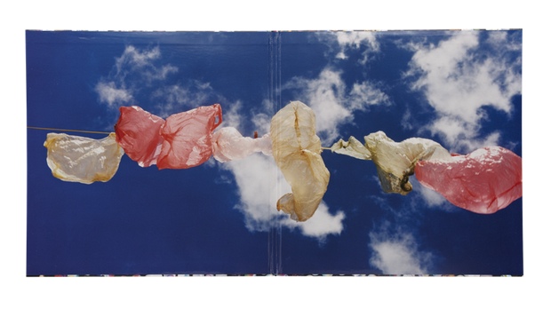
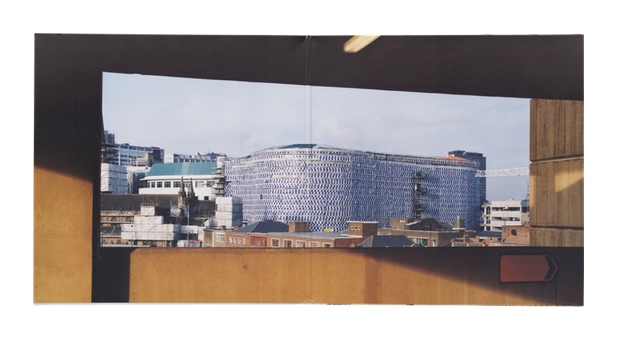
Jason Evans, spread from NYLPT, 2012. London: MACK Books. Designed by Grégoire Pujade-Lauraine and Jason Evans. 11 5/8 x 9 1/2 in. (29.5 x 24 cm), 160 pages, 80 duotone plates. Paperback with flaps.
Kieran Hebden: I think it makes sense today almost not to worry about those concerns too much, to be less conventional. You could say, “I’m not really interested in doing an exhibition. That’s not what I’m about right now. I’m going to put a book out through a conventional book publisher and they are going to do their thing. And then I’m going to do an app with the same material, but it’s a completely different thing. It has totally different images and it has a synthesizer soundtrack. I’m going to put that out and a different group of people will relate to it.” I think people can do things that way now and have it be okay.
I decide things like the price of my records and other releases based on how people will feel about it in the shop rather than the budget for the production or anything else. I’ll consider losing money on the production if I believe it’s going to make people think or make people happy. And sometimes you charge more for things because you know that people will then take them more seriously. I know that because I’ve got that same sort of fetish. I say things to myself like, “Oh my God! They are only releasing 150! They’re £25 each, but I’ve got to buy it.” I don’t know how well that translates to the world of photography and photobooks. Maybe you have a situation where you could release everything digitally, totally disregarding the commercial world, knowing that it was going to create such a hoo-ha that you will be invited to photograph Kate Moss for H&M and then you can buy a new house or something . . .
JE: It’s funny because that’s exactly how it works. [laughs]
KH: I can’t shake my deep respect for the tradition of the album: maybe forty-five minutes long, two sides, a kind of experience in itself, with the sleeve and all the artwork. I find that whatever I’m doing with music I keep coming back to that as a very pure and perfect way to put music together. Releasing my music that way allows it to be part of that history, and if I know that people might have my album sitting on the shelf next to . . . well, I can’t resist wanting to be part of that. I am very aware that we now have created an enormous body of artwork together. And the whole collaboration has become a sacred thing to me. How long have we been working together? Fifteen years? This is an unbelievable amount of music and sleeves, and two people have seen the whole thing through. Pure bodies of work like that don’t exist so much these days. I love labels like ECM Records or Impulse, for which people had an artistic vision and were militant about it, saw it through.
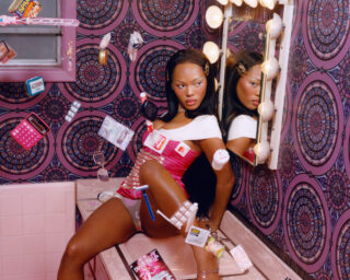
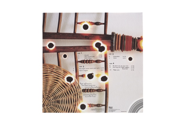
Interior gatefold of Four Tet, There Is Love In You LP, 2010. Domino Recording Co. Design by Matthew Cooper and Jason Evans; photographs by Jason Evans.
JE: We are both so passionate about music artwork. You mentioned ECM and I get really excited by Hipgnosis. Why do you think that the history of music-industry artwork has been neglected? So many great pieces of music from great albums have an extraordinary visual-physical presence . . .
KH: I think it has been seen as solely a functional part of music culture. Some of the best sleeves that I own are for library records, and the person doing the sleeve would never have heard the music. They simply would have been commissioned. You know, “We need something! This record is called Industry 4, we need something that goes with that.” And they would make some bonkers painting, then put some crazy text on it and say, “Here you go!” And the record wasn’t even being made for commercial release. We look back at it now and think, “This is the best record sleeve I’ve ever seen. This is amazing music.” But it’s very, well, functional.
JE: The kind of photography I like was never intended as art. The kind of music and artwork you’re describing were never intended as art.
KH: But maybe in four hundred years someone will look at a Cornflakes box and think, “Oh my God, these people were mad!” [laughs] “This crazy, crazy thing. How beautiful is that?”
JE: That should be the case! I collect Japanese chewing-gum packaging because it’s a really bizarre visual manifestation of late capitalism and it has driven people to insane heights of aesthetic discourse in the same way that LSD did in the late 1960s.
KH: Record sleeves must be getting made for so many people in that purely functional way and I’m an enthusiastic record collector, so it appeals to me. I’m a big believer in the concept that time will tell. After ten years or so you can get some sense of whether something was any good or not, be it the music or the sleeve. We find these records from the 1960s and ’70s and think the sleeves are fantastic, but maybe at the time we would have thought absolutely nothing of them. At some point in time someone is going to find these things and they are going to be relevant and exciting and inspiring. One of the best things about having your NYLPT book out is seeing people getting excited by it. But the part that is even more exciting is the idea of some kid finding it on her grandmother’s shelf, you know—
JE: Yes, I do—
KH: —Seventy-five years from now, and it’s sitting next to an A-to-Z and a copy of Reader’s Digest. They’ll think, “Well, I’m going to sit on the toilet and read this one today. . . .” And then realize, “Whoa, this is amazing!”

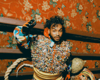
Interior gatefold of Four Tet, Everything Ecstatic LP, 2005. Domino Recording Co. Design by Matthew Cooper and Kathryn Bint; photographs by Jason Evans and Simon Foxton.
JE: I hope so. It’s funny you should say that because when I designed the book I was thinking about a book by Marianne Wex that I had stumbled across. I love the format of Let’s Take Back Our Space—the printing quality and the design, the naïveté versus or counterbalanced by the intention. It was really important to me. The kind of photobooks I get excited about are like the kind of record covers that we get excited about . . . things that were never too self-conscious—or maybe self-conscious but not very self-aware. And especially when I’m on the West Coast of the U.S., I go to thrift stores and I find a book from the 1970s about how to make a teepee or how to make your own toffee. I want NYLPT to end up battered and found on such a shelf. I’ve got a copy that I carry around in my rucksack to get more knackered, so it can look like it should. The form of the book is obviously really important, but the form is designed to bring you back to the content.
KH: You should plant copies in bizarre places.
JE: I’ll let you know!
This interview has been condensed and edited.

Front cover of Four Tet, Rounds LP, 2003. Domino Recording Co. Design by Matthew Cooper; photographs by Jason Evans.
Interior gatefold of Four Tet, Rounds LP, 2003. Domino Recording Co. Design by Matthew Cooper; photographs by Jason Evans.
Back cover of Four Tet, Rounds LP, 2003. Domino Recording Co. Design by Matthew Cooper; photographs by Jason Evans.