How to Produce a Photobook
Four bookmaking experts speak about each step of the production process—from making an image sequence to finding the perfect paper, size, and design.
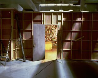
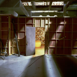
Studio of Bart Lunenburg, where the first rounds of editing were done for This Creaking Floor and All the Ceilings Below (FW: Books, 2021)
Courtesy Hans Gremmen
What does it truly take to make a photobook? Making a photobook is like playing a puzzle or a game, one with plenty of room for creativity within certain rules or parameters. As Christina Labey, cofounder and creative director of publisher and bespoke production house Conveyor Studio, puts it: “One thing I love about the book format is that it inherently has limitations.” There are many possible permutations in book design, which is perhaps why Labey and other publishers and designers often get involved early on. This can mean coming on board when the project exists solely as a folder of images—or even before the photographer has started shooting.
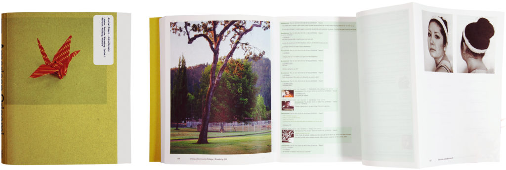
Designer Hans Gremmen is the founder of Fw:Books, the respected Dutch publisher behind award-winning titles such as Andres Gonzalez’s American Origami (2019) and Lora Webb Nichols’s Encampment, Wyoming (2021), as well as designing a number of Aperture publications, including the ten-year anniversary edition of Rinko Kawauchi’s Illuminance (2021), Ametsuchi (2013), and Halo (2017). Gremmen, who has worked during the concept stage and while the photographer was still making the series, explains how getting involved early can allow for a holistic approach, for thinking of the book and the project together. The approach also helps to prevent issues such as realizing too late that something is missing.
Cécile Poimboeuf-Koizumi, director of French publishing house Chose Commune, always approaches the artists she wants to work with so she can broach the possibility of a book before they’ve even thought of it. And for Cemre Yeşil Gönenli, the artist, publisher, and brains behind Istanbul’s FiLBooks, the first step is to question whether a project should be a book at all. “I get involved when I really think that the book as a format adds to the narrative of the story,” she explains. “I feel I need to justify the reason behind why that specific work has to be in a book form.”
If a book makes sense, these makers typically get involved in editing and sequencing the images. This can be done digitally—with Poimboeuf-Koizumi using Adobe Bridge to edit images before sliding them onto InDesign—but will usually also involve physically printing the images and laying them out. Making a photobook will always involve making a dummy or prototype at some stage, though this may be without the images. As Poimboeuf-Koizumi points out: “The act of flipping through pages is definitely not the same as clicking on a PDF.”
Courtesy Hans Gremmen
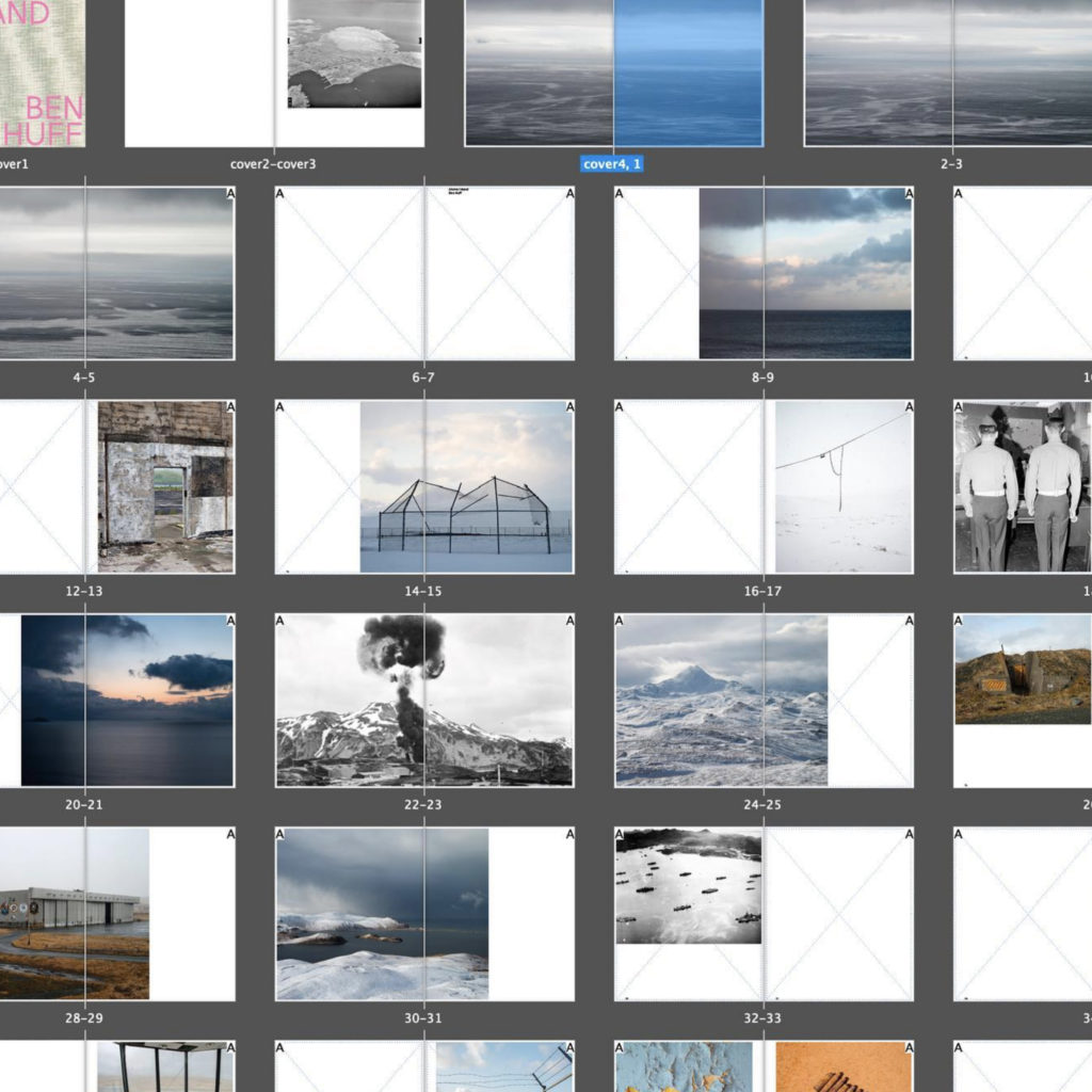
That physical aspect is important when thinking through the edit and sequence, because both can be affected by the choice of papers and binding. As Gremmen explains, books are typically made in sections of eight or sixteen pages, which means any special group of images will ideally be gathered in multiples of those numbers; once that set is assembled, it can’t be added just anywhere in the rest of the pages.
The paper—or papers—is a key factor in the book’s tactile impact, but it can also affect the images. Coated or glossy papers typically hold the inks better than uncoated pages, which means the photographs will look sharper, more detailed, and more contrasted. On the other hand, the glossy papers will also reflect light more, making the images harder to see. Uncoated papers feel softer between the fingers but may result in images that are slightly less crisp. If the book is being bound with a spiral ring, the paper will also need to have a minimum thickness to withstand being punctured.
The image and paper combination can also affect a photobook’s size, because one must strike a delicate balance between maintaining creative freedom and keeping within budget. Making the book at one size mean printing thirty-two pages per printing sheet, for example; making the book just one inch bigger might mean cutting that to sixteen pages per printing sheet, which instantly doubles the paper cost.
Factory Visit: Conveyor Studio from Conveyor Studio on Vimeo.
Going large will add weight and therefore transportation costs, which Labey points out can have a significant impact when shipping books long distance for book fairs or distribution. “There is an added pressure to sell heavy books at a fair, or correctly predict how many to bring, otherwise you have to ship them home, and you might end up losing money on that edition,” she says. “When you print in smaller editions the production price per book is notably higher—an important factor if you hope to profit, or honestly, just break even.”
Size and weight are also critical to the reading experience. A big book may work well for very detailed images, for example, which call to be printed at a substantial size; on the other hand, going large can create a monster volume that is unwieldy to hold or move. “In addition to practical considerations for the book maker or publisher, you need to consider how the reader gets physical with your work,” Gönenli says. “The size of the book is a very fundamental element which directly influences the intimacy between the book and the reader.”
“The basic things I always try to get down very quickly are the size of the book and the amount of pages,” Gremmen adds. “When you know about those two things, then the paper choice follows quite quickly afterwards. But also with those two things, you determine what kind of book you are making. You can calculate budget based on those two specifications, but you also decide on the kind of book.”
A text—or texts—may also be included, though the publishers included here are wary of thoughtless or overly didactic writing. If a text is going in, a typeface will also have to be chosen. Fonts can be used multiple times by a designer, who may already have some available at minimal cost, but if not, a new font can be bought in or, to go the whole hog, created bespoke for the project.
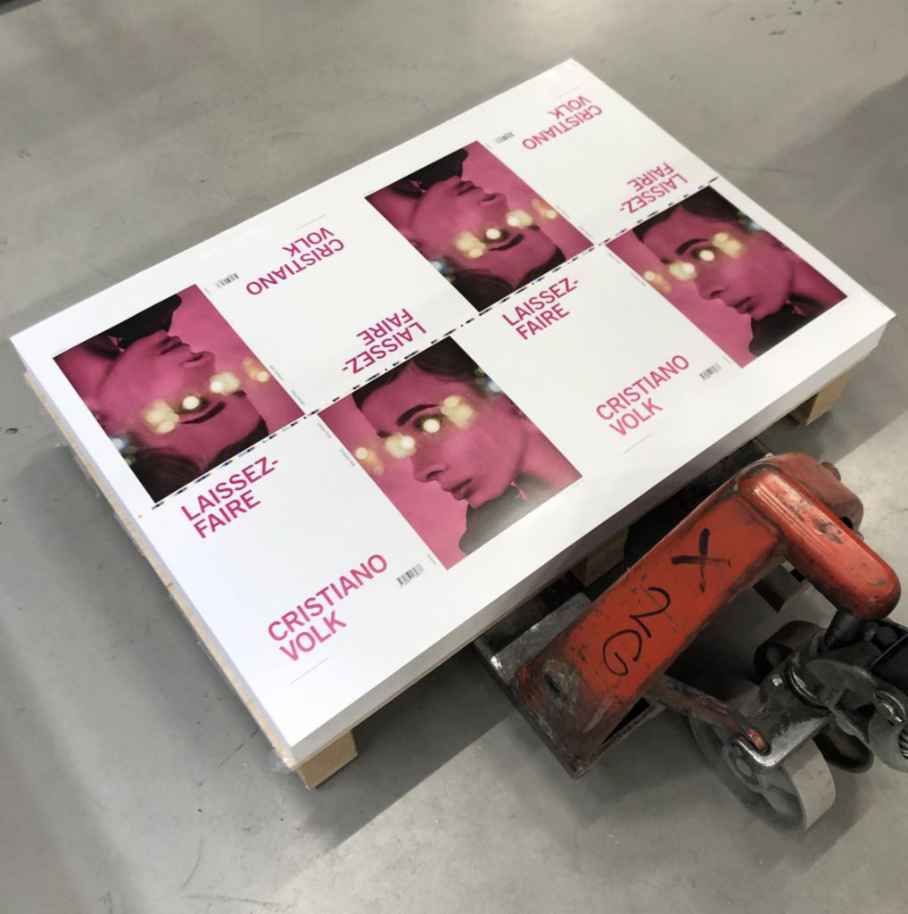
Printing essentially comes down to two choices: offset or digital. Put simply, offset is the traditional option that involves aluminum plates with a silicon base for each sheet; the inked image is transferred from a plate to a rubber blanket and then to the printing surface. Since each plate comes at a price, offset is typically used for print runs of a minimum of five hundred copies, allowing the initial outlay to be spread over more units. Though digital printing is often regarded as lower quality, it can work best for smaller prints runs, as the price per book remains the same.
The choice between offset or digital printing also depends on the capabilities of the printer, because digital offset can be used for bulk jobs to more average ends, or by skilled operators to a very high level. “We print on an HP Indigo, which is considered a digital-offset press,” says Labey. “It combines the electrophotographic process of a copy machine with the architecture and liquid ink of a traditional offset press. In short, the printing plate is wiped clean, and a new image is etched with each rotation. This removes the time and cost of creating physical plates and allows us to print very small quantities with high-quality results.”
Courtesy Hans Gremmen
Whether it’s traditional or digital offset, books are printed with the CMYK color model (cyan, magenta, yellow, and black), which means the images must be converted from the RGB color values (red, green, blue) generated by digital cameras and scans. The CMYK gamut contains a much smaller range of colors than the RGB color space, and although the conversion can theoretically be done by anyone with access to Photoshop, it’s a complex art best approached by an expert. In skilled hands, this, too, can become a creative process that might even involve alternative inks. Labey has worked with artists who replaced the magenta ink with fluorescent pink, for example, “which makes the images pop.”
Before pressing play on the print run, it’s advisable to print off some test images (which can cost over five hundred dollars per sheet of test paper, but that’s much cheaper than having to scrap an entire edition). Perhaps surprisingly, it’s unusual to test print all the images when using offset, because of the cost of the plates. Instead, a few key photographs are typically selected and printed on the paper to be used in the book, creating what’s known as a “wet proof.” An upside to printing digital offset is that it is possible to proof the full book on the same press and paper stock, trimmed to the same size as the final version.
There’s no one right way or recipe or formula. A book should always listen to its own rules.
Alternatively, a publisher can make digital proofs, which can represent every image in the book because they are cheaper per print. However, these tests are only simulations of the final result, and Gremmen takes a dim view of them. “To me those things are useless,” he says. “If you make a test print, it’s not about simulating, it’s seeing one on one how things will be.” Gremmen is often willing to oversee and sign off on the printing and production of books himself, but he says he prefers to work with companies he knows. Similarly, Gönenli works with only one printer: “Ofset Yapımevi, and they are perfectionists.”
The final step is putting everything together and binding the book—and, as with everything else in photobook-making, there are many options and lots of creative potential. Binding basically involves stacking the pages and combining them in a durable way, but books can be stapled, screwed together, or even folded together, if in handmade territory. In larger print runs, books are typically glued or sewn together.

Gluing, considered “perfect binding,” involves adding glue along the spine and simply affixing the cover. It can be efficient and very affordable, but it’s less dependable in the long term—a fact familiar to anyone who’s seen a book spine crack in the cold or melt in the heat. Sewing is more complicated because it involves folding and collating the separate sections, or signatures, of paper, then stitching them all together. There are many different approaches to this stitching, and it’s sometimes left exposed as a design feature.
The technical difference means that sewn books typically open and lie flat more easily than glued ones, though again, that’s not a hard-and-fast rule. The degree of flexibility depends on factors as (seemingly) obscure as the direction of the fibers in the end paper or the quality of the glue, making bookbinding another expert field. “It’s getting more tricky to find really good binders—they all go bankrupt, or retire, or whatever, and the knowledge is lost,” Gremmen says.
“But the most important thing for me is that the book opens very well,” he adds. “I see a lot of photobooks and, with almost half of them, I think, ‘This is horribly bound.’ It’s such a pity. You spend all this money on printing perfectly, and then you don’t care if this book opens well or not? I don’t understand it at all.”

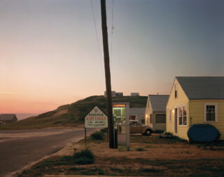
Courtesy the artist/Magnum Photos
With all these variables at work, making a photobook can be tricky to get right—but it’s not impossible. When asked, all four designers and publishers easily named outstanding photobooks that they believe pull off everything mentioned above and more. For Gremmen, it’s Elasticity by Aglaia Konrad (NAi Publishers, 2002), which he describes as “perfect on a technical level” but also remarkable because of its interplay of image and design. “They push one another to another level,” he explains. “The photography makes the design better and the other way around.”
Gönenli reflects on Niagara by Alec Soth (Steidl, 2008) for many reasons, but partly for little details, such as the fact that “you have to tilt the book to be able to read the text on the back cover, as if it were a daguerreotype.” Poimboeuf-Koizumi says she was immediately struck by Rinko Kawauchi’s Utatane (Little More, 2001), explaining: “It’s literally when I understood the power of sequencing.”
For Labey, Misplaced Fortunes by Ross Mantle (Sleeper Studio, 2021) is a special book. Mantle cofounded Sleeper Studio with fellow photographers Ben Alper and Peter Hoffman, and his book is a good example of why this model can be beneficial, according to Labey. “It’s clear he was able to choreograph and control all of the elements from concept to design to production,” she says. “Thus, it really feels like a work in its own right.”
“There’s no one right way or recipe or formula,” Gremmen says. “A book should always listen to its own rules.”