ONLINE ONLY: Jason Evans in Conversation with Kieran Hebden—Part 2
Jason Evans: I think DJing is quite an important part of the glue between us. I was promoting the club night “No Requests” at Electricity Showrooms, and every week I would play a few records and s

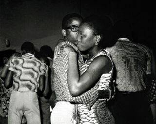
Front cover of Four Tet, Lion / Peace for Earth 12″, 2012. Text Records. Design and photograph by Jason Evans.
Jason Evans: I think DJing is quite an important part of the glue between us. I was promoting the club night “No Requests” at Electricity Showrooms, and every week I would play a few records and sometimes you’d be the guest DJ. DJing has been important to the promotional portraits and cover art we’ve made together, because it gives me a sense of where your head’s at because you don’t DJ for the crowd but for the love of music. And (one) I never really knows what you are going to play next. Whenever you make a new album or we start a discussion about artwork, it begins with me trying to make photographs that look like the music sounds. And we’ll speak about the artwork well before the record is finished, so there is loads of time to think about it and to prepare. I feel like we have reached a point where we have things very structured because you just can’t help having structure after working together for a long time.
But there has been another shift: I think I’m facilitating much more. For the cover of Pink you had a very specific idea about what you wanted and the references.
Kieran Hebden: I think that was by far the most specific I’ve ever been for any sleeve.
JE: One of the funny things about Pink is how your photographic referencing has changed since we first started. You’d seen an Atget show in New York … I love Atget’s photographs, but we’d never discussed the fact. And I particularly love Atget’s trees, which you picked out along with a bunch of amazing hand-drawn record covers from the Lebanon and Kenya from the late 1970s.
KH: I sent you an e-mail that said, “I’ve actually got a really clear idea for the next album. I’ve been to an exhibition by this old French photographer and I like these pictures of his and I’m really interested in these Lebanese 78 sleeves, so can you do something that brings all those things together, please?” [laughs] I remember you sent me an e-mail back: “I think that’s the weirdest e-mail pitch I’ve ever had.”
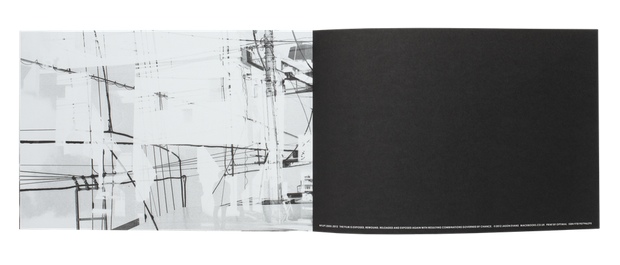
Jason Evans, spread from NYLPT, 2012. London: MACK Books. Designed by Grégoire Pujade-Lauraine and Jason Evans. 11 5/8 x 9 1/2 in. (29.5 x 24 cm), 160 pages, 80 duotone plates. Paperback with flaps.
JE: And the most refreshing: what a great hybrid! That’s exactly what digital dissemination should be leading to, those kind of hybrids, those kind of marriages. One of the things that was really interesting was the way that we finally created the imagery for Pink as objects for a physical release that had been staggered over a year as a series of 12 inches and then also as digital releases. So, when you’re making a piece of artwork that has to operate as a twelve-inch square and as an MP3 icon—essentially an inch square—it has to be right in both areas. And one of the things that I really love about Pink is that in order to make the MP3 icon and the printed artwork look as good as each other, we had to do the print as a lithograph with a screenprint on top of it. In order to make it look as good as it looked on screen, we used entirely analog methods. I just loved that hilarious moment of turning to screenprinting to make something look as good as it would on an Apple device. [laughs] It’s the only way to get that density of color. And now there are two thousand original screenprints floating around the world— really lovely objects for people to find. Thinking about how to make stuff shift easily between analog and digital formats has become more and more important to us.
KH: Another thing has happened that I feel is hugely liberating to me: I feel like there is absolutely no need anymore to have any text on a record sleeve. You are never going to be in a situation where somebody is going to buy that record after flicking through record racks at a store or by first seeing it in a window display. Nowadays, the computer tells you what you’re listening to. The name, artist, and track name always comes up, and if you’re buying it anywhere online all that information appears next to the cover. So I can’t see any reason, ever again, to put any text on a record sleeve. Because of websites like Discogs.com, which archive all the information on all records ever released, all you have to do is give your record a catalog number. And if anybody wants to find out who did the artwork, what studio it was recorded in, what date it was recorded, whatever, that information will always be available on the internet. None of us know how rock-solid digital archives will be, but at the moment I feel like it’s so easy to find things out that putting much less information on albums is perfectly fine because people will find it. And people like to find that stuff out. The weirder its name, the more difficult it is to get hold of, all those things, the more popular the record is. Go as weird as you like…
JE: Have you ever been guilty of being deliberately enigmatic?
KH: All of the time! [laughs]
Front cover of Four Tet, There Is Love In You LP, 2010. Domino Recording Co. Design by Matthew Cooper and Jason Evans; photograph by Jason Evans.
JE: I relate to this. It was really important to me to keep the information on and in the NYLPT book as spare as possible. It doesn’t have an essay in it and it doesn’t need one. I’m borrowing a model of innovation from the music world, and I’d love the photography world to do more of this. Digital photo innovation is often fueled by the perceived amateur market and is currently obsessed with ideas of quality, as opposed to qualities . And one of the things that’s really interests me about your work—your collaboration with Burial, for example—is turning away from an industry-standard perceived notion of quality. It seems like one is able to get away with that in music but not in photography. Do you agree?
KH: One of the really, really nice things about working in music, especially electronic music, is that once you’ve paid your electricity bill, you can do everything for free, including distribution. You can do something that is entirely digital, you can quietly make your own thing—in complete isolation, without telling anybody in the world about it—and then distribute it to the world in a very efficient kind of way. But all creative forms, including music, film, photography, have issues with the disseminators and the hardware providers. One of the things that we share as content providers is a real anxiety about paying for the electricity and that, I think, is going to be one of the next big forms of cultural struggle … to rethink the way in which content providers are supported.
JE: There is always going to be another generation willing to buy the back catalogue of Madonna, so you could argue that we won’t need any new music or images to accompany it. I wonder if the question at Apple HQ is “Do we need any more content? No, we’ve got content now. We just keep repackaging Michael Jackson forever.” And that worries me, that’s one of the things we both have to think about. I’m anxious about the ways in which photographic technology governs, maybe even authors, what it produces. There will be fewer options for ways of making images. Perhaps that’s a controversial thing to say, but I stand by it. It’s different with music because there are any number of computer programs or piece of hardware or objects that you can make a noise with. How can we find that diversity for photography?

Front cover of Four Tet, Everything Ecstatic LP, 2005. Design by Matthew Cooper and Kathryn Bint; photographs by Jason Evans and Simon Foxton.
KH: There are problems with digitization, of course. If you take a recording that was made in the 1950s or ’60s, when the quality of recording was amazing, and play it on the best studio stereo equipment, it will floor you. It will sound like the musicians are there with you in the room. Recordings made now, on the other hand, are optimized an iPod speaker or the radio. The music sounds great on those devices. You can also listen to an old jazz record or whatever on those devices, and it will sound good, too. But the difference is in the potential in them. The modern recording has gone as far as it can go, whereas when you play the old one on sophisticated equipment and it sounds better and better. Contemporary recordings just don’t have the same depth of information inside them. It’s really important to me that things that I make have got this hidden potential in them, that they can be better and better than most people ever even realize.
So if someone looks at the sleeve for There Is Love In You and loves it; if this person sees it on all the different formats and notices that they’re all different in their scale; if this person looks closely and maybe reads an interview where you discuss the process for making the sleeve; then perhaps that’s a way to see the potential in photography, to see it go much further. I think that understanding makes it truly lasting and stands the test of time in an amazing way.