How an Irreverent and Joyful Interiors Magazine Redefined the Idea of Home
With its impressive roll-call of photographers from Nan Goldin to Catherine Opie, Nest magazine celebrated self-invention.

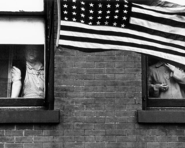
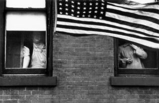
Cover of Nest, Fall 1997, with photograph by Jason Schmidt
It began with photographs of Farrah Fawcett. Raymond Donahue, a young showroom decorator for IKEA, had plastered the walls and ceiling of his bedroom in the small New Jersey bungalow he shared with his mother with black-and-white photocopies of Fawcett’s magazine covers: High Society, Vogue, Good Housekeeping. Nest, a new shelter magazine, sent the photographer Jason Schmidt to capture the room, which made the cover of the debut issue, dated Fall 1997. “I love Warhol’s use of repetition, so I photocopied magazine covers and made wallpaper out of them,” Donahue said to the curator Valerie Steele, who conducted the accompanying interview. “Nest offers its own definitions in celebrating human self-invention at home,” Joseph Holtzman wrote in the issue’s Dear Reader letter. “Our focus will never be on focus groups. We’d love an authentic chunk of your mind, though.”
Nest magazine ran quarterly for twenty-six issues. It was heady, odd, acerbic—sardonic about conformity and corporate America, yet, when it came to decorating, never overly goading or insincere. All tastes were welcome, provided they delighted, or intrigued, or tickled Holtzman, a decorator from Baltimore whose family money afforded him the opportunity to launch such an ambitious magazine.
“Nest—I could not resist that title. I said ‘Yes’ based only on that, I remember clearly,” says Paola Antonelli, senior curator of the Department of Architecture and Design at the Museum of Modern Art, who profiled the Italian twentieth-century design dealer Fulvio Ferrari for Nest’s first issue. “It was clear he loved other human beings,” she said of Holtzman. “We were all tired of exclusive, staged, rich, haughty, and glossy. We longed for intimate, messy, illicit, stolen, and generous—we wanted to find out how real people lived.”
Nest was seldom cozy. Each issue clashed the refined with the banal or makeshift or extreme; a story on a luxury swimming pool could be followed by a piece on tents in Kosovo, or igloos, or the women confined to the State Correctional Facility near Grants, New Mexico.
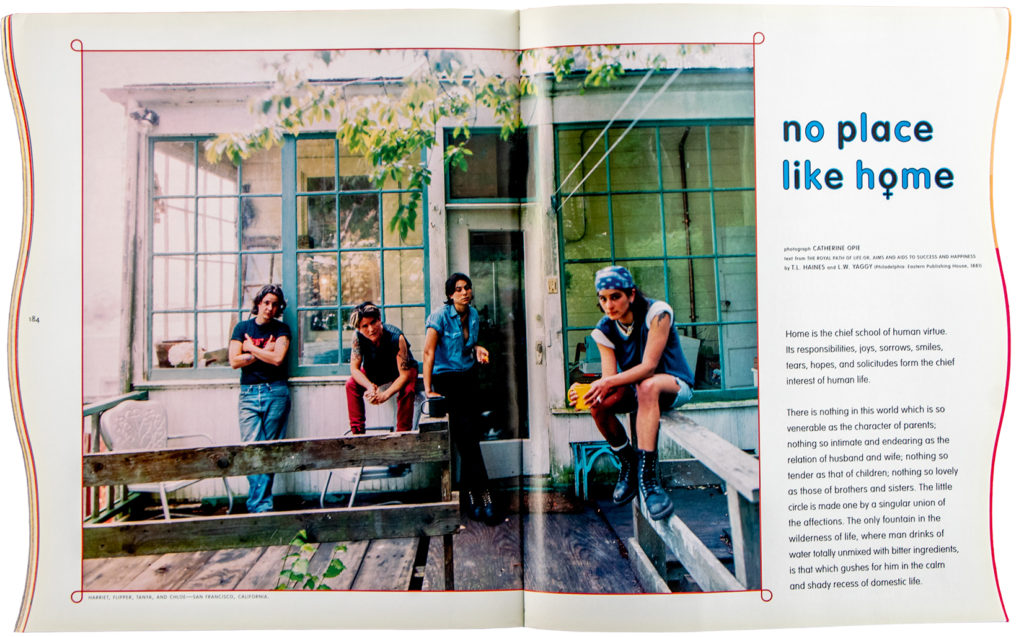
In the debut issue, Jan Groover’s photographs of the bathroom at Manhattan’s Gay and Lesbian Community Services Center, painted by Keith Haring in 1989 at the height of the AIDS crisis, appeared a few pages away from David Levinthal’s images of Barbie’s Dream House and Derry Moore’s pictures of Longleat, the home of the Marquess of Bath, who made paintings of all the women he slept with and hung them up his stairs. (Moore, a celebrated interiors photographer and the 12th Earl of Drogheda, and thus a regular at castles and manors, fulfilled Holtzman’s obsession with English aristocratic taste.) The Fall 1998 issue featured a story on the Turin home where Carlo Mollino spent the last fourteen years of his life, pictured alongside his Polaroids of the prostitutes who visited him. Summer 1999 saw stories by Robert Polidori on beehive-shaped mud houses in the al-Shilo village in Syria and Mitch Epstein on the ape house at the Philadelphia Zoo. For Fall 1999–2000, Nan Goldin photographed the artist Nayland Blake in his mother’s bedroom, which he’d wallpapered with over four hundred pounds of gingerbread. The roll call of photographers was impressive—David Armstrong, Martin Parr, Jim Goldberg, Richard Barnes, and Terence Donovan, among others, all made work for Nest—yet only a handful of the image makers, such as Moore, were particularly known for classic interiors photography.
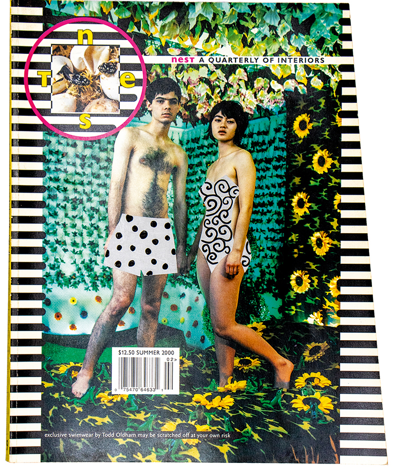
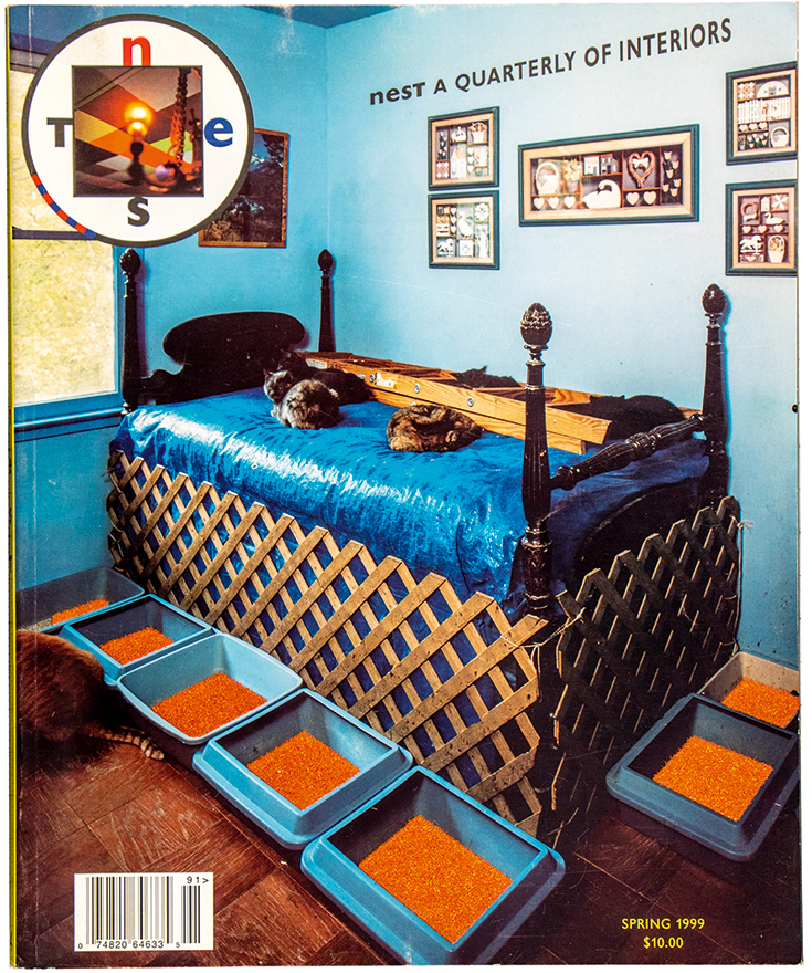
“I subscribe to a number of shelter magazines—World of Interiors, House & Garden (RIP), Elle Decor (before its recent decline)—but Nest was different,” says the critic and magazine collector Vince Aletti. “When the second issue came out, I’m embarrassed to report that I wrote a fan letter to the magazine advising it to be more appealing to potential readers—not put them off with the sort of abstract design and weird graphics on the cover of the Fall 1998 issue, which no one would have recognized as a shelter mag.” That issue featured a black-and-brown striped cover and a hand-applied cutting of flocked wallpaper, the pattern of which resembled random stains, by the artist Rosemarie Trockel. “It was obvious Nest couldn’t care less about the general audience,” Aletti says. “You liked it or you left it, and most of its core readers loved it. I don’t think I would have called it beautiful at any point, because it was not afraid to get a little ugly, and it went beyond mere beauty.”
The design was “almost baroque,” according to Tom Beckham, who joined Nest ahead of the second issue as design technician, and stayed to the end, quickly becoming graphics director. At points, it veered toward the unhinged—one issue came with four holes drilled straight through it, as if the reader was hanging a particularly hefty picture; while others arrived with scalloped edges or scratch-and-sniff patches. Photographers’ images would often be placed on top of florid, graphic patterns or framed with shouty borders. The magazine was “another iteration of Joe’s interior design,” says Beckham.
Before launching Nest, Holtzman had considered starting a magazine that was severe and serious. But after Wallpaper launched in 1996, Nest went in the opposite direction. Holtzman took to thumbing his nose at other, less playful titles. The Summer 1999 cover was photoshopped to resemble a comic strip; a thought bubble above the head of a handsome man, nude save for a towel and reclining in a chair, reads, “Hang me. I thought Wallpaper was shooting my apartment.” Behind him, his decorator, clad in a fur stole, is shown thinking, “God willing, my next assignment will be for Architectural Digest.”
“Nest questioned the concept of conventional beauty and redefined the importance of decoration in a world in which minimal aesthetics dominated,” says Christoph Radl, creative director of Cabana magazine. Indeed, Nest came along at a relatively flaccid period within interior publications. House & Garden, once known for photographic commissions by the likes of Irving Penn and Horst P. Horst in the 1940s and ’50s, when it was art-directed by Alexander Liberman, was floundering by the ’90s; it closed in 1993 and briefly reemerged in 1995 before closing again in 2007. New launches, such as Martha Stewart Living, which began in 1990, were decidedly pleasant and sanitized. But Nest ignored the increasingly recognizable format of the tidy, symmetrical interiors photograph. “Nest’s photographic approach preferred individual perspectives compared to a canonical narrative of the interiors,” says Radl.
“They were really looking for photographers from more of an art background than an Architectural Digest background, because they didn’t want the spaces to be overwrought with that idea of how we view what space does and how it exists,” says Catherine Opie, who shot regular stories for Nest. She once turned down a feature on a woman who collected vacuum cleaners. “I still kick myself,” she says. “Being a part of Nest informed my work later on. I don’t know if I would have made 700 Nimes Road”—Opie’s celebrated 2015 series about the home and possessions of Elizabeth Taylor—“without my experience of years of photographing for Nest, in which an environment became a portrait.”
With Nest, the question was not just how do we decorate our homes, but also what is home. It took a conceptual approach to things like ownership, value, luxury, comfort—many of its stories seem pointedly relevant now. In one feature, Eileen Myles spent a week sleeping in a cardboard “homeless box,” invented after a 1993 spike in homelessness in Rotterdam. Much airtime was given to those worried about climate change, including those who’d fashioned elaborate bunkers, and time was taken to document the living arrangements of people with mental-health illnesses or disabilities. Holtzman seemed particularly intrigued by the complex worlds of children. “The Squeeze Machine,” a story in Summer 1999, focuses on eleven-year old Matthew from Alaska, who is autistic and derives comfort from being held tightly. “Nest was always political,” Beckham says. One particular concern was “how being gay gets represented in culture—the idea of the gay decorator.” Nest is “especially legendary among the gays,” says Jop van Bennekom, founder of the adored gay magazine BUTT and, later, Fantastic Man. “It was a bit too opulent to me and the design was a bit too ‘decorative’ for my Protestant taste, but of course, there was joy that splattered from every page.”
Courtesy the collections of Vince Aletti and Donna Ghelerter
Nest is, indeed, joyful. It billed itself as ambivalent to fusty norms but celebratory about style. Impressively, given how closely the magazine revolved around Holtzman’s singular vision, it was never gushing or dictatorial. Through both the sometimes haphazard, whimsical tastes of the subjects profiled and its own eclectic gaze, Nest embraced and encouraged contradictions. One could be radically political while still having good chairs. One could be queer while still worshipping relics of tradition. Nest cared enough about the march of capitalism to mock the unquestioning stuffiness of other titles, but not quite enough to turn down advertising from Calvin Klein or Diesel, or to cease from swooning at some truly extravagant pile, shot by Moore. It needled the status quo without asking its readers to change even slightly; the best you could be, according to Nest, was yourself.
Though briefly courted by Si Newhouse at Condé Nast, Nest folded in 2004. “A Champion of the Quirky Writes Finis,” read the New York Times announcement by Fred A. Bernstein, which recalls how Nest was never afraid to shock: “Holtzman wrote one of his editor’s letters from what he called a ‘small, well-proportioned room’: in a psychiatric hospital. Furniture coverage included close-ups of electric chairs.” Holtzman revealed that he’d ploughed between four million and six million dollars into Nest—he sold a Matisse bronze to support it. The final issue featured one of his own paintings on the cover, nodding to his new plans for life as an artist.
“We at the magazine think that we have at the very least demonstrated that a shelter magazine can march to a different drummer,” Holtzman wrote in his final Dear Reader letter. He expressed hope for the future. “I do believe that the young people coming of age will make a big contribution to design and decoration. The time has come to do more than mix and manipulate the givens of our creative legacy, and I know that this generation is not afraid to stand up to the past.”
This piece was originally published in Aperture, issue 238, “House & Home,” Spring 2020, under the title “Interior Life.”