Five Book Design Trends Spotted in the PhotoBook Awards Shortlist

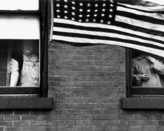
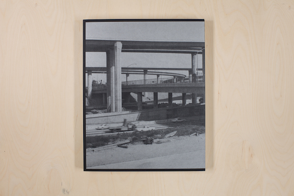
Siegfried Hansen, Hold the Line (Verlag Kettler)
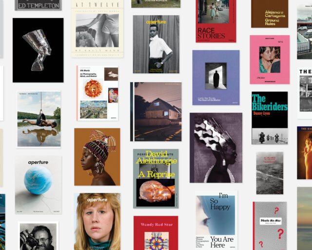
Every summer, the entries to the Paris Photo–Aperture Foundation PhotoBook Awards come pouring in: from the U.S., the U.K., Brazil, Japan, Germany, China, Russia, Australia, Israel, and beyond. This year, the Awards received more than a thousand entries, from over sixty different countries. Amazingly, despite the entries’ incredible diversity, patterns do begin to emerge: not only in subject matter, but also in the books’ design.
This year’s shortlist includes thirty-five books (and one special jurors’ mention) that run the gamut from self-published tomes to high-budget museum catalogues, and even print objects that could only barely be considered “books” in the traditional sense. But designers working everywhere from São Paulo to Paris sometimes end up reaching for the same unorthodox materials, or setting type in just the same way—thanks to the increasing popularity of international book fairs, mobility on the part of young photographers and designers, the internet, and maybe even pure coincidence. Whether these photographers and designers are setting trends, following them, or flipping and subverting them altogether, the Awards offer a unique opportunity to track the evolution of the photobook. Here are five design trends we noticed in this year’s shortlist.
1. Transparent plastic jackets
Protection from ungentle hands and shipping containers, or just a fun way to add gloss or texture to a cover? Either way, several books on this year’s shortlist came enveloped in slick plastic jackets—whether colorless and transparent, as for the exhibition catalogue William Eggleston: A Cor Americana and Sophie Bramly’s hip-hop album Walk This Way; or in a matte red, as for PhotoBook of the Year winner Thomas Mailaender’s Illustrated People.
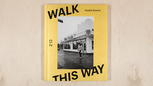
Sophie Bramly, Walk This Way (Galerie 213)
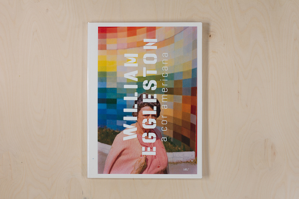
Thyago Nogueira, ed., William Eggleston: A Cor Americana (Instituto Moreira Salles)
2. Pages of all shapes and sizes
Continuing an increasingly popular trend, many books submitted to this year’s Awards played with pages’ trim lengths, calling attention to different sections and changing up the frame. Sometimes shorter pages act almost as built-in bookmarks to demarcate sections or chapters, as in Dominic Forde’s reimagined skateboarding archive Ramps, Pools, Ponds and Pipes. In Hiroshi Takizawa’s Mass, though, the artist and designer went for broke: every single page is a different size, and often a different kind of paper, too, highlighting the sculptural bent of the images.
Hiroshi Takizawa, Mass (Newfave)

Dominic Forde, Ramps, Pools, Ponds and Pipes (self-published)
3. The rise of the paperback
With all due respect to the beautifully bound hardcover, softcover books—formerly considered less durable and less valuable than hardcovers—are on the rise. Nearly half the shortlist books this year were softcovers. From the exhibition catalogue Beastly/Tierisch, with its fuzzy orange title and back cover, to the richly printed, black-and-silver cover of Dana Lixenberg’s Imperial Courts 1993–2015, the paperback proves to be a versatile and tactile form.
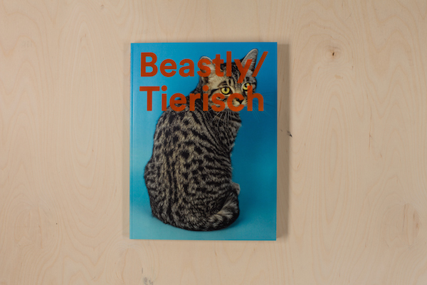
Duncan Forbes, Matthias Gabi, and Daniela Janser, eds., Beastly/Tierisch (Spector Books/Fotomuseum Winterthur)
Dana Lixenberg, Imperial Courts 1993–2015 (Roma Publications)
4. Book blocks, roaming free
2015 is the year of the free-floating book block; as in, the pages are bound to each other, but not to the cover. This does make the books that employ this design more delicate—the pages are liable to fall out anytime—but it also gives designers space to play. Sjoerd Knibbeler’s Paper Planes, for example, features one long, double-sided accordion of pages, and is meant to be flipped and swiveled.
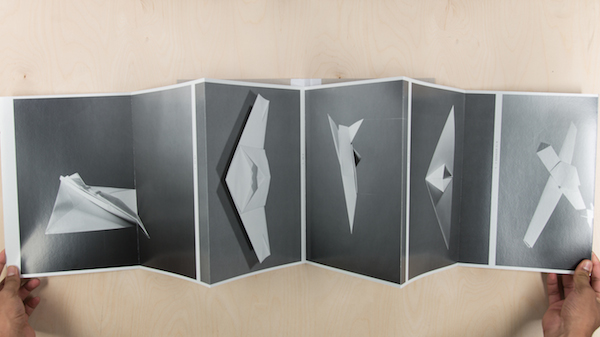
Sjoerd Knibbeler, Paper Planes (Fw:Books)
5. Monospace type, reclaimed
Monospace typefaces—in which each letter or character is the same width—were first created for typewriters, although these days they’re more likely to be associated with computer code than they are with actual ink. Nonetheless, they’ve begun popping up in new photobook design, taken back from programming. A monospace type feels fresh when contrasted with the color-saturated street scenes in Siegfried Hansen’s Hold the Line, or when juxtaposed against serifs to call out pieces of information. In Lucy Helton’s Transmission, the typeface alludes to the dispatches from outer space; in the essay component of Antony Cairns’s hacked Kindle book LDN EI, the type seems to align the images it accompanies with futuristic dystopia.
Lucy Helton, Transmission (Silas Finch)

Antony Cairns, LDN EI (self-published)
The Paris Photo–Aperture Foundation PhotoBook Awards Shortlist exhibition will be on view at Aperture Foundation from December 12, 2015, to February 8, 2016. Click here for a list of other venues where you can see the exhibition.